How to create an extraordinary UI design for an app


The market of mobile applications is rapidly growing, and so is the competition. To be successful, an app should resolve a user’s problem, but at the same time, be pleasant to look at so that you won’t delete it after the first second of use. Therefore, it is crucial to make a good first impression, and this is exactly where user interface (UI) comes into play. Let’s explore what UI is and why it is so important, and then dive into the app design tips.
What is so special about an app interface design?
User interface design is a process of building interfaces focused on a style. It follows information architecture principles that help customers interact with software. UI includes such elements as icons, buttons, checkboxes, progress bars, notifications, tooltips, and others. Basically, UI is everything you see on your mobile phone screen when it’s unlocked.
The key points that a user interface design deals with are the following:
- Information layout: An arrangement of elements is primary to a product’s unique style.
- Visual design: A UI specialist works with typography, shapes, and color palettes to create an aesthetically pleasing image.
- Prototyping: Mockups of a future product help to gather feedback and test its usability.
An intricacy of designing for mobile rather than desktop is that mobile screen space is very limited compared to, say, a laptop — the smallest mobile screen size is 360x640 for Android. Still, you need to facilitate a user’s actions by wisely composing info on a page.
Moreover, you cannot supply each item with a text, as it clutters up space and distracts a user. Elements of an app’s interface should speak for themselves without extra-textual explanations. Another thing to consider is that a user interacts with a touch-sensitive display. A touch point size needs to be convenient to tap in all orientations and sizes while, at the same time, it shouldn’t take all the space on the screen.
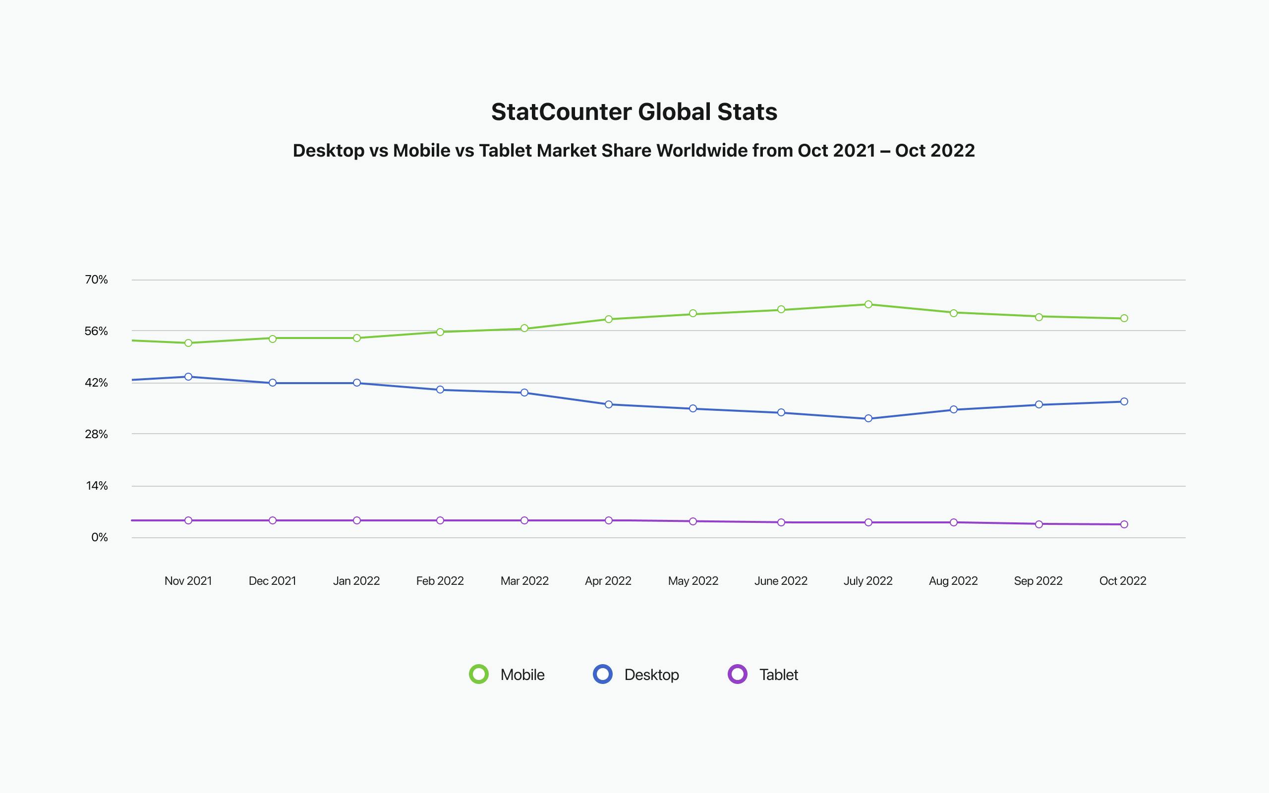
Anyway, why pay so much attention to user interface engineering first? Stats say that, as of October 2022, 58.27% of internet traffic was mobile and 39.72% was desktop. Hence, customers are more likely to run into a product on their mobile screens, rather than on desktops or tablets.
So, how to make your mobile application an outstanding one and increase user retention?
Tips on how to create a great app design
There are some basic rules in building intelligible and convenient app interfaces, including such rules as making it easy to navigate, consistent in every aspect, and accessible for people with special needs. The question is: How to design a mobile application that will stand out from others?
Tip 1: Be familiar. It may sound controversial, but you do not have to build a totally-unlike-others app to be exceptional. Download the most trending products in your field and analyze their functionality. Borrow the best practices and improve them further.
Tip 2: Be simple. A flat design is the most common in creating app interfaces today — it is better not to overweight yours with three-dimensional animation. Keep it simple: Don’t make it too decorated, don’t make it too colorful.
Tip 3: Be funny. Being hilarious in error notifications or FAQ isn’t quite appropriate, but why not spice up UI with a pinch of humor in onboarding or task completion processes.
Tip 4: Move. In the real world, when we touch objects, they move, speed up, and decelerate. You can make scrolling in the app more interactive and natural by adding some motion.
Tip 5: Be clear. Be clear not only in writing but in visuals, too. Use high-resolution images only. To make them fit the brand colors of your mobile application design, add an overlay.
Tip 6: Mind the hierarchy. It is fine to combine 2 or 3 fonts, but you can create a good visual language by using just two different weights of one font. Use a heavier one to emphasize the main text, and a lighter one for the rest.
Tip 7: Follow guidelines. While being creative, stick to the guidelines of Material Design and Human Interface Design. In our custom software solutions, we follow iOS and Android guidelines to build user-friendly apps.
For more recommendations, see the Stories and articles page.
All in all, actions speak louder than words. Let’s have a closer look at the best apps that accomplished the listed tips for great UI.
Examples of awesome UI designs for apps
Balance: Meditation & Sleep
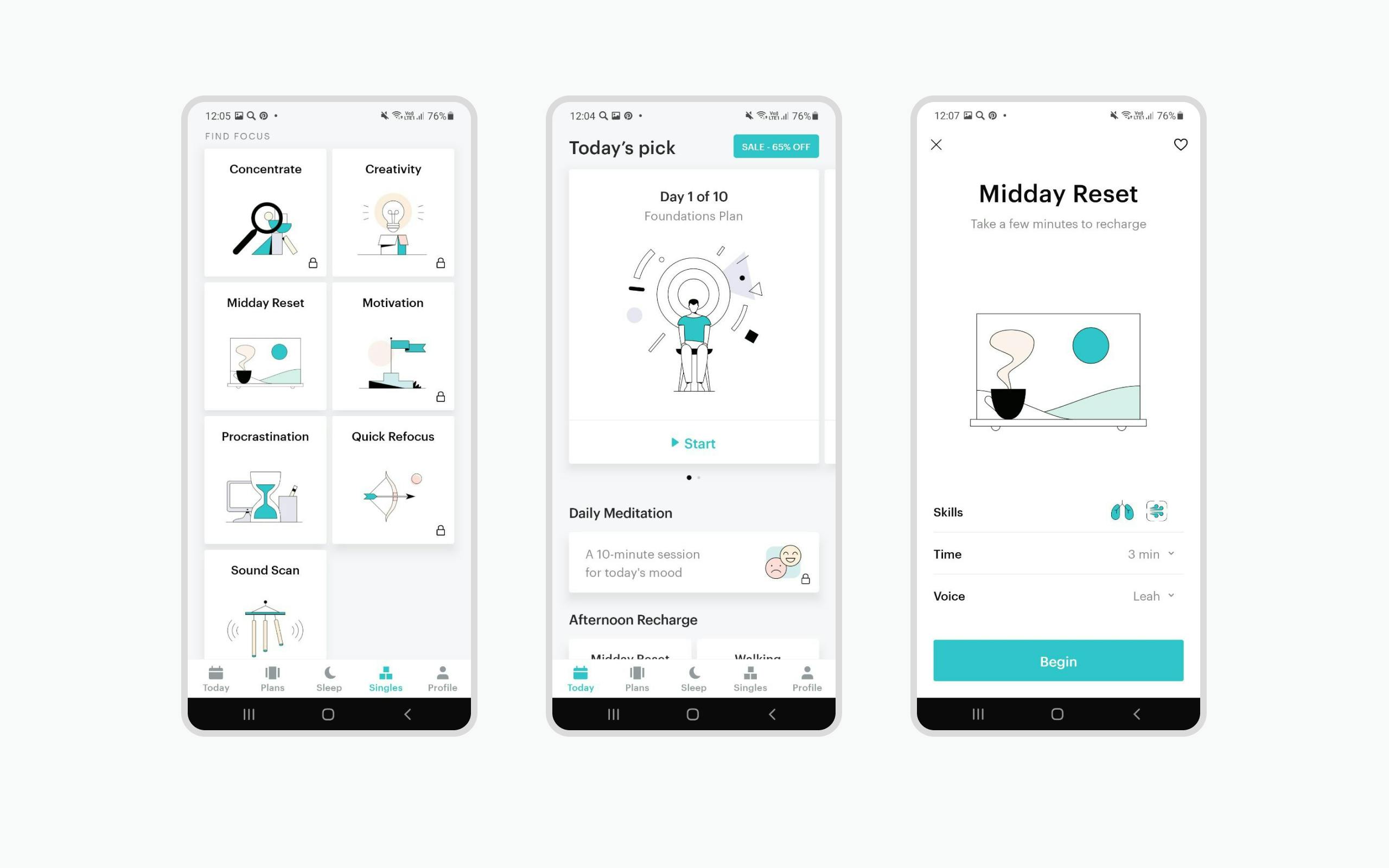
The award-winning app welcomes you with a smooth motion picture and adapts meditation programs to your habits by asking a few questions during simple onboarding. It mostly uses icons and a bit of 2D animation in a calm color palette, which does not distract you from achieving the main goal of relaxation.
Duolingo
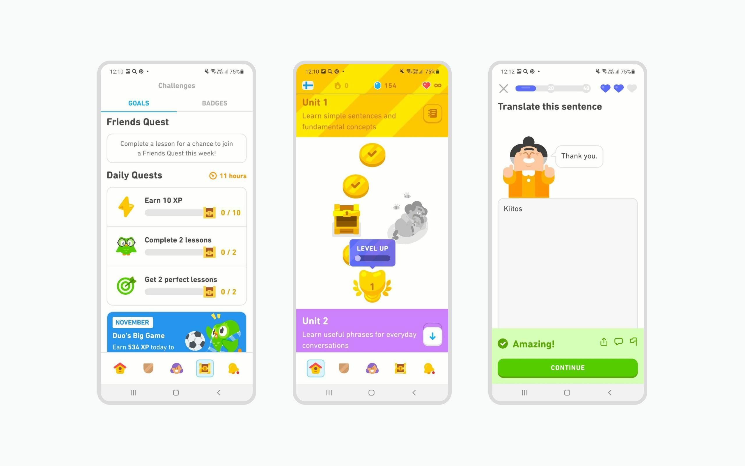
The most trending app for learning languages. It is simple, it has recognizable animated characters and shows your progress as a path with steps representing levels you have reached. Despite some arguments around its 2022 redesign, Duolingo is an example of a successful mobile application that managed to gain over 500 million users.
Meetly
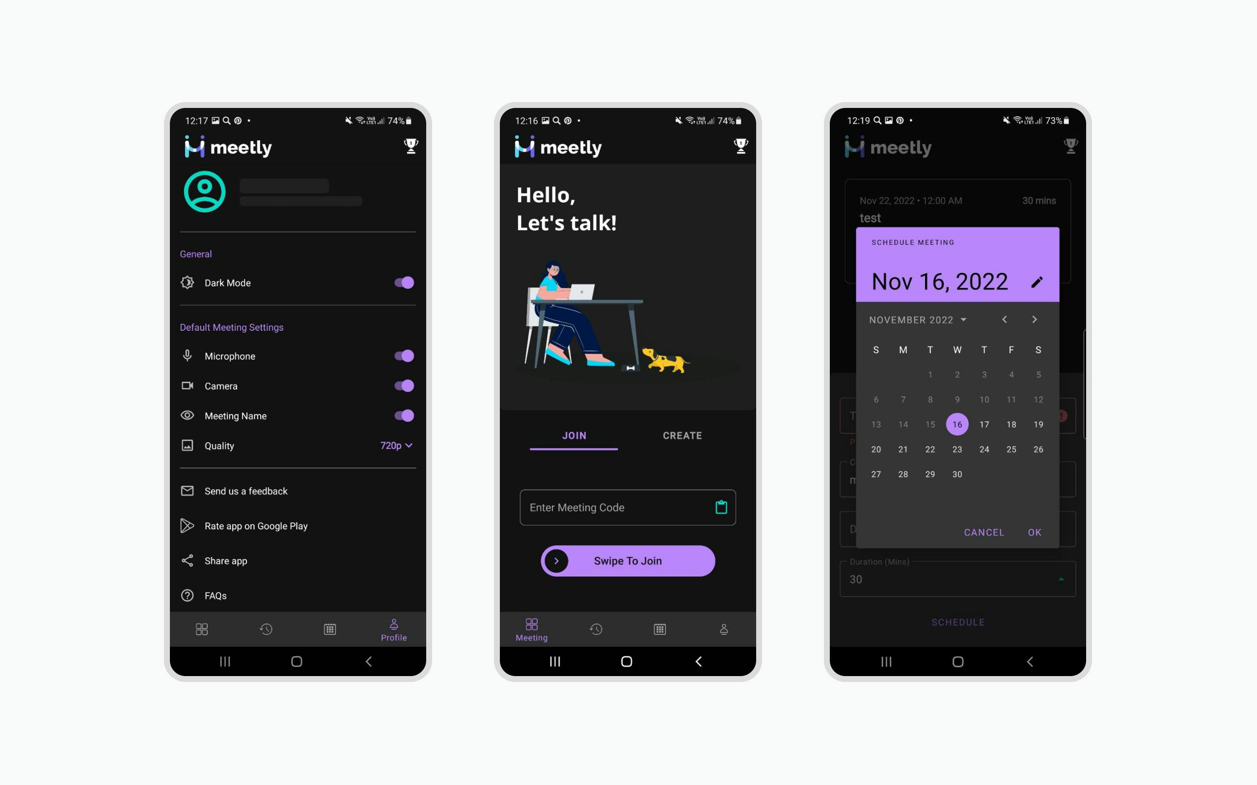
The app follows the trend of a dark theme in UI. The reason for the trend is that black background, as opposed to white, doesn’t affect your eyes with blue light that much. To make the product pleasant for the users, its creators picked colors according to the color contrast standards recommended by Material Design. As a result, they won an award from Google for implementing these principles.
To sum up
As you can see from the tips and app examples we have listed, being creative when designing an interface is just a part of other requirements. By following them, you can be sure that your users have a great experience with an app. Unique features and patterns shouldn’t confuse users. So to say, making an extraordinary UI implies spicing up rather than oversalting.
Throughout 15 years, Ronas IT has created over 200 mobile app designs and is heading for more. Check our Design Services page if you are specifically looking for the UI design, or visit Services if you are interested in full-cycle development and other.