Why every business should consider investing in data visualization services


Businesses accumulate enormous amounts of data daily. However, interpreting this data can pose a challenge, especially when trying to pinpoint specific issues such as bottlenecks in a sales funnel. This problem often arises from the challenge of integrating data from various channels like customer relationships management (CRM) tools, project management tools, and more. A highly convenient solution in this case would be custom software development for data visualization. Let us now dive deeper into this particular aspect.
Understanding the solution: Data visualization services
Data visualization offers a straightforward solution to the complex issue of data management. It involves using a system that collects information from various sources, securely stores it, reducing reliance on a single source, and then presents it in a user-friendly format such as charts, diagrams, histograms, maps, timelines, etc. This not only simplifies data interpretation but also provides insightful perspectives on business operations helping decision-makers to make informed strategies.
Unpacking the system: How data visualization services work
The data visualization service we provide at Ronas IT operates on a structured, multi-stage process, there are several steps preceding the final chart on the screen. The overall system aims to allow easy interpretation of significant volumes of data, identify new opportunities, and implement an effective strategy for improved business decisions.
The picture below represents how the data is moving from collecting to presenting information on the screen in a graph.
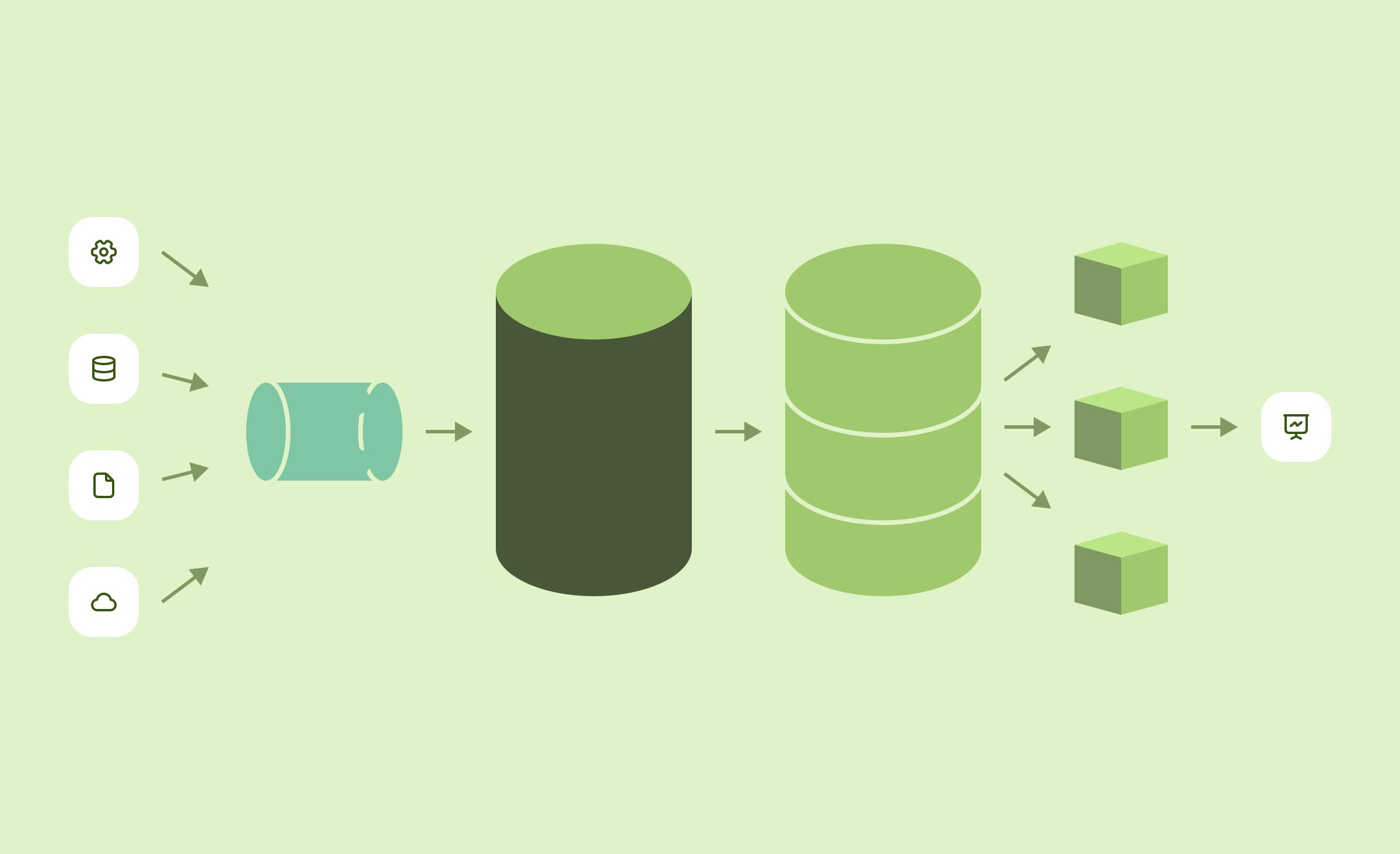
Let’s now briefly explain the process:
- Collection and structuring of information
Data from various sources is gathered and structured in what is referred to as a "data lake". This is the initial stage where raw data begins its journey towards becoming an insightful visual representation.
- Transfer to the data warehouse
From the data lake, the structured information is transferred to a data warehouse. This step is crucial as it ensures that business continuity is maintained by reducing reliance on subscriptions to individual management sources.
- Storage of data
A primary function of the data warehouse is to provide secure storage for the amassed data. Here, the data is not just stored but also maintained over extended periods to allow for periodic analysis and long-term trend monitoring.
- Preparation for visualization
The final stage within the warehouse involves preparing the data fields for visualization. The data is transformed from complex, often hard-to-grasp datasets, into a format that can be easily understood when visualized.
- Insight generation
With the data now visually represented, patterns and trends become clear. For example, a drop in client correspondence after the second round of follow-up emails could be identified — a critical insight that could lead to a revision of your email script.
Are you ready to make the most of your data?
Advantages of data visualization services
Data visualization services offer numerous benefits across multiple sectors allowing entrepreneurs and anyone working with data to make better decisions. They help businesses identify trends, analyze their data, discover new opportunities, and navigate complex datasets. Above all, it’s generally easier to comprehend information in its visual form rather than textual. Regardless, here are more advantages:
Enhanced decision-making processBy visualizing data points, businesses can analyze critical metrics, such as the lifetime value (LTV) of a customer. This way, decision-makers grasp a clear understanding of the data, supporting strategic and informed choices.
Improved understanding and interpretation of business trendsWith data visualization services, complex data strings are transformed into simple, visual formats such as graphs or charts. These visuals allow for easy identification and understanding of business trends, thus aiding in future planning and forecasting.
Effective communication of data insightsData visualization simplifies complex data sets, converting them into easy-to-understand visuals. This helps considerably in communicating data insights to stakeholders, making presentations more understandable and impactful.
Fostering a data-driven cultureWith accessible and comprehensible data visuals at their fingertips, all team members, regardless of their tech-savviness, can contribute to meaningful and data-driven discussions. Over time, this fosters a data-driven culture within an organization.
Comprehensive representation of dataUnlike tools such as Google Analytics or CRM systems that show results from their respective channels, data visualization services can integrate and represent data from various sources. This ability provides a holistic view of business operations, offering insights that individual, channel-specific analytics tools cannot. This complete perspective leads to a much deeper understanding of the business, which can further direct strategic decisions in an informed way.
How data visualization services can help different businesses
Across industries, numerous businesses have leveraged the power of data visualization services for optimization and improved decision-making. Here are a few examples of how it can aid business operations:
E-commerce
The e-commerce sector can use data visualization services to enhance its customer experience. By visualizing customer data, aggregators can anticipate shopping patterns, preferences, and customer behaviors, leading to personalized recommendations and an improved shopping experience. Thus, Amazon has developed a similar set of analytic tools and offers them to customers by subscription.
These include predictive analytics to anticipate customer buying patterns and determine promotions and discounts in stores, and customer segmentation tools to identify and analyze customer buying habits. Amazon also offers an analytics suite that uses worldview graphs to show customer preferences and buying patterns across age groups, genders, and product categories. The data visualizations consist of visuals such as infographics, world maps, pie charts, and word clouds.
However, it is important to note that while these tools are readily accessible and highly valuable, they have an underlying connection to Amazon and are not a fully independent and custom solution.
Healthcare
In the healthcare industry, data visualization tools are becoming increasingly crucial for hospitals to effectively track patient data and manage overall healthcare.
One exemplary application of data visualization services in healthcare is the implementation of electronic health records (EHR) systems. EHR systems not only collect and store patient health information such as medical history, laboratory results, medications, and vitals, but also allow healthcare providers to analyze this data. It is essential for these systems to possess data visualization tools that enable healthcare professionals to effortlessly view and interpret patient data in a visual format, such as graphs or charts.
By visualizing this information, doctors can detect patterns, identify trends, and recognize anomalies in patients’ health conditions, thereby facilitating accurate diagnosis, more effective treatment planning, and improved monitoring of progress over time.
Food and beverage
Restaurants and coffee shops can use data visualization to decide on new store locations. Looking at data about traffic, demographics, and even the proximity to other points of sales locations, the company makes informed decisions about where to open its next store.
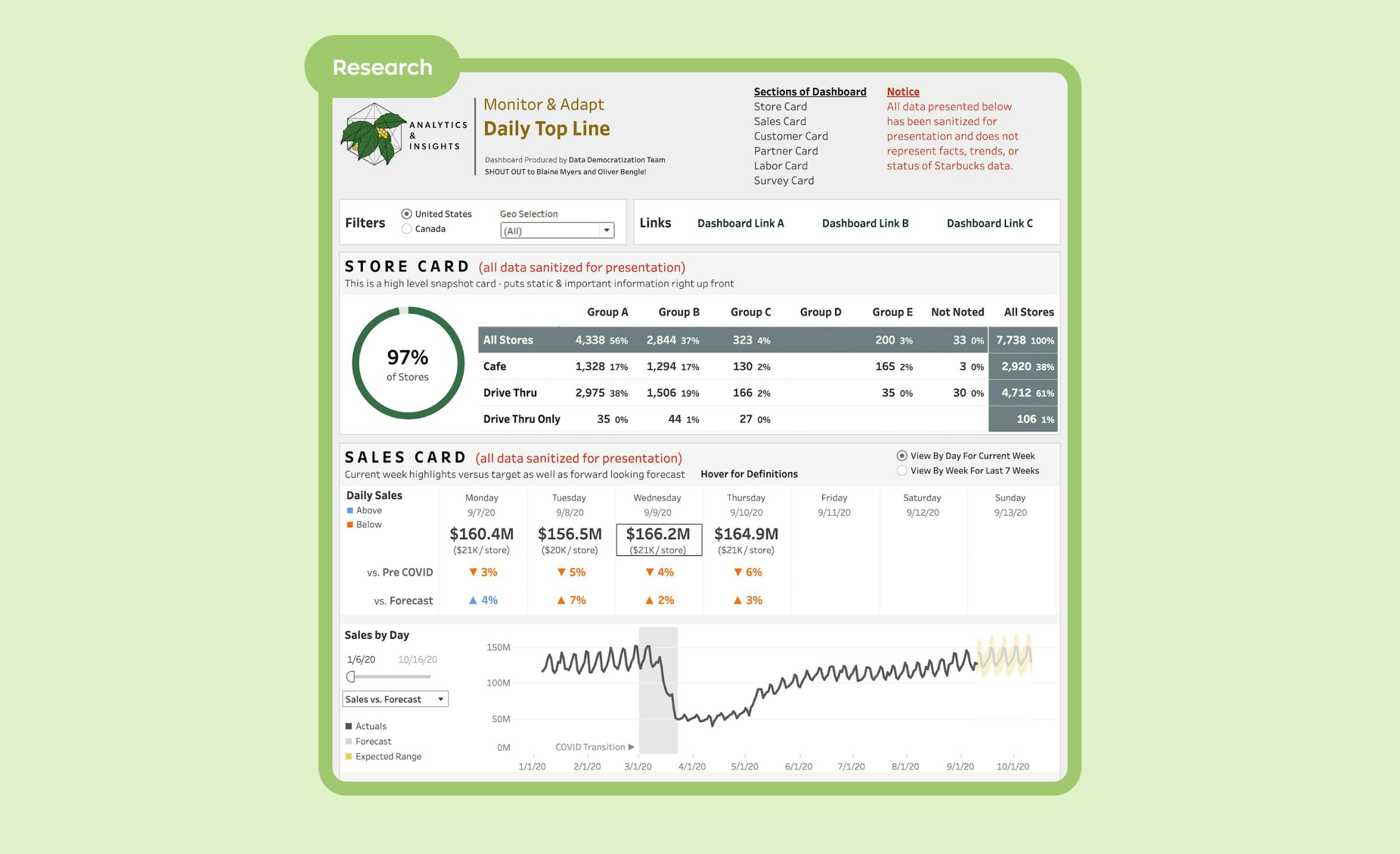
An interesting “bathroom case” happened to Starbucks in the pandemic times. In response to the situation, Starbucks relied heavily on data to adapt and transform its business model. The company shifted from the traditional store model to a digital model, where customers ordered via a mobile app and picked up their orders with minimal contact.
Starbucks’ Analytics and Technology Data teams developed a real-time report, providing essential data points to make effective decisions. To everyone’s surprise, they discovered the availability of bathrooms was emerging as a key service aspect, highlighting the hidden insights that data can reveal. The company managed to maintain its customer service quality while achieving a safe and efficient operational model amidst the pandemic, demonstrating the power of data-driven decision-making.
These examples highlight how data visualization services can lead to better decision-making, improved customer experiences, and ultimately, business growth. Whether it’s simplifying complex data, detecting patterns, or showcasing trends, the potential for data visualization across various sectors is immense.
Data visualization tools
Various dashboards are available to visually represent your data in a user-friendly interface. Such tools are called business intelligent software. It aims to allow easy interpretation of significant volumes of data, identify new opportunities and implement an effective strategy for improved business decisions.
It’s important to understand, though, that these tools are primarily designed for visualization and presentation, not end-to-end data processing. Essentially, they serve to convert your existing data into a visually appealing and easily comprehensible format.
Metabase
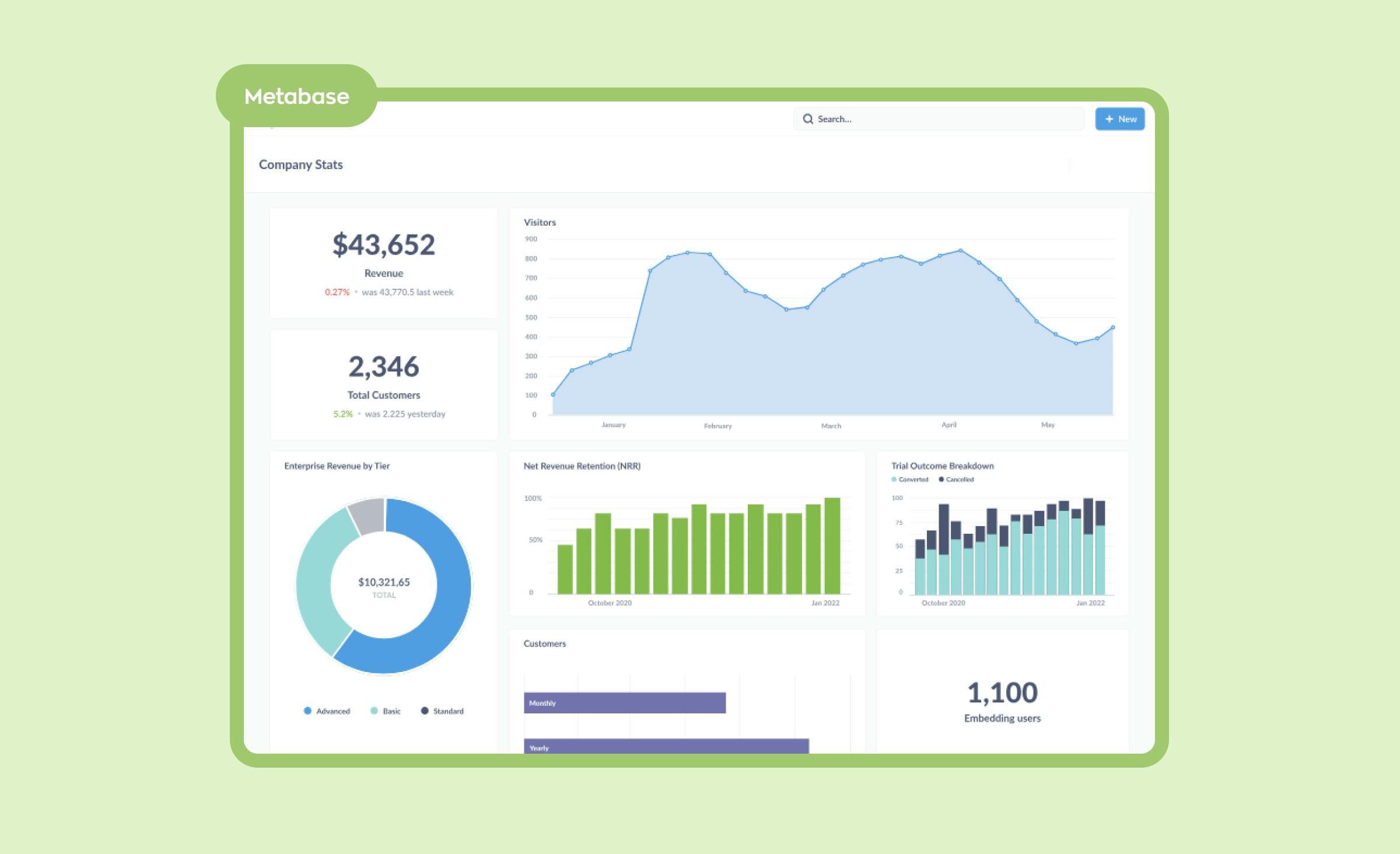
Metabase is an open-source analytics and data visualization platform that is used by non-technical people. Users can create charts and dashboards without needing to write code. It is designed to provide new users with an easy-to-navigate interface that does not require programming knowledge. Its features include visualizations, a query editor, and an interactive dashboard builder. Additionally, Metabase can be integrated with popular databases, including MongoDB, MySQL, PostgreSQL, and BigQuery.
Tableau
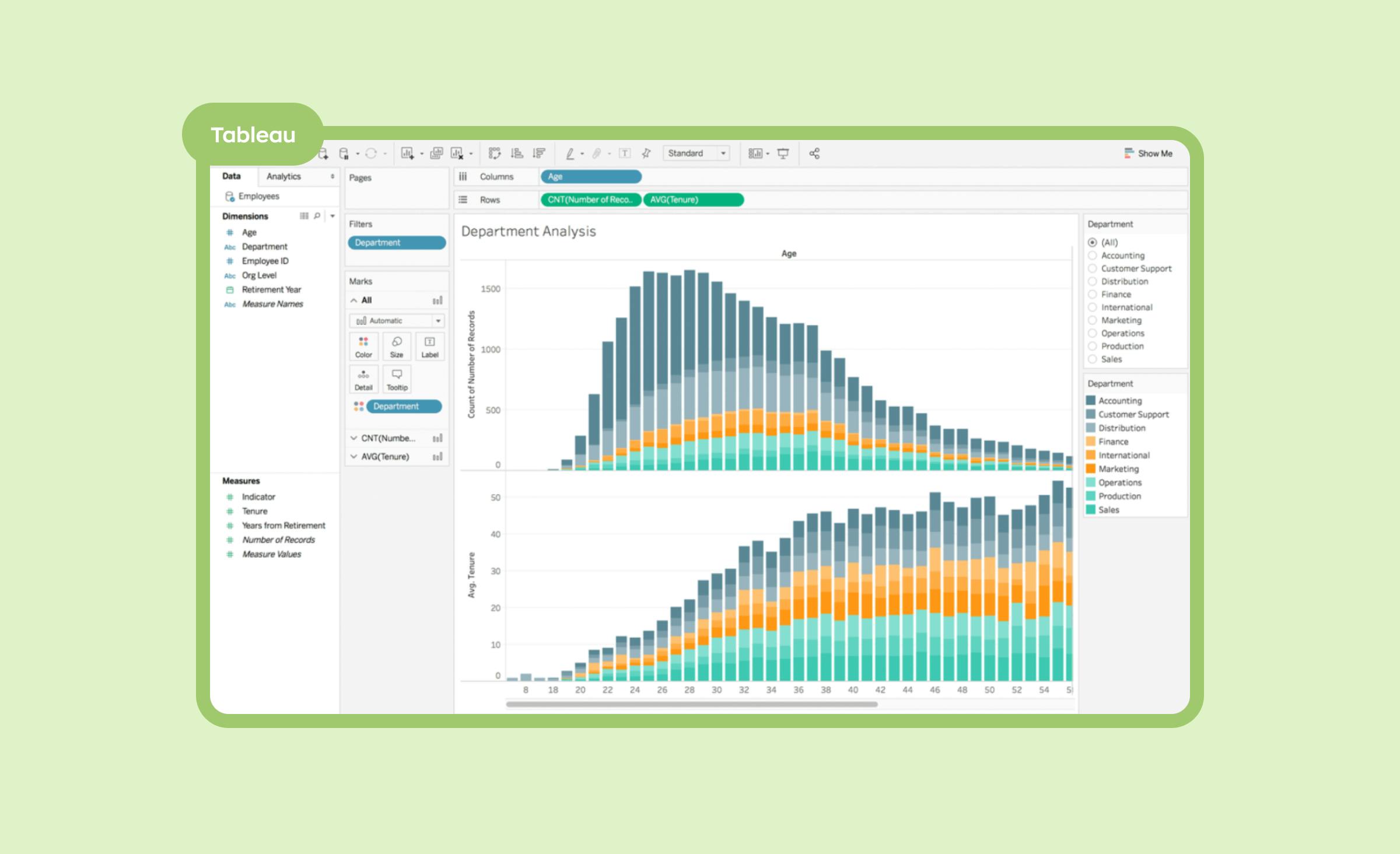
Tableau is a popular data visualization tool used by individuals and organizations to analyze and interpret data. It offers users a wide range of comprehensive features such as data preparation, chart creation, interactive dashboards, and more. Tableau can work with tabular data from a variety of sources, including databases, flat files, and cloud services.
Qlik
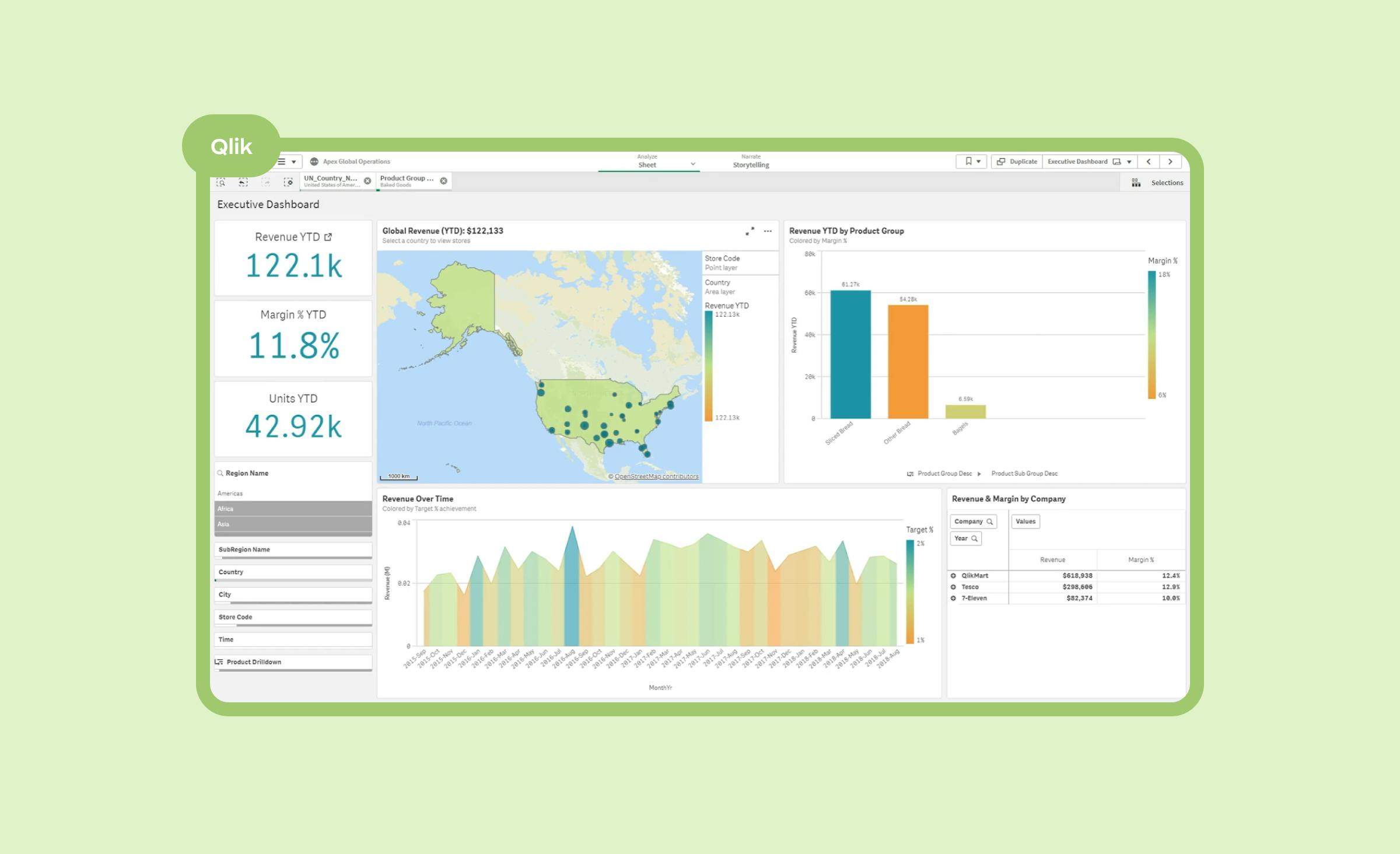
Qlik is a data analytics tool that helps users make sense of large data sets. It offers users powerful data visualization capabilities such as interactive dashboards, 3D scatter plots, maps, trends, and dynamic charts. Additionally, Qlik offers natural language processing capabilities that allow users to ask questions and get answers in real time.
Looker
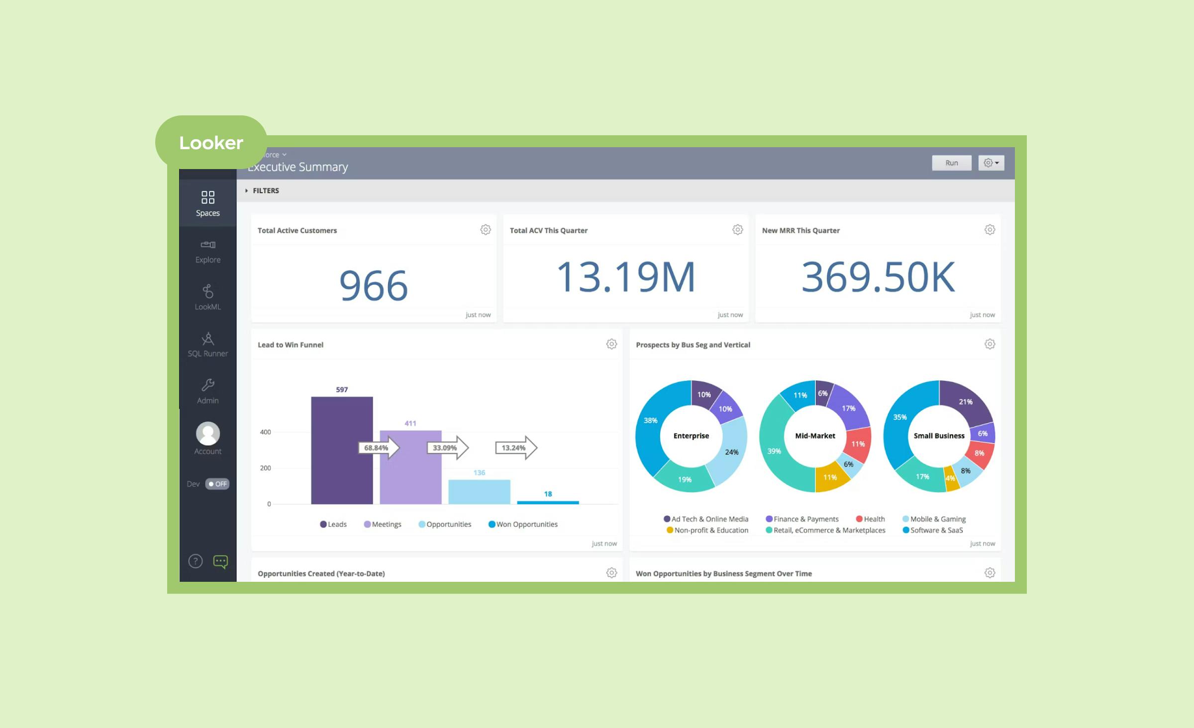
Looker is an analytics platform that enables users to explore and interpret their data. It uses an interface called LookML to define databases and build visualizations. Looker can integrate with a variety of data sources, such as Amazon Redshift, Google BigQuery, and MongoDB. Additionally, it allows users to create custom dashboards and reports as well as perform real-time analytics.
Conclusion
Data visualization services have become a fundamental tool for businesses seeking to use their data effectively and intelligently. These services have proven their worth across various industries, helping businesses understand their data and thus make informed decisions. From enhancing decision-making processes to identifying business trends and fostering a data-driven culture, the importance of investing in data visualization is undeniably significant. Whether you operate in retail, healthcare, publishing, or any other sector, data visualization services can be a game-changer in uncovering the hidden gems within your data.
At Ronas IT, we firmly believe in the power of data visualization. We’ve built a system of our own to evaluate the efficiency of our business processes, and we can create a system specific to your needs, presenting charts and information that you require, collected from any sources you prefer. Just click on “Get in Touch” below.