
Design system services give your product one shared set of design tokens, components, and usage rules that designers and developers both work from. At Ronas IT, UI kit work on a live product that keeps its current design is estimated by the screens and states it touches; a design concept with its UI kit, from $1,000, is the reference point. A redesign or a new web or mobile app design includes a UI kit that can grow into a system. The work is worth its cost when several teams or products build the same interface and the screens no longer match each other.
What design system services include
A full engagement covers everything from an audit of what you have to the rules for who owns and changes the system. A smaller scope is fine, as long as the quote says which parts it covers.
- Interface audit: the designers collect every screen and list each version of each element. For example, five button styles and three date pickers show what the system has to replace.
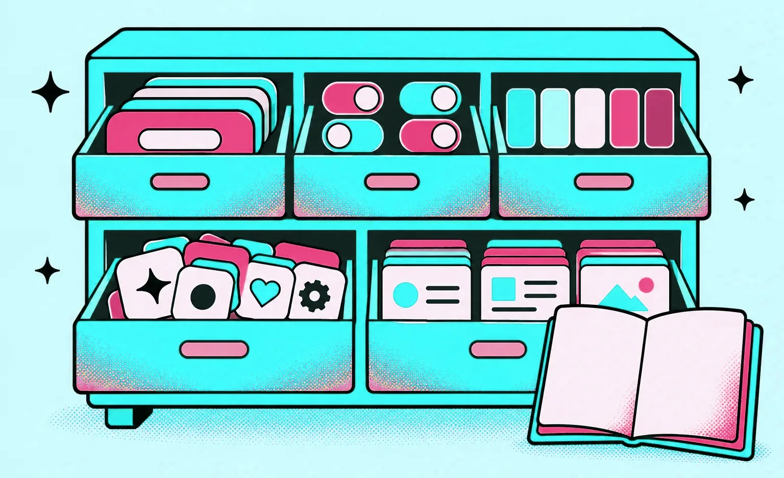
- Foundations: colors, typography, spacing, corner radius, and icons, each defined once and named by its role, such as “primary” or “background”.
- Design tokens: the same foundations stored as variables that both the design tool and the code can read, so a change in one place reaches both.
- Component library: buttons, fields, cards, tables, and navigation, each with its states, such as hover, disabled, error, and loading.
- Patterns: groups of components for common screens, such as a sign-in form, a list with filters, or an empty state.
- Documentation: when to use each component, when not to, and how it adapts to mobile and desktop.
- Governance: who owns the system, how teams request a new component, and how updates reach the design files and the product.
Documentation and governance decide how the system is used and kept up to date after launch. The Nielsen Norman Group names two parts of a design system, the design repository and the people who manage it, and notes that any design system needs instructions for use.
Design system vs. UI kit vs. component library vs. style guide
These four terms are often used as synonyms, but they describe different amounts of work, as the table shows. So check which of these a quote for a “design system” really delivers.
| Deliverable | What it contains | Who uses it | When it is enough |
|---|---|---|---|
| Style guide | Brand colors, fonts, and logo use | Designers and marketing | Brand work without a product interface |
| UI kit | The visual components of one product in a design file | Designers | One product with one design team |
| Component library | Reusable components with names, states, and usage notes, in design and often in code | Designers and developers | A growing product where developers rebuild the same elements |
| Design system | Tokens, components, patterns, documentation, and governance | Every team that builds the interface | Several teams or products that must look and work as one |
When you need a design system, and when a UI kit is enough
You need a design system when the cost of inconsistency is higher than the cost of the system. A new product with one team may not reach that point for a long time: while it is small, a UI kit covering its current screens does the job. The signs that it has outgrown the kit:
- More than one team builds the interface: each team makes its own version of the same table or form.
- More than one product: a web app, a mobile app, and an admin panel should feel like one company, but they were designed at different times.
- The design and the product differ: developers change spacing or colors without exact values, and the screens in production no longer match the design files.
- New screens repeat old work: designers redraw buttons and fields instead of taking them from a library.
- A rebrand or dark mode is planned: without tokens, a new color scheme means changing every screen by hand.
The Nielsen Norman Group notes that for a prototype that is likely to change, a full design system is unlikely to return its cost in the near term. It names three ways to get one: adopt an existing system, adapt one to your needs, or create your own. The more custom the system, the more time and money it takes, so a custom system is worth it when your needs cannot be met by an open-source one.
“The size of a UI kit does not tell you when to move to a system. I look at who makes the choices. While the designers who built the kit decide which component goes on each screen, the kit is enough, because they know the rules. When designers and developers who did not build the kit start making those choices, the rules have to be written down, and someone has to own them. That is the point where a UI kit needs to become a design system.”
Alexander Kontsevoy, Art Director at Ronas IT
How we build a UI kit for your product
Every Figma file our designers create starts from our own base design system: a component library, a type kit, a palette, icon sets, a scale of spacing variables from 2 to 240 pixels, and templates. For a new project, the designer copies the base file and changes the colors, type, and look of the components to fit the product. As a result, you get a UI kit with variables, text styles, and components from the first screens, instead of a set of drawings to organize later.
We plan the design system in sprints that usually take one to three weeks. At the end of each one, you get something you can open and review, such as mockups.
- The scope is agreed first: which products, platforms, and screens the UI kit must cover, and whether coded components are part of the work.
- The designer audits the current design: for a product that is already live, the design work starts here.
- The designer sets up the foundations as variables: colors, type, and spacing get names by role. The type kit has desktop and mobile modes, and the colors can have light and dark modes, so a theme changes without redrawing the screens.
- The designer builds the components: elements that repeat across screens and work on their own, such as fields, become components, with all of their states as variants. A screen never overrides a component: a new look becomes a new variant in the kit. When a screen needs a control the kit does not have, the new component goes into the kit, as it did on Lainappi, a rental marketplace app.
- Another designer reviews each stage: before the review, the designer who made the screens checks them against our quality checklist, for example that every element comes from the UI kit and every color from the project palette. The reviewer leaves comments in the design file, and you receive the stage after every comment is resolved with a change to the design.
- The developers receive the UI kit: its page in the design file holds a table of the project's variables, and the developers repeat those variables in the code, so they build each component from the same values. The repository also gets a DESIGN.md file, described in the next section.
That handoff is the default. Our design guidelines also describe an alternative path, where the screens are built as a working front-end prototype with AI assistants and the prototype goes to the developers as the source of truth. If you want front-end code instead of a Figma file as the deliverable, that is a separate option, Design as code, listed in the price table below.
Our designers build the kit with an AI agent attached to their Figma file, one that can open every frame and edit it. The agent works on the design itself, not only on chores: with it, the designer builds components and their variants, sets up the type styles, binds values to their variables, and thinks through the user flows the kit has to serve. The designer directs that work and makes the calls a kit is made of: which states a component needs, how it behaves on a small screen, and when two similar elements should become one. Another designer still reviews the result. Along with the DESIGN.md file, a clickable prototype of the flows can be exported as a web page, so people who do not use Figma can try the screens in a browser.
Design tokens: how the design reaches the code
Design tokens connect the design files to the product. A token stores one design decision, such as the primary color or the base spacing, under a name that both designers and developers use. Change the value once, and it changes in every screen and every component that uses it.
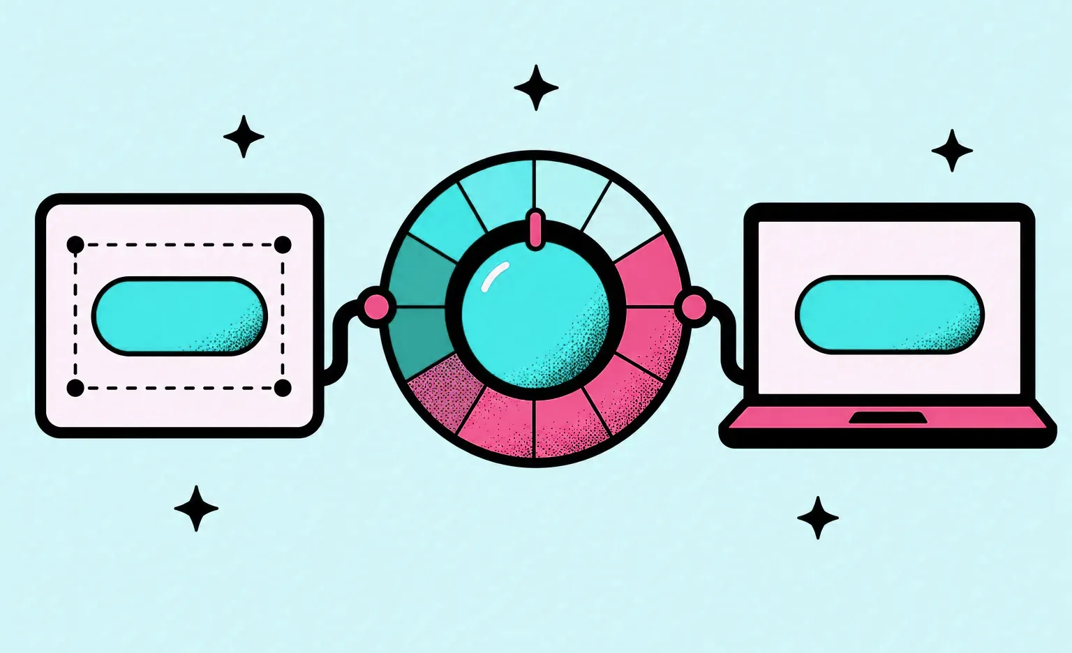
Tokens now have a common file format. In October 2025, the Design Tokens Community Group of the W3C published a stable version of its Design Tokens Format Module, which describes tokens as a way to express design decisions so they can be shared across tools and technologies. In Figma, tokens live as variables, and variable modes store several values for one variable, such as a light and a dark theme. How many modes you can create per collection depends on the Figma plan.
On some of our web projects, tokens move from Figma to the code through our open-source Figma export tool. It exports palette and typography variables to JSON and SCSS, exports icons from a Figma sprite, and converts Figma frames and components to React JSX and SCSS. On those projects, developers start from the values in the design file instead of copying them by hand.
Tokens now have a second reader: the AI coding agents developers build screens with. Our developers work with such agents, so every handoff includes a DESIGN.md file in the product's repository. It lists the token values and explains in plain text when to use each one and how the components behave, so a developer working with an agent assembles a new screen from the system instead of guessing the style from screenshots. Our guide to UI/UX design cost describes the format in more detail.
“An export gives developers the right values at the start. What keeps them right later is a plain rule: nobody types a raw color or spacing value into a component. If a value is missing from the tokens, it goes into the tokens first, and only then into the component.”
Alexander Storozhevsky, Lead Developer at Ronas IT
When components are built in code, the system also needs a check that a change to one component does not break the screens that use it. Netlify described its setup in 2023: every pull request builds a preview of the app and of every Storybook story, and its designers reference those stories directly in Figma. Screenshot tests then compare each component with its last approved look. Most such services charge per screenshot, Netlify notes, and with more than 2,200 stories and over 50 CI runs a day the team would use up its Chromatic snapshot quota in less than a week. It takes one combined screenshot per component instead. If coded components are in your scope, agree who keeps this check running and who pays for it.
What design system services cost
The price depends on the scope, so the first question is what the system must cover. At Ronas IT, design work is priced by what the project delivers: a UI kit for the current design of a product, a new design with its kit, or components delivered in code. Every option except Design as code gives you a UI kit with its variables, which are the design tokens, and every option comes with the DESIGN.md file described above. A full design system adds usage documentation and governance rules on top of that kit, and we estimate them by their scope:
| Situation | Starting price | Timeline | What it covers |
|---|---|---|---|
| UI kit for a live product without a redesign | Estimated by screens and states; reference point: design concept and UI kit from $1,000 | Depends on the scope | Variables, text styles, and components with all their states |
| New web or mobile app | From $2,000 | At least 1 week | Flows and all screens with a UI kit; a larger product is estimated by its screens and their complexity, not by its platform |
| Redesign of a live product | From $2,500 | At least 1 week | A review of the current product, a new design of its key screens, and a UI kit for the rest |
| Key flows as code (Design as code) | From $1,200 | At least 1 week | Key flows of five or more screens delivered as front-end code with a DESIGN.md file of style rules, for teams and AI tools that build the remaining screens |
Each price includes project management. A component library built into a live codebase is development work with its own estimate. For a full breakdown of how design scope turns into a budget, see our guide to UI/UX design cost.
How to choose a design system agency
Choose the agency whose system your developers will use and your team can keep up to date after handover. Six questions on the first call help you check both.
- “What do we get in the design file, and what in code?” The answer shows what your developers still have to build. If the components exist only in the design file, building them in code is a separate job, so make sure the estimate includes it.
- “How do tokens reach our code?” Expect an answer about variables, how their values get into the code, and who updates them when a value changes.
- “Who owns the system after handover?” The answer should name a role on your side and a way to request new components.
- “How do you handle accessibility?” Contrast and focus states belong in the tokens and components. The WCAG 2.2 guidelines ask for normal-size text to reach a 4.5:1 contrast ratio or higher to meet Level AA.
- “Can we see a UI kit from a past project?” Look for named components with all their states, not only a page of buttons.
- “Can AI coding agents build from the system?” If your developers use agents, ask how the tokens and component rules reach them outside the design file.
A design system is one of the tools of DesignOps, the work that helps a design team deliver at scale. When you buy design system services, you buy the system and the routines around it, such as reviews and handoff, not a design operations team.
If you are still choosing an agency for the wider design work, our comparison of UI/UX design companies lists what to check beyond the design system.
What to do next
- Take screenshots of your main screens and count the versions of buttons, fields, and tables.
- List the products that share your interface and the teams that build it, and decide which of them the system covers.
- Decide whether you need components in design only, or in design and code.
- Name the person on your side who will own the system after handover.
- Ask each agency the six questions above.


Frequently Asked Questions (FAQs)
What is a design system?
A design system is a shared set of standards for building a product's interface: design tokens for colors, type, and spacing, a library of reusable components, patterns for common screens, and written rules for when to use each part. Designers and developers work from the same system, so a button looks and behaves the same on every screen.
What should be in a design system?
Foundations first: colors, typography, spacing, corner radius, and icons, stored as design tokens. Then the components your screens reuse, such as buttons, fields, and cards, with every state. Then patterns for common screens, usage guidelines, and a governance model that says who can change the system and how changes reach the product.
How do you create a design system?
Agree the scope first: what the system covers and whether it includes coded components. For a live product, the design work starts with an audit of the current design. Then set up colors, type, and spacing as variables named by role, build the elements that repeat as components with their states, have another designer review them, and give the developers the same values for the code. For a new project, our designers start from a copy of our own base design system. The result is a UI kit. It becomes a design system when you add patterns for common screens, written usage rules, and an owner who decides how it changes.
What is the difference between a design system and a UI kit?
A UI kit is a set of visual components in a design file. A design system adds what makes the kit usable at scale: tokens, patterns, written rules, and an owner who keeps it up to date. Its components are often built in code as well. A single product with one team can work from a UI kit for a long time.
How much do design system services cost?
The cost follows the scope: how many screens exist, how many products share the system, and whether the components are also built in code. At Ronas IT, a UI kit for a live product that keeps its design is estimated by the screens and states it covers, with a design concept and UI kit, from $1,000, as the reference point. If the product also needs a new design, the kit comes with the redesign, from $2,500. The full design of a new web or mobile product, without development, starts from $2,000 and includes a UI kit; a SaaS product is estimated by the number of screens and their complexity, not by the platform. Key flows delivered as front-end components instead of a design file start from $1,200. The design file options give you a UI kit with its design tokens, every option comes with a DESIGN.md file, and project management is part of every price. A full design system adds usage documentation and governance rules, which are estimated by their scope.
How long does it take to build a design system?
It depends on the size of the product and on how much the system covers. A UI kit for a new product grows with the screens: the design of a new web or mobile product takes at least 1 week. A redesign of a live product with its UI kit also takes at least 1 week. The timeline of a UI kit for a live product without a redesign follows the screens and states it covers. For any of them, the real timeline is set by the scope agreed at the start.
How do you maintain a design system?
Give it an owner, a way to request changes, and a release routine. New components are added when a screen needs one that the system does not have, and changes to tokens go out to the design files and the code together. Without an owner, teams can start to copy and change components locally, and the system splits again.
How is a Figma design system implemented in code?
Through design tokens and matching components. Colors, type, and spacing are stored as variables in Figma and repeated in the code under the same names, by hand or through an export to a format such as JSON or SCSS. Developers then build each component once, using those values, so a change to a token reaches every component that uses it.
Is a design system part of DesignOps?
Yes. DesignOps is the work that helps a design team deliver at scale: tools, processes, hiring, and how design works with product and engineering. A design system is one of its tools: it removes repeated work and gives designers and developers one source for the interface.