Reading app
Mobile and web development for a reading service
*As the client's idea is unique, we worked on this project under an NDA. This way we ensure that the specific details and innovations remain confidential during the design and development phases. Hence, we can’t disclose the name of the client and the project, as well as other private details.
*As the client's idea is unique, we worked on this project under an NDA. This way we ensure that the specific details and innovations remain confidential during the design and development phases. Hence, we can’t disclose the name of the client and the project, as well as other private details.
Project idea
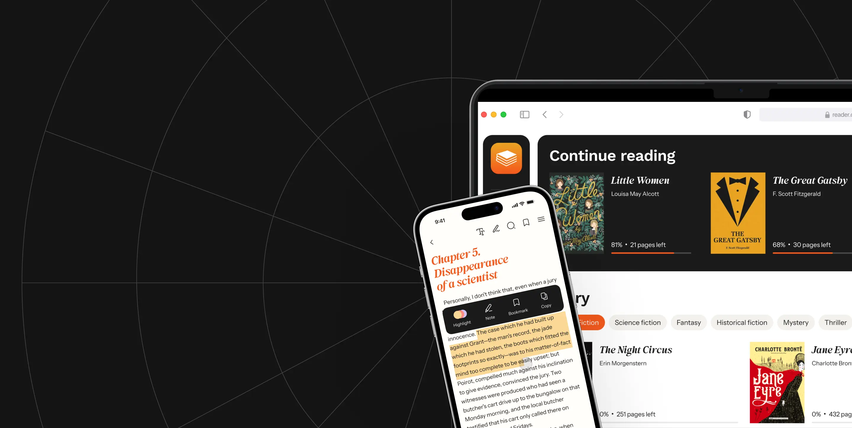
A startupper has recently challenged our team to create an MVP of a service for reading books. With this app, our client wants to give users a reading experience that feels close to reading a paper book but enhanced with several features that make reading extra convenient.
The reading app needed to have the following functionality:

Goal
Our client's goal was closely tied to our team's task.
Client’s goal
Our task
The startupper wanted to get an MVP of the reading service to test the idea with real users rapidly. After the idea is validated, our client is going to move on to choosing a monetization strategy for the service.
We were challenged with creating three apps from scratch. a mobile app for readers, a web app fully replicating the mobile app, and a web admin panel for the service owner.
As a part of this project, we built the entire UI/UX design and architecture of these apps, implemented the functionality with up-to-date technologies and tools, and helped the client with the release.
How we worked

As far as our client needed to roll out the service within a minimum timeline, we have decided to parallel the stages of design and development. During project work, our design team thought through the UX of the interface and its visual style.
Designers worked in close connection with the engineering team to find out what design solutions would be both convenient for users and quick to implement at the coding stage.
Simultaneously, the development team was thinking through tech aspects and chose tools and solutions that could be used to implement the app functionality.
Such an approach helped us to shorten the timeline of this project, make the design most suitable for development, and avoid bugs and errors.
UI/UX design
At this stage, we aimed to create an intuitive design that most users would easily understand. We focused on making the visual style transparent to ensure that the content of the books remained the key focus of the app.
Design solutions that we implemented


Hid the tab and navigation bars
To ensure users can comfortably read a book on a phone screen, we needed to maximize the available space and minimize distractions. Therefore, solutions that keep the navigation bar and tab bar constantly visible were not suitable for a reading app.
To address this issue, we designed an interface where the navigation bar and tab bar hide when a user scrolls the text and reveal when a user taps the screen. This approach ensures that nothing spoils the reading experience and preserves full interface functionality.

Created 3 different color themes
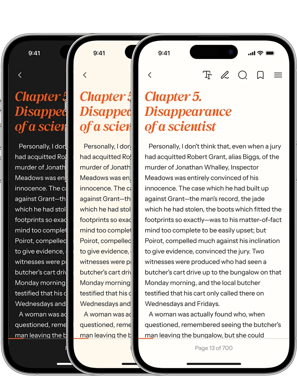
Some people read a book on their way to work, others at home in the evening, and some read it on vacation at a sunny beach. All scenarios are different and require different solutions. That’s why we have designed three different color themes: dark, light, and sepia.
We also added the ability to select the font, its size, and line spacing, so everyone can choose what is most comfortable for them.

Choose color palette and typeface
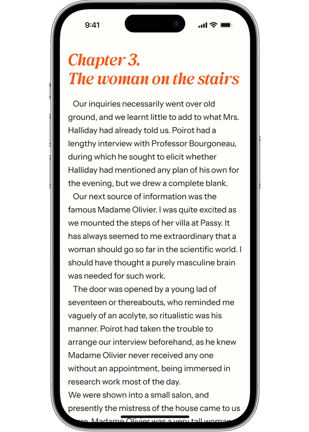
For this app, we selected a clean sans-serif typeface with minimal detailing for the main text, paired with a more expressive typeface for titles, glossary terms, and statistics. This choice helps minimize visual noise, prevents eye strain, and ensures the design remains recognizable.
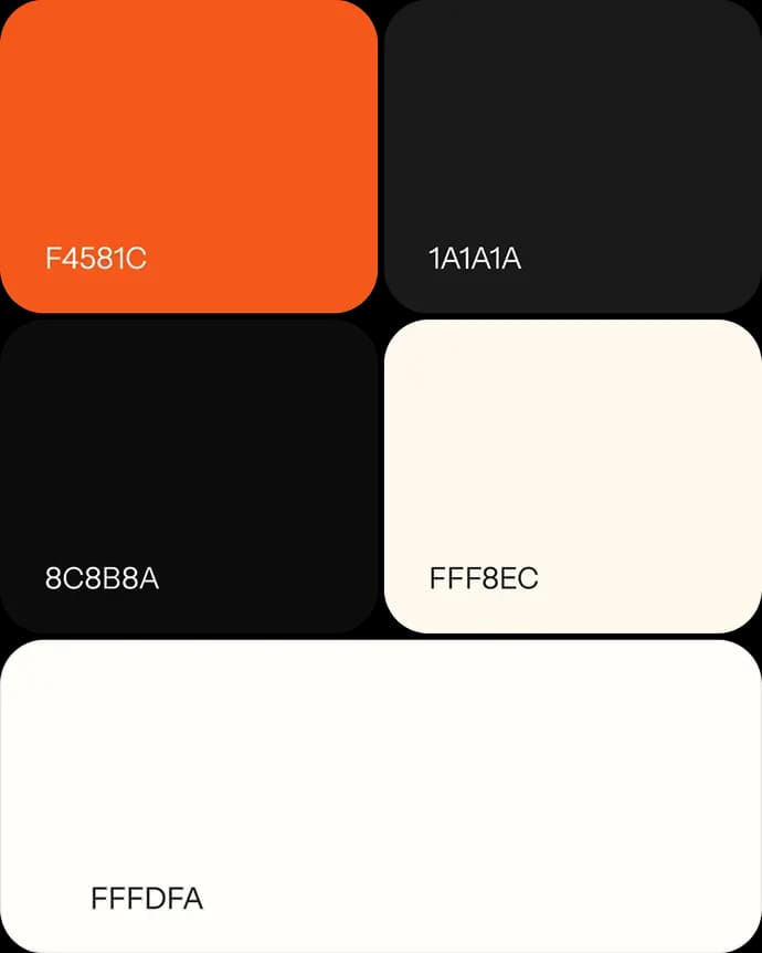
As for the colors, we opted for a light background that resembles pages of antique books and a contrasting orange shade for chapter names and quotes within the text. Our key target was to create a clear contrast between the background and the text to make it easy to read.



App icon
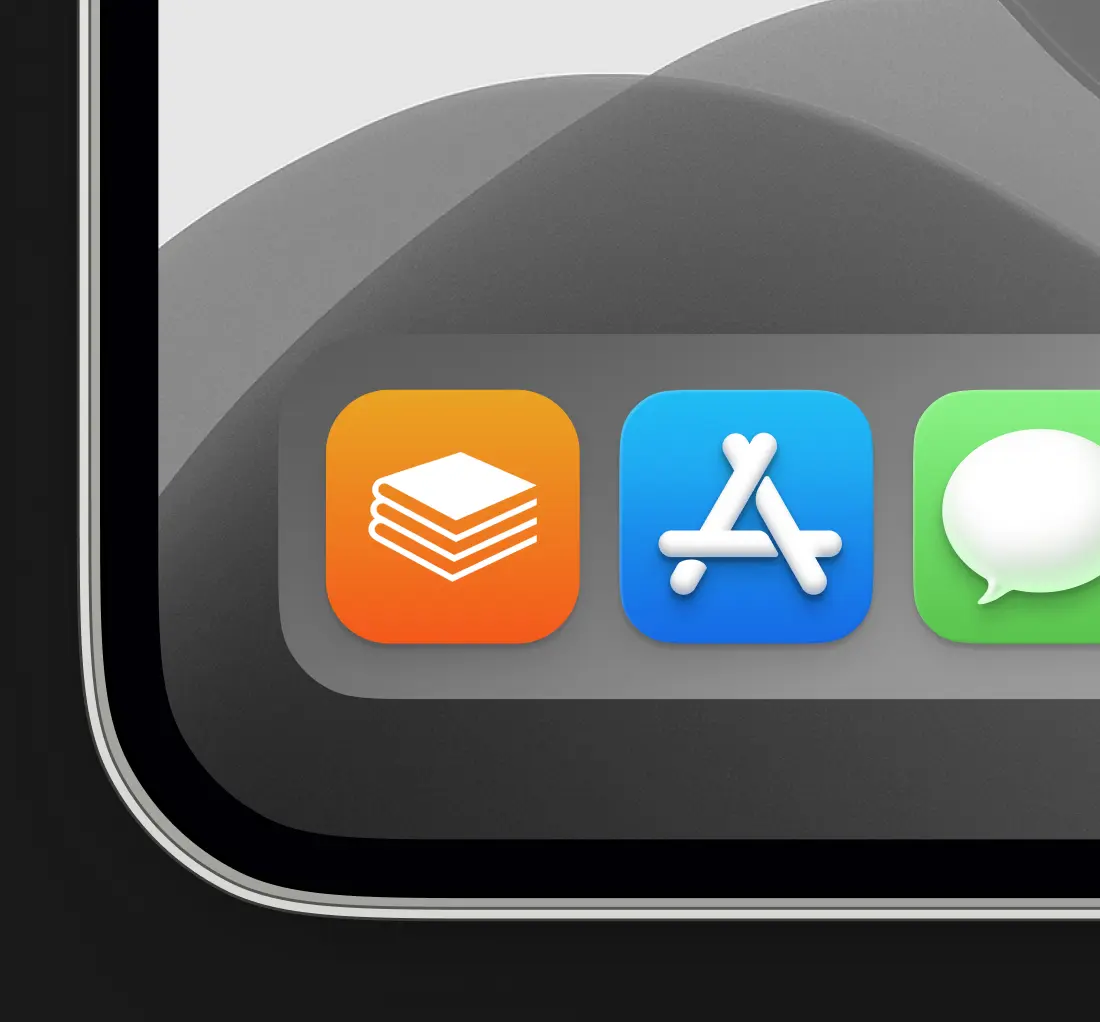
We not only helped our client with an interface, but we also designed some branding elements. One of them is a logo that also serves as an app icon. We used only large and clear shapes without little details to avoid visual noise and make the icons look good on both mobile and PC screens. This app icon will present the app in the Google Play and App Store.
UI-kit
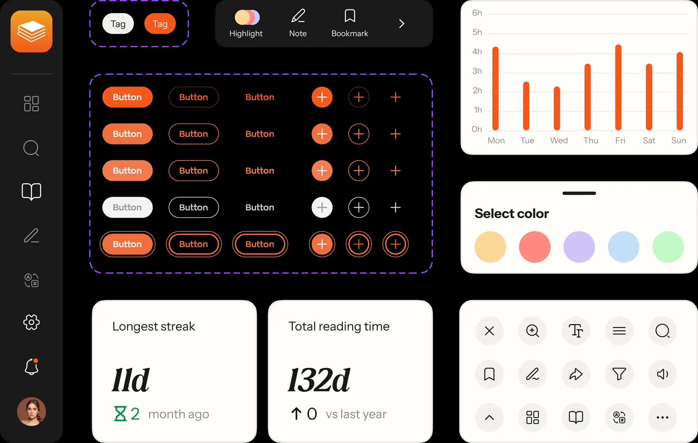
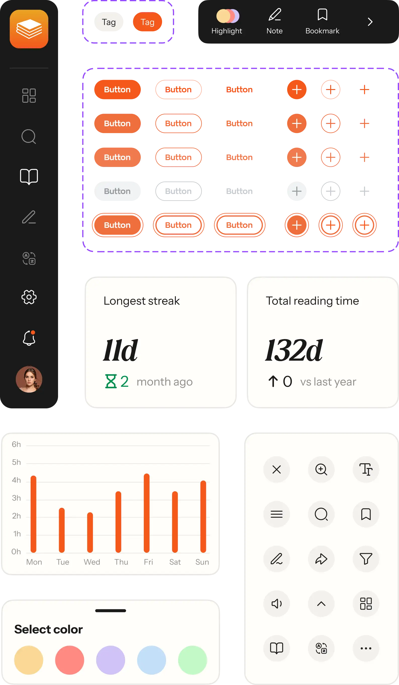
While designing the interface, we compiled a UI-kit — a collection of essential design elements including buttons, icons, sliders, widgets, and other interface components. With this kit, we can design interfaces more quickly and maintain consistency.
Using the UI-kit enables the entrepreneur to later expand the interface with new screens and features as needed. Our team also uses this kit to accelerate the design process, ensuring that we don't spend excessive time recreating each UI element.
Development
Together with the client, we have decided to develop both mobile and web apps with React Native on the frontend and PHP Laravel on the backend.
Although React Native is usually used for mobile app development, this time we have decided to use it for web development as well.
We made this decision because our customer’s time and budget are limited, and React Native allows launching apps for iOS and Android from a shared codebase and then reusing it to build web apps as well.
We recommended Laravel for the backend since we have extensive experience with it and have many pre-build code pieces that allow us to scale the backend part quickly.
Third-party integrations
Google Auth and Apple Auth for authentication
The client required us to sync the reading across all user’s devices so all the notes, bookmarks, and highlights could be accessed both by smartphone and web interface. Also, the interface has a personalized feature — a dashboard for tracking the user’s reading progress. That’s why we needed to allow users to create and delete their accounts.
We enabled iOS users to authenticate using Apple Auth. With its help, users can verify themselves with Face ID or Touch ID. Thus, they don’t have to remember their password and username. Another authentication method was enabled with Google Auth which allows signing in with Google account credentials.

Mailgun to delete an account
Whenever users create accounts in apps, they need to be able to delete their accounts and remove their data from a service when they no longer want it to be stored or used. This aligns with the privacy rights of different countries as well as with the General Data Protection Regulation (GDPR).
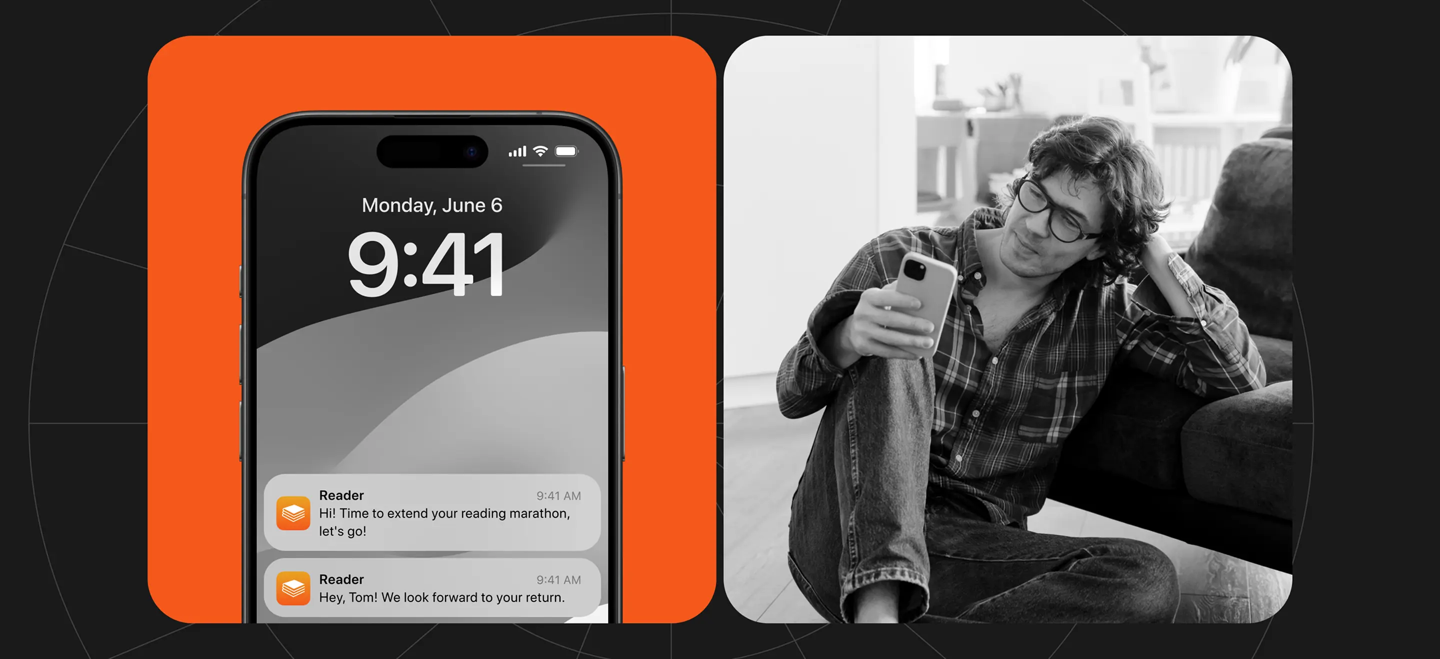
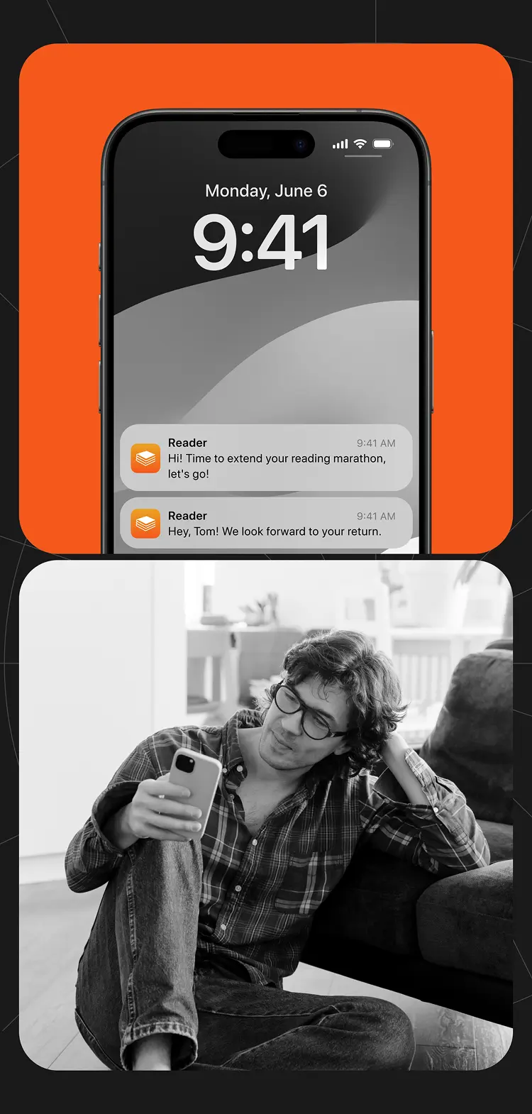
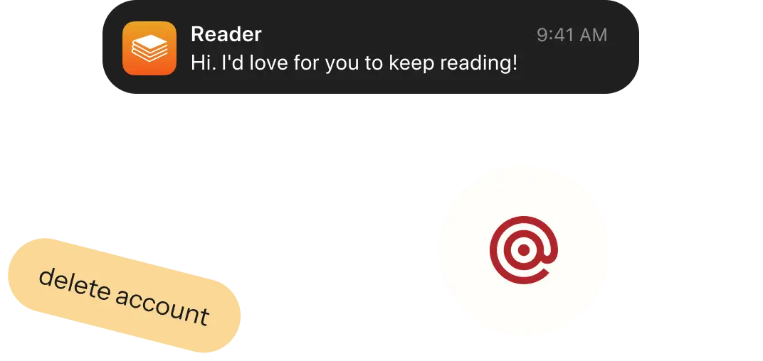
To implement a feature for deleting accounts, we integrated the reading app with Mailgun. The app owner plans to send users emails with which they can prove their account deletion. When the user base grows, Mailgun can also be used to send users reminders to continue reading to raise user engagement.
Creating book import
Our client already possessed a library of books that they planned to offer for reading and use for commercial purposes. That’s why no author’s rights were violated.
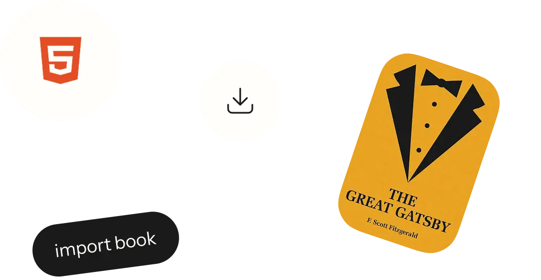
The client offered all the books in HTML format, and we imported all of them into a database with a defined structure. This database allows storing the books conveniently, quickly accessing them for reading, and accommodating new books when they are added to the service.
Implementing smooth scroll
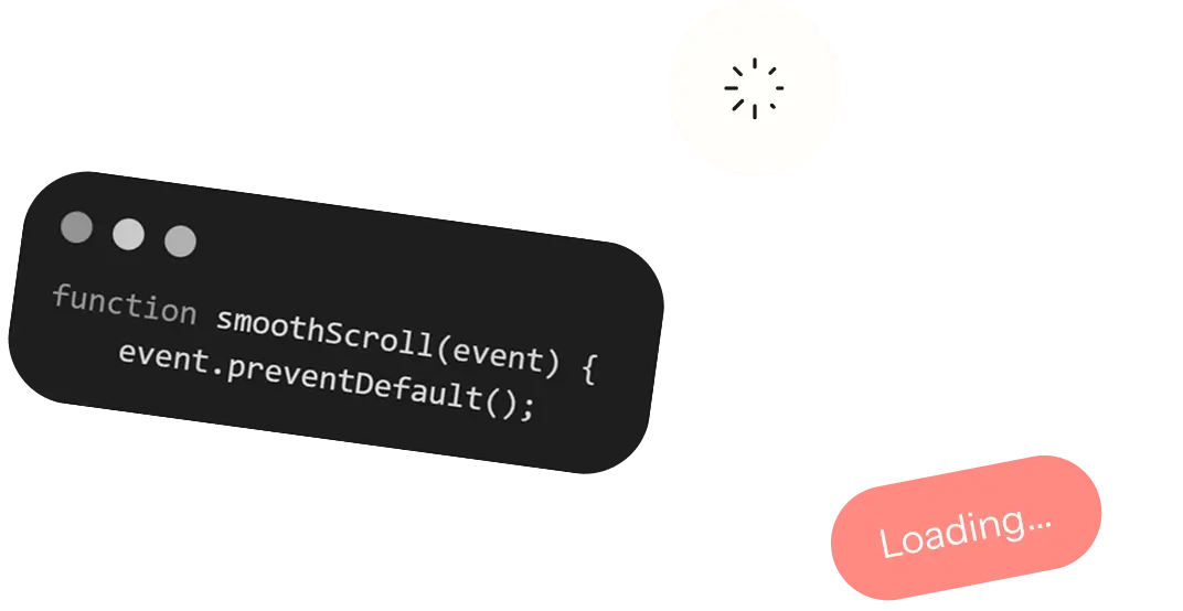
To provide users with a seamless user experience, we needed to implement smooth scrolling. To achieve this, we have developed a mechanism that loads the entire text of the book into the cache. Then the text in the visible area is rendered along with several screens up and down the visible area. This ensures that the book content is loaded gradually and users don’t need to wait each time they scroll through the text.
Solving the problem with text highlight feature on iOS
React Native has no built-in way to add custom actions to the text selection menu, so for Android we used a ready-made library that renders selectable text with its own menu. On iOS, the same library accepts plain text only, while the book text contains formatting: accented titles, quotes, glossary terms, and icons of notes and references. This formatting would be lost as soon as a reader selected a passage.
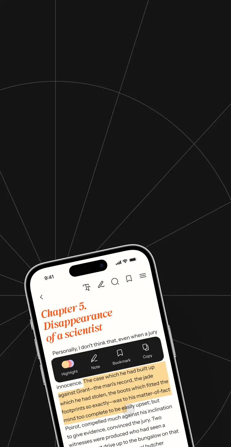
To keep the formatting and the highlighting on iOS, we built our own text selection. A paragraph becomes selectable after a long press, we hide the standard iOS menu, and the app shows its own menu with three actions: highlight, note, and bookmark. We also store the position of the selected fragment in the text, so a highlight stays on the same words when the reader opens the book again.
Reading service features
The client aimed to distinguish this reading service from competitors by incorporating features such as text highlighting and personalized reading statistics.
These enhancements would make the app particularly suitable for educational and learning purposes. From our side, we focused on making this functionality convenient and easily accessible to users within just a few taps.


Reading space
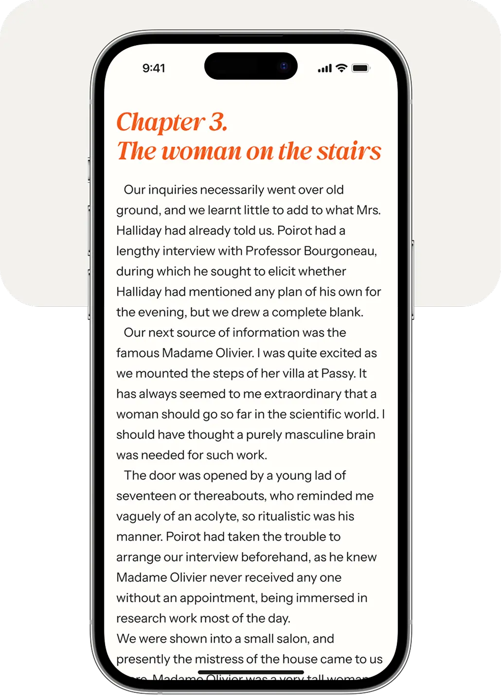
The books provided by our client display titles, subtitles, quotes in different languages, terms, dialogs, and other entities that need to be distinguished from the rest of the text. To make all of them visible we have accented each entity differently, built a clear visual hierarchy, and made the text of all the books look consistent.
Turning pages
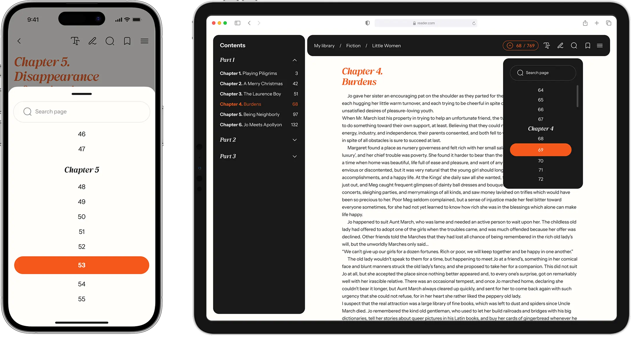
Initially, our client suggested creating an interface where users can only scroll the text down and view the current page number. We suggested an alternative solution — adding a dropdown menu with a number of pages and a search bar to type the number of the needed page.
Thus, the users can always switch to the needed book page without scrolling the text. We created similar dropdown menus for mobile and web app versions since this would make their development easier and more quickly.
Enlarging images
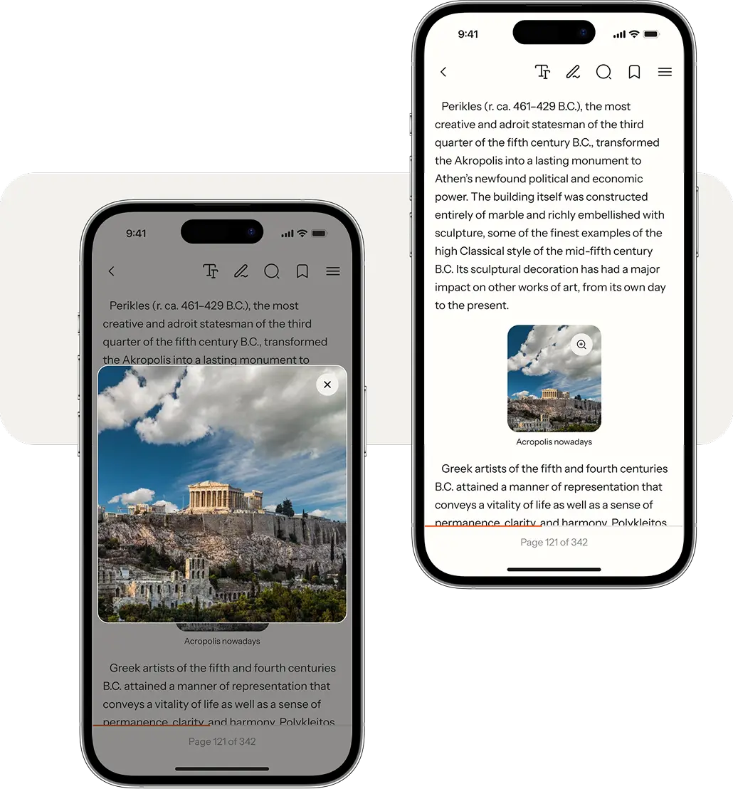
The book contains not only text but also illustrations that aid in the understanding of the text. Users can enlarge the images by tapping the magnifier button on the reading screen.
Bookmarks
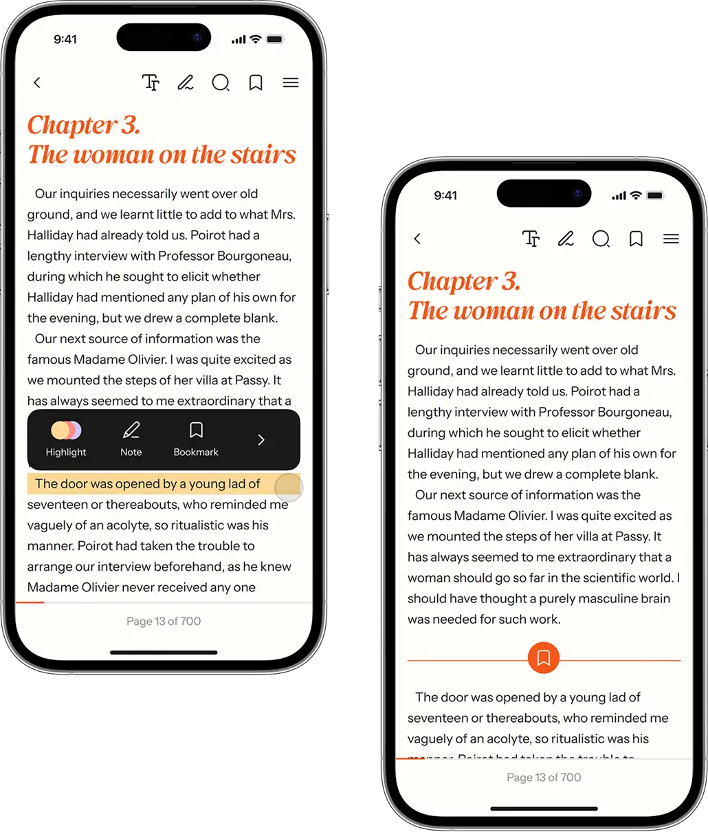
The app showcases a wide variety of books, allowing users to jump from one to another. To ensure users can easily keep their place without losing track, we've incorporated bookmarking directly on the reading screen. This feature enables users to quickly create or remove bookmarks without the need to navigate away to the menu.

Notes
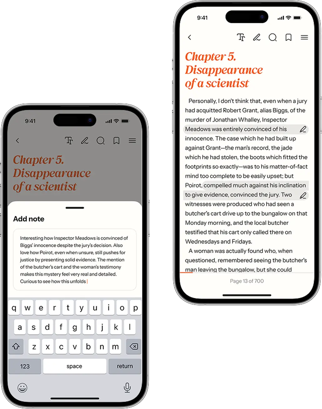
Users have the ability to do more than just create bookmarks. They can also leave notes to sections of text that provoke thought or interest. When a user chooses a part of the text and types the note, the chosen segment becomes highlighted, clearly indicating where the note is located and what thoughts were captured. All the notes can be edited or deleted right at the reading screen.
Highlights
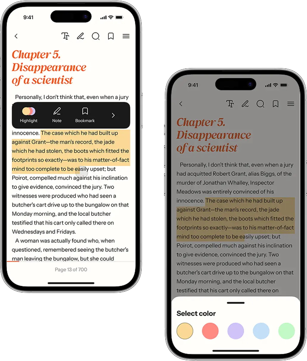
Additionally, users can highlight text in various colors directly from the reading screen. To do this, they simply select the desired text and choose a highlight color. We've designed the color selection menu to be large and touch-friendly to make it convenient to use.
Menu for text snippets
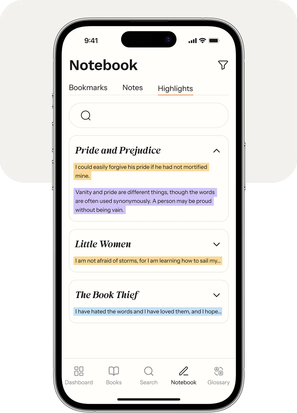
To ensure that no important information slips away from readers, all bookmarks, highlights, and notes are saved in a separate tab. This tab collects highlighted snippets of text from various books. Later, the user can return to them and reconsider the content once some time has passed after reading.
Sharing text snippets
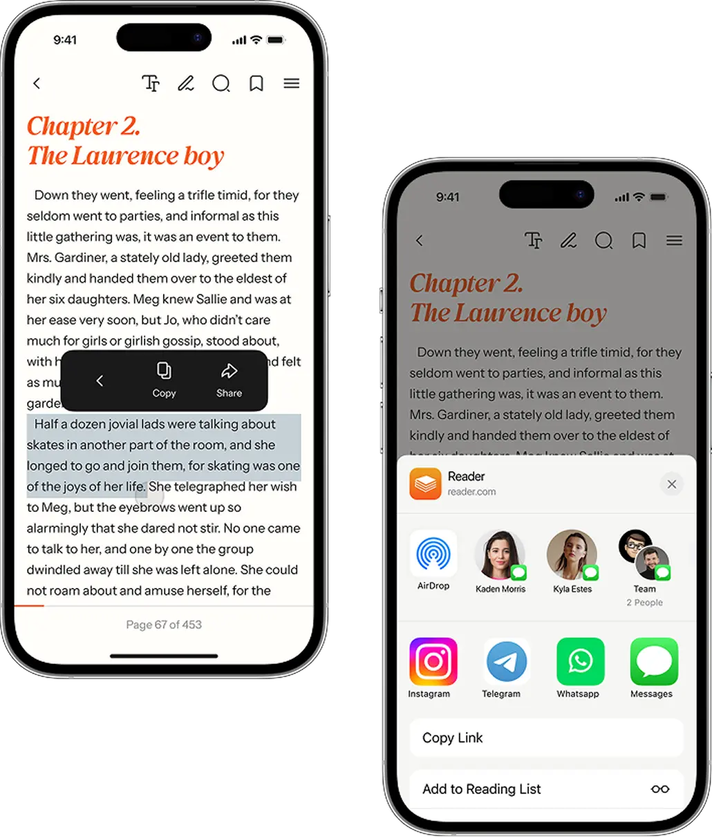
Giving users the ability to share text from books with other users is one way to increase user engagement and attract new users to the application.
Therefore, we have added a feature where a user can share a link to the text piece in a messenger or social network.
Dashboard to track reading progress
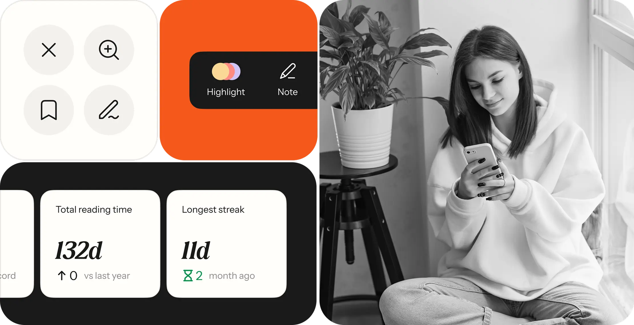
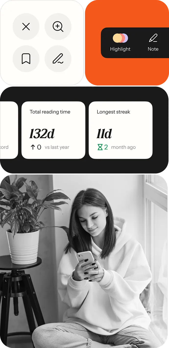
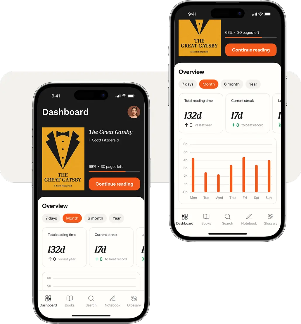
Another way to increase engagement is to add personalization to the app. We implemented a dashboard for tracking statistics. With its help, users can find out how many days and how much time they have spent reading. Reading time statistics are broken down by day, allowing users to see on which day they spent the most time reading. Users might wish to improve their statistics and start returning to the app more often.
Glossary
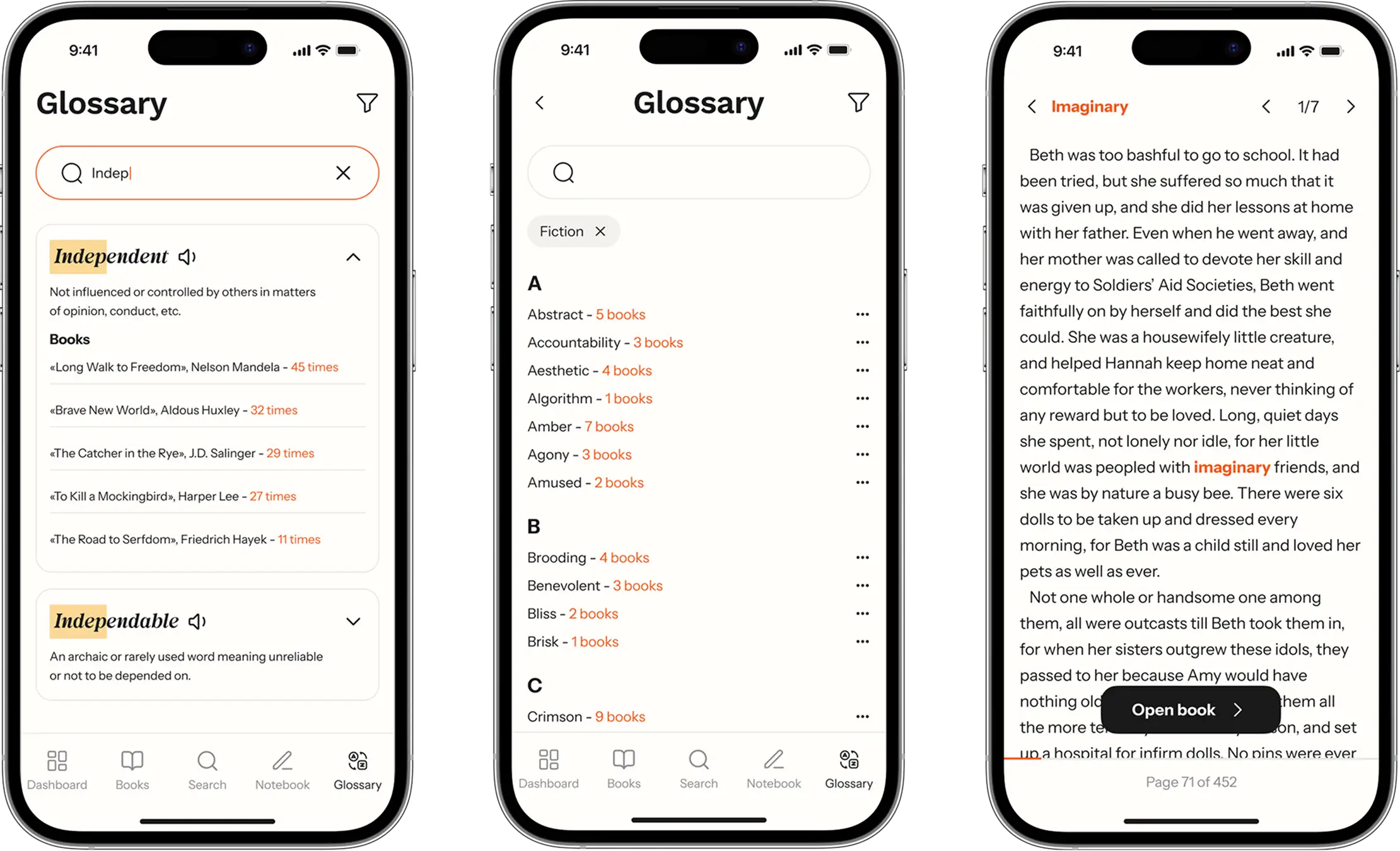
Readers sometimes encounter unfamiliar words even in texts written in their native language. for such instances, we've added a glossary to the app. You can access it, look up the definition of the needed word, find out in which books it appears, and ask the app to highlight this word in the text.
The glossary organizes all saved words in alphabetical order, which makes it easy to navigate. You can also sort words by genre, frequency of mention, or date added.
This way, users can better remember the contexts in which such a word can be used.
Book menu
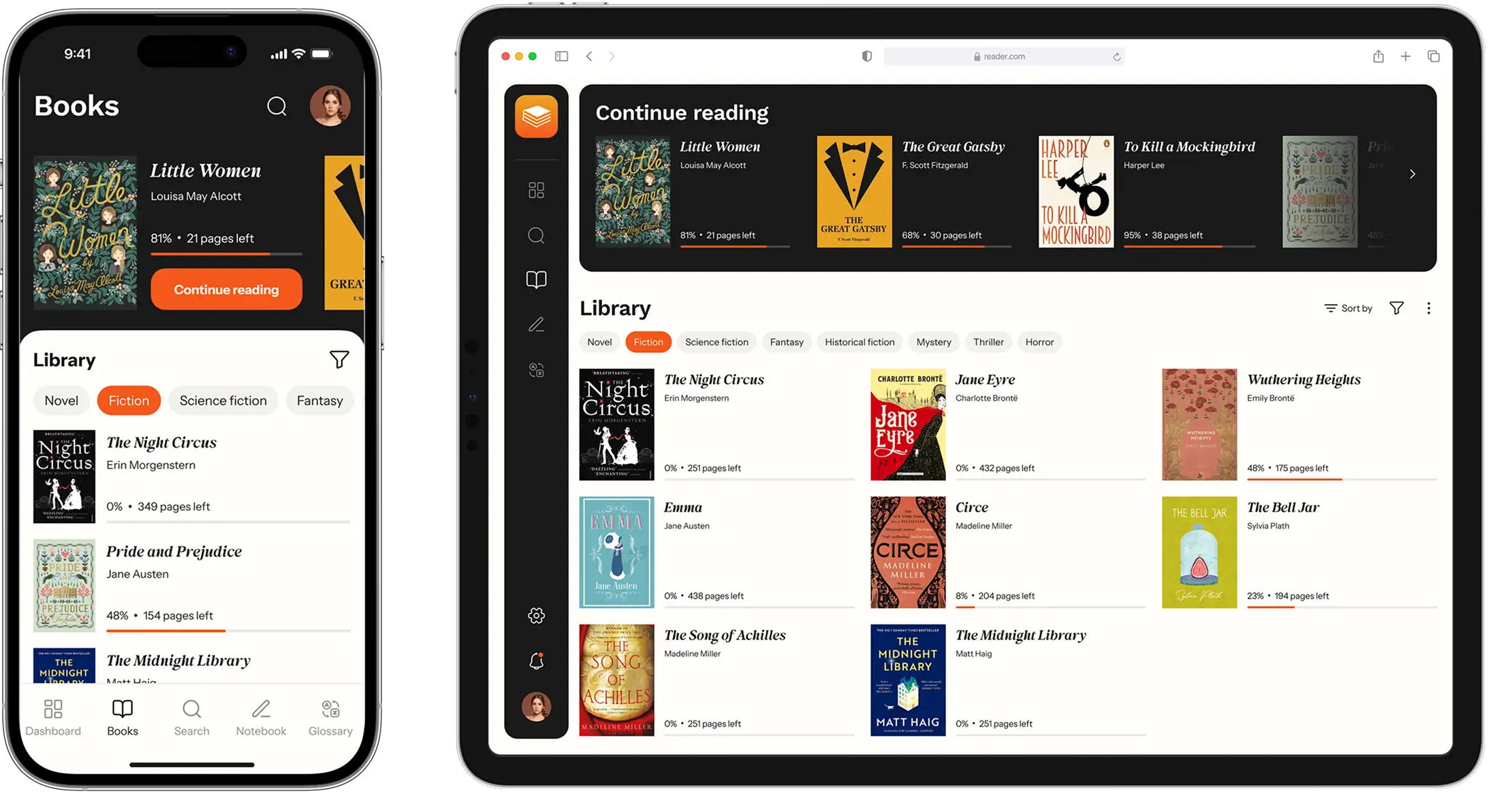
We designed a menu with a list of books. Each book is presented in the form of a card, featuring the book cover, title, and a progress bar to show how much of the book has been read.
To keep the cards looking clean, we used minimum details, removed shadows and outlines, and eliminated unnecessary UI elements. We also considered that users might access the book menu from a variety of devices, and therefore, we adapted the menu layout for multiple screen sizes.
Admin panel
The app owner required an admin panel to manage key entities of the reading service: books and glossaries, users, and payments.
We created an admin panel using Laravel Nova and enhanced it with features for editing texts of the books and glossaries and managing user accounts.
We’ve also added payment management features as in the future the startupper is going to find suitable monetization methods and will need mechanisms to manage payments from users.

Project team
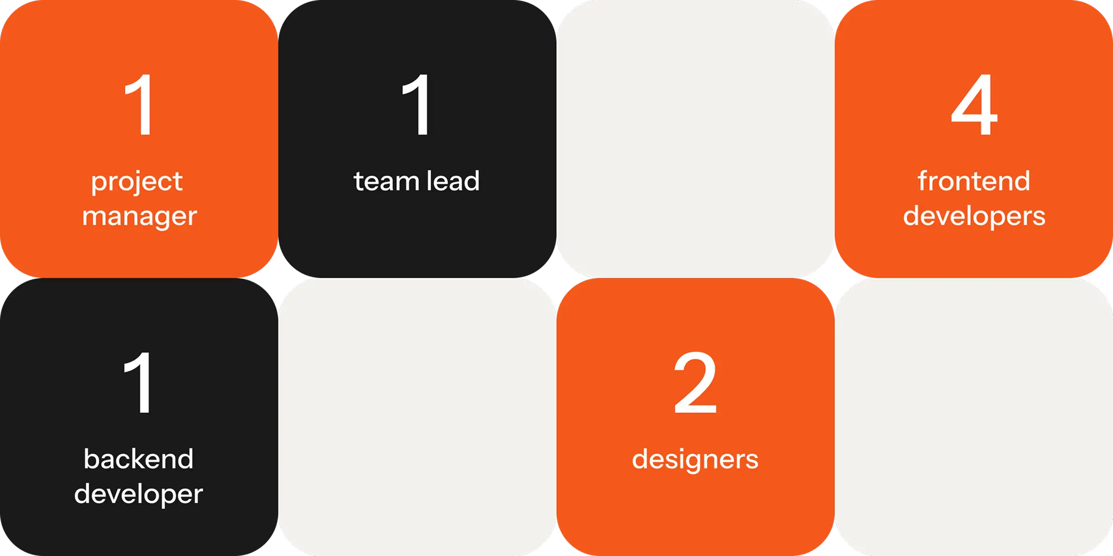
Our teams typically consist of 4 members but this time it consisted of 8 members. We decided to enlarge the team to speed up the design and development of apps and roll them out within the timeframe set by our client.
Each project team in our company is accompanied by a team lead, a senior tech specialist who guides the entire cycle of development and testing and ensures that all apps are high-performing and function as intended.
Results
Our team has managed to release all three apps of the reading service within the specified timeframe. During this time, we have accomplished design, development, testing, and verified the apps in Google Play and App Store.
Our client started testing the business hypothesis with real users. During this time, they found more books to add to the reading service and came up with multiple monetization strategies to try. The client is satisfied with our work and continues to collaborate with us as the apps have transitioned into the post-release maintenance stage.