How to redesign a mobile app: a 2026 checklist from our UI/UX designers

Start a mobile app redesign with a diagnosis, not with a new set of screens. Before anything gets restyled, you need to know which flows users abandon, whether the app feels slow because of the interface or because of the code, and whether the codebase can carry the change at all. Skip that step and you get the pattern every product owner has seen: a confident relaunch, a wave of one-star reviews, and a rollback.
In practice that means four steps: read four weeks of analytics to find the flow users abandon, get a code audit to learn whether the fix is an interface or a rebuild, pick one approach, and ship one flow per release with a way back. A product redesign at Ronas IT starts at $6,000; if the audit says rebuild, you are into development pricing. We have provided UI/UX design services for 19 years with designers and developers working on the same products, so most of what follows comes from redesigns we shipped rather than from theory.
What is a mobile app redesign?
A mobile app redesign is a planned change to an app's interface, flows, and often its code, aimed at fixing measured problems rather than refreshing the look. Designers rework layouts, navigation, and visual style. Developers fix what makes the app slow or unstable. The scope can be a single flow or the whole product, and picking that scope is the first real decision of the project.
The three things people call a redesign cost very different amounts:
- Visual refresh. New colors, typography, icons, and components. Flows stay where they are, so users do not have to relearn anything. Our guide to app UI design covers what to change at that level.
- UX redesign. Navigation, screen order, and flows change. Users do have to relearn part of the app, which is why this needs testing before release.
- Rebuild. The interface changes and the codebase is replaced. This is the option you pick when an audit says the current code cannot carry new features safely.
In the redesigns we have seen go badly, the common pattern is a visual refresh that quietly turns into a rebuild halfway through, after someone discovers that moving the menu means rewriting how screens talk to the backend.
How do you know your app needs a redesign?
Your app needs a redesign when its numbers have gone wrong, not when its style feels dated. Age on its own is not a reason. Pull four weeks of analytics and read the last hundred store reviews first, then match what you find against the signals below.
| Signal | Where to look | What it usually points to |
|---|---|---|
| Drop-off inside a flow that used to convert | Funnel and event analytics | Navigation or form design, rarely visuals |
| Crash-free sessions below your own baseline | Crash reporting, Android vitals, and App Store Connect metrics | Code and architecture, not design |
| Rating sliding while install numbers hold | App Store and Google Play reviews | One broken flow, most often onboarding or payment |
| The same question in support every week | Support tickets and chat logs | Labels and information hierarchy |
| Screen readers and contrast checks fail | An accessibility audit against WCAG 2.1 AA | Interface, and a legal exposure if you serve the EU |
| The app looks nothing like the OS around it | Current Apple and Google design guidelines | Visual system and components |
| Your build tooling is behind the store minimum | Your CI configuration and release notes | Release risk that has to be cleared before design work |
| Your logo, palette, or voice changed but the app did not | Your current brand guidelines next to the live app | A brand-led visual refresh rather than a flow change |
| Sign-in and data handling would not pass a review today | A security review of storage, tokens, and transport | Code, plus the new screens whatever replaces it needs |
Users abandon flows that used to work
This is the strongest single signal, because the effect is measurable before and after. Find the step where the largest share of users leaves a flow they had already started, then watch a few session recordings of that step. Look for rage taps (four or more taps on the same spot in a second), taps on elements that do not respond, and users looping back to a screen they had already left. Those patterns, not a hunch about the layout, tell you which screen to fix first. In our projects the cause behind them is usually a form that asks for too much at once, a label that means something different to the user than to the team, or a screen that hides the action it exists for. Behavioral design explains why those small mismatches change what people do.
The app is slow or crashes
Crash reports that cluster in specific screens are an engineering finding, not a design one, so get a code audit before commissioning any new interface. Designers do help here, by simplifying heavy screens, cutting oversized assets, and reducing what has to load before a user can act. What design cannot fix is an architecture that fetches everything on every screen open.
Here is that last sentence with numbers on it. A list screen in Docky, a berth booking marketplace, lagged visibly, and the first suspect was the library that turns API responses into objects: one screen's response took 2,478 ms to convert. The library was not the problem. Every berth in that response carried a price relation returning an hourly and a daily rate in every currency the app supported, close to 500 objects per berth that no part of the screen displayed. Removing that relation from the response brought the same work down to 170 ms. We finished the library benchmark anyway, and it argued for leaving things alone: a hand-written alternative was roughly five times faster in isolation, and the difference only becomes visible past about 500 items. So we changed the query and kept the library. A redesign would have delivered a prettier screen that was just as slow.
The interface has drifted from platform conventions
Both platforms changed their visual language in 2025, and users compare your app against the system apps around it. Apple introduced Liquid Glass, a translucent material that reflects what sits behind it, across iOS 26 and its other systems. Google moved Android toward Material 3 Expressive, with bolder shapes, color, and motion.
Adopting either look is optional. Building with the current SDK is not: Apple requires apps uploaded to App Store Connect to be built with Xcode 26 or later and an SDK for iOS 26, in force since 28 April 2026, and Google Play requires new apps and updates to target Android 16 (API level 36) from 31 August 2026. If your project is still on older tooling, that upgrade comes before design work, because a release you cannot publish is a release nobody sees.
Accessibility gaps have become a legal problem
The European Accessibility Act has applied since 28 June 2025, and its scope covers e-commerce, consumer banking, and passenger transport services, which in practice means the apps that deliver them. The obligation follows the customer rather than the company address, so a business outside the EU is generally covered once it sells to EU consumers, though exact scope depends on your product and market and is worth checking with counsel.
In build terms the benchmark is EN 301 549, the European standard that adopts WCAG 2.1 level AA: screen reader labels on every control, contrast that passes at AA, text that scales with the system setting, and touch targets a person with limited motor control can hit. A redesign is the cheapest moment to fix all four, because the screens are being rebuilt anyway.
Your brand has moved on
When a company changes its logo, palette, or voice, an app still carrying the old identity reads as neglected. This is the one redesign driver where visuals genuinely are the point, and also the one where it is easiest to fund a visual system nobody asked for. Our own design projects show what a brand-led visual system looks like across a full screen set.
Security has aged out
Older apps often store data in ways that would fail a review today: local storage without encryption, sessions that never expire, a single password as the only barrier to an account. OWASP's Mobile Application Security Verification Standard groups the fuller list of those checks under Storage, Cryptography, and Authentication. None of this is a design problem, but a redesign is the moment to fix it: you are rebuilding the sign-in and payment screens anyway, so multi-factor authentication and proper encryption for stored data cost little extra.
Why do app redesigns fail?
Redesigns fail when they change more than the team can measure. If navigation, features, visual style, and copy all move in one release, nobody can say which change helped and which one pulled the review score down.
Too much changes at once
Sonos released a rewritten app on 7 May 2024 without features existing owners relied on, including alarms, sleep timers, and several accessibility options. On its fiscal Q3 2024 earnings call the company said it would spend $20 to $30 million repairing the app and supporting customers, and postponed two hardware launches until it was fixed.
The delivery was the problem, not the decision to redesign: the rewrite reached every customer at once, so no version was left to compare against. A published mobile build cannot be recalled from people who already updated, so the control has to sit before release: a feature flag you can switch off from the server, plus App Store phased release or a staged Google Play rollout to limit how many people see the new flow while you are still watching it.
The redesign answers the team's taste, not user research
Wanting a product to feel new is not the same as having evidence that users want a different interaction. Instagram replaced vertical scrolling with a tap-through feed for part of its audience in December 2018 and pulled it back within a day, because users who had scrolled the same way for years read the new behaviour as broken rather than fresh.
Testing happens after release instead of before
A navigation change is the one users notice immediately, so it has to be tried on a prototype before it is built. Snapchat mixed friends' stories into a single feed in early 2018, collected a 1.2 million signature petition against the change, and spent the following months separating the stories out again in a second redesign. That is two rounds of design work where one round of testing would have answered the question.
Which redesign approach fits your app?
The approach follows from the state of your product, not from preference. Five approaches, compared:
| Approach | What it changes | Best for | Main risk |
|---|---|---|---|
| User-centered | Flows and screens, guided by interviews and usability testing | Apps where users struggle but the business model works | Research adds weeks before design starts, and scope tends to grow |
| Incremental | One flow or one screen per release | Live apps with enough traffic to measure each change | Slow to shift the overall feel, and frequent updates can annoy users |
| End-to-end | The whole interface, and usually the codebase with it | Apps that are unstable, unlaunched, or beyond patching | Highest cost, and every user has to relearn the app at once |
| Data-driven | The specific screens with the worst numbers | Products that already have clean analytics in place | Blind to problems the analytics never recorded |
| Brand-driven | Visual system, typography, and palette rather than flows | Products after a rebrand, a merger, or a funding round | Spends the budget where the numbers were never the problem |
Almost every real project combines two of them: incremental plus data-driven on a working product, user-centered plus end-to-end on a broken or pre-launch one. A third case decides itself, when the code rather than the interface sets the scope. Those three pairings are the tracks we run. Brand-driven sits outside all three, because its trigger is a business event: run it when a new name or palette already landed on your website and your other products, and the app is the last surface showing the old identity.
How we redesign apps at Ronas IT
We run redesigns down one of three tracks, and the track is decided before any design work starts.
“The first question we ask is not what the app should look like. It is which screen is costing the client money. Once we know that, the visual part gets easy, because we are solving for one flow instead of arguing about taste across forty screens.”
Elizaveta Kozacha, Lead Designer at Ronas IT
When the product works: change one thing at a time
For a functioning app we make gradual changes to individual screens and flows, driven by how people actually use them inside the app rather than by opinion. Each change ships on its own, so its effect on usability and engagement is readable in the analytics instead of buried in a batch. A change that does not move the numbers gets reverted, not defended. Slower than a relaunch, and considerably harder to get wrong.
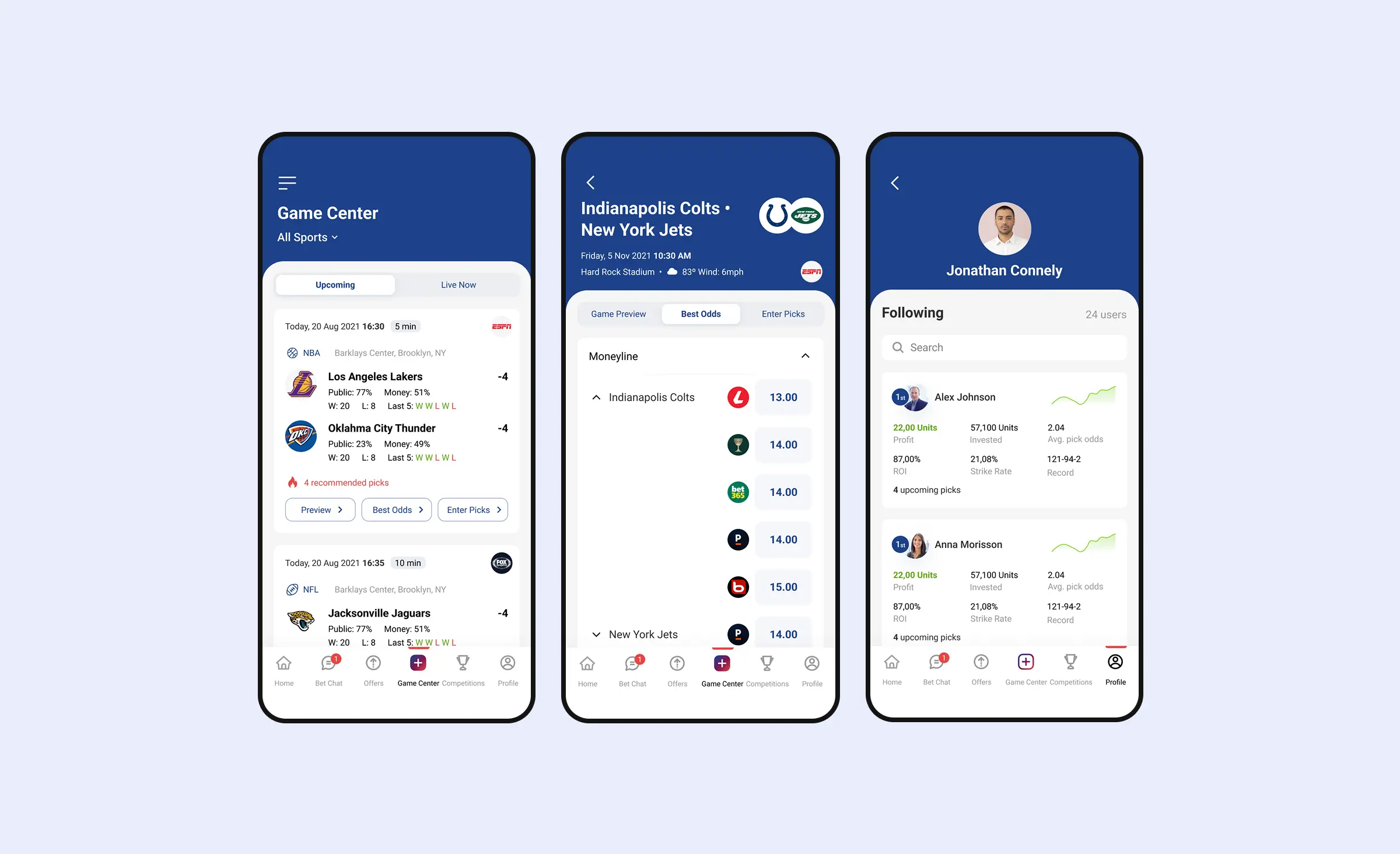
The OddsCrowd app for sports bettors is a long-running example. We released updates after every milestone and read the result in Firebase Analytics, which tracked which screens users opened and how long they stayed on them, so each change was judged against those numbers rather than against how it looked in a review meeting. One recurring change sat behind the screens rather than on them: whenever the client found a more reliable sports data provider, we swapped the integration so the odds and statistics users saw stayed accurate. From the outside it looked like the same app quietly getting better.
When the product is broken or unlaunched: research first
When an app works poorly or has not launched, we start with research into what users need and test new flows with real people before development. We look at the architecture at the same time, because a redesign of that size needs designers and developers deciding together what is worth keeping.
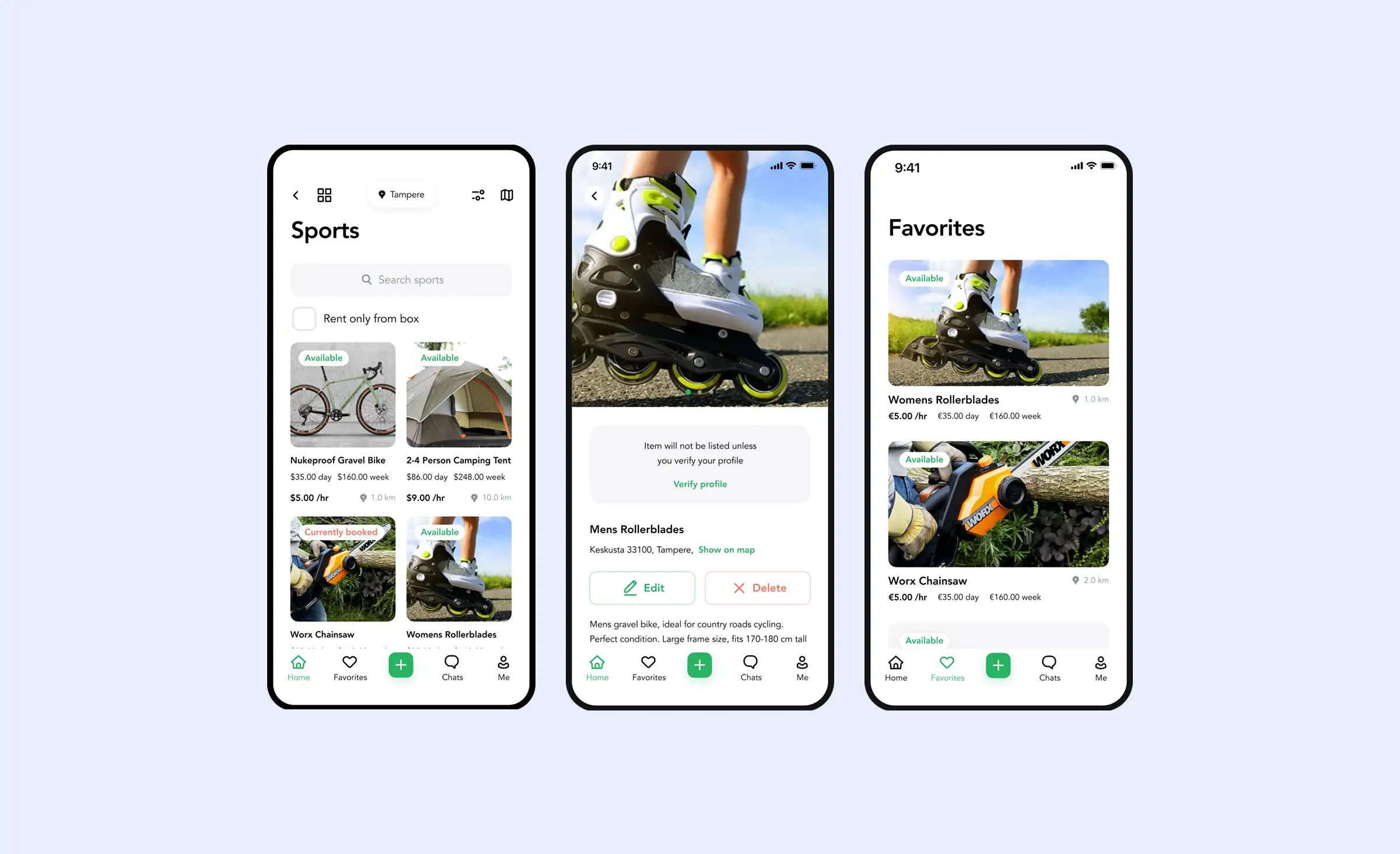
The Lainappi rental marketplace arrived with a finished design and a request to build it. Reviewing it, we found problems with the logic, with the visuals, and with how hard it would be to implement, plus too little of what the company stood for. So we rebuilt the design: a green and white palette for a service about reuse, a booking and payment screen the prototype never had, product categories with a search bar and filters in place of the original tabs, and a user profile showing everything a person was renting.
The clearest win was collapsing account verification. Users had to enter personal data, confirm identity, wait for a result, and add bank details across separate screens; we reduced that to a single block on the profile screen. We also turned the rental process itself into a chat that carries messages, system updates, and the actions, so renters and owners never leave the conversation to move a deal forward.
When the code decides the scope: audit before you redesign
Some products cannot be fixed at the interface level, and the only way to know is to read the code. We combine manual review by senior developers, AI code review, and static analysis tools such as SonarQube and IntelliJ IDEA Code Inspection to map what is safe to keep and what is a liability.
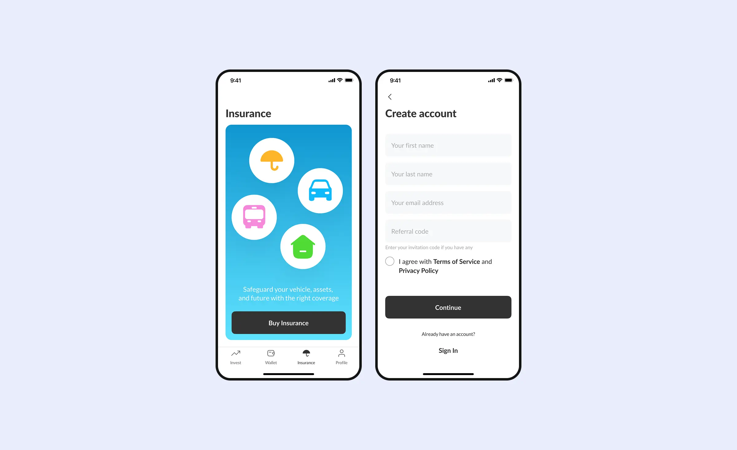
That is how a Nigerian trading platform reached us, an app for buying assets on the Nigerian stock market and investing in mutual funds — one of the projects behind our fintech software development work. The client had a working product with problems in both the design and the implementation after a previous partner failed to deliver, and asked us for an audit. It found high-severity bugs, test coverage too low to change anything safely, and security issues, so we recommended a full rewrite rather than refactoring around them. The client stayed for the rebuild, and the new interface was designed against an architecture that could support it.
“An audit is the cheapest part of a redesign and the part that sets its budget. We have told clients to spend less than they planned, because three flows were the whole problem. We have also told clients that new screens on top of their current code would break within two releases. Both answers came out of the same week of work.”
Evgeny Leonov, CTO at Ronas IT



When a redesign is the wrong fix
If almost nobody opens your app, redesigning it will not help. Low usage across the whole product usually means the product is not solving a problem people have, and restyling screens nobody reaches spends money on the wrong layer. In that situation we would rather run a short prototype test with real users than start a redesign, even though it is the bigger project for us. A redesign cannot create demand that was never there.
How much does a mobile app redesign cost?
At Ronas IT a redesign starts at $6,000 and takes from two weeks, and if the codebase has to be replaced you are into development pricing instead. The table below sets out what each option covers, and our breakdown of UX design cost shows what drives the hours inside those numbers.
| What you are buying | Starting price | Timeline |
|---|---|---|
| Product analysis phase: scope, flows, and feasibility before you commit | $2,000 to $3,000 | 1 to 2 weeks |
| Product redesign: review of the current product plus a reworked interface | From $6,000 | From 2 weeks |
| Mobile app design: a full new design set for native or cross-platform | From $8,000 | From 2 weeks |
| UI/UX design by the hour, for scoped changes to a few flows | From $50 per hour | Depends on scope |
| Cross-platform rebuild in React Native, iOS and Android from one codebase | $20,000 to $40,000 | 4 to 6 weeks |
| Native iOS rebuild, single-role app with core flows | $25,000 to $45,000 | 8 to 12 weeks |
The distance between the $6,000 line and the $45,000 line is why we audit first. Current rates for every option sit on our pricing page, and if you want to sanity-check a quote from somewhere else, our guide to estimating app development explains how those numbers get built.
Your app redesign checklist
Run these steps in order. Steps 1 to 5 cost nothing but time; the audit in step 6 is the first paid one, and design work only makes sense once the diagnosis behind it is done.
- Write down the number you want to move. Retention at day 30, checkout completion, rating on the store. One metric, stated before design starts, so success is not a matter of opinion afterwards.
- Pull four weeks of funnel data. The step with the largest drop in a flow users had already started is your first redesign candidate.
- Read the last hundred store reviews and a month of support tickets. Grouped by theme, they name the screens to look at, and the words users choose often become your new labels.
- Watch session recordings and heatmaps of the worst screens. Where people tap, hesitate, and scroll past shows problems that funnel numbers only hint at.
- Compare that one flow against two or three apps in your category. Look at how they solve the exact screen your funnel flagged, not at their overall style. Copying a solved checkout is useful; copying a trend is how Instagram's tap-through feed happened.
- Commission a technical audit. For an existing product, this is the analysis phase. A repository-level mobile audit usually takes 2 to 4 weeks and combines a manual review by senior developers with AI code review and static analysis. We set its scope and price after an initial look at the codebase. The audit determines whether the product needs a redesign or a rebuild.
- Check the app against WCAG 2.1 level AA. Screen reader labels, contrast, and text scaling, plus WCAG 2.2's 24-by-24-pixel minimum touch target size, which only became a Level AA rule in that later version. For a covered service delivered to EU consumers this is a compliance item, not a nice-to-have.
- Confirm your build tooling meets current store requirements. Both stores now gate uploads on recent SDK versions: an iOS 26 SDK build for App Store Connect, Android 16 targeting for Google Play. Clear this before design work, or the redesign cannot ship.
- Pick the approach and write down what is out of scope. Incremental or end-to-end, plus an explicit list of what this project will not touch. That list is what stops a refresh turning into a rewrite.
- Test new flows with real users before you build them. Interactive prototypes tested with five to eight people from your actual audience surface the navigation problems that matter, for about a week of work.
- Release one change at a time, with a way back. Ship a flow behind a feature flag you can switch off from the server. Phased release alone will not do it: pausing it only stops the rollout from spreading further, it does not undo the build for users who already have it. Give the flag two to four weeks of traffic, then compare the users who saw the new flow against the users who saw the old one rather than against last quarter's trend.
- Prepare the store submission early. Screenshots, descriptions, and review guidelines take longer than teams expect, and a rejected build stalls a launch you have already announced. Apple and Google review each store on its own schedule, so a fix on one side does not force a new review on the other: when Apple asked us to add Sign in with Apple to OddsCrowd's login screen, we shipped it and got iOS approved in three days, without touching the Google Play build that had already cleared review.
- Plan who maintains the result. A redesign creates new components that need monitoring and updates, and part of that clock is not yours to set. Google deprecated the legacy Firebase Cloud Messaging API in June 2023 and began shutting it down in July 2024; on Lainappi we moved push notifications off it on 29 May 2024, about eight weeks ahead of that shutdown, not after it broke. App maintenance is what keeps the new design from becoming the next thing that needs redesigning.
Frequently Asked Questions (FAQs)
How long does a mobile app redesign take?
How much does it cost to redesign an app?
Should I redesign my app or rebuild it?
Will a redesign make me lose existing users?
Which screens should I redesign first?
Do I have to redesign my app for iOS 26 and Material 3 Expressive?
Does the European Accessibility Act apply to my mobile app?
Can a new team take over an app another agency built?
Related posts



Related Services
React Native App Development Services
Save time and costs with Ronas IT's React Native app development, allowing cross-platform capabilities for iOS and Android. Our team has built 20+ React Native apps since 2020, ensuring rapid development, flexible maintenance, and cost-effective solutions.
Cross-platform App Development
Ship to iOS and Android from one React Native codebase instead of funding two native teams. Ronas IT handles UI/UX design, development, and the releases to Google Play and the App Store, delivering high-performance, secure apps within 2 to 4 months.
iOS App Development Services
Choose native iOS when the product leans on Apple hardware, the newest OS features, or the wider Apple ecosystem. Ronas IT builds on Swift and SwiftUI and covers UI/UX design, development, the App Store release, and ongoing support, with single-purpose apps shipping in 8-12 weeks.
UI/UX Design Services
Ronas IT designs user-focused interfaces for mobile, web, and desktop products, with designers and front-end developers working side by side for pixel-perfect handoff. A library of UI flows for common business scenarios speeds up delivery, and every project follows the same established design standards.