
Web application UI design is the design of the screens people use to get work done in a browser: the menus, tables, forms, and the messages that tell users what is happening. At Ronas IT, web app design without development starts from $2,000 for the flows, responsive screens, and a UI kit. A good web app UI lets each type of user find the next step without help and makes mistakes hard to make.
What is web application UI design?
A web application is software that runs in a browser and that people use for repeated tasks: a SaaS product, a customer portal, a booking system, or an internal tool. Its UI design decides how every screen looks and responds, and it rests on UX decisions: which tasks the app supports and how a person moves between screens. The practices below start with those UX decisions: roles and tasks, then navigation.
A website is mostly read, while a web app is mostly used, and that changes the design work:
| Aspect | Website | Web application |
|---|---|---|
| Main goal | Inform visitors and lead them to a contact or a purchase | Help users finish the same tasks again and again |
| Typical screens | Pages of text and images | Lists, tables, forms, dashboards, and settings |
| Users | Mostly anonymous visitors | Signed-in users with roles and permissions |
| Session | A few pages, then the visitor leaves | Long sessions, often every working day |
| What the design must handle | The layout and content of each page | The states of the data: empty, loading, error, and limited access |
This article is about the app behind the login. If you are planning a phone app, our guide to the mobile app design process covers what changes on a small touch screen. For large enterprise systems and their dashboards, see our article on enterprise UX design.
Ten web app UI design best practices
The ten practices below come from one fact about web apps: people come back to them to finish the same tasks again and again, so the interface should save their time and attention. Apply them during design, before development starts: a change then means moving elements in a design file rather than changing code that is already built.
1. Start from the roles and their main tasks
List every type of user, such as customer, team member, manager, and admin, and write down the main tasks each one comes to do most often. These tasks decide what goes on the first screen after sign-in, which actions sit one click away, and which can wait in the settings. A role that only views data needs a different screen from a role that edits it, even when both work with the same records.
2. Pick one navigation model and keep it
One option is a side menu for the main sections and a top bar for search, notifications, and the account menu. A side menu suits apps with many sections, because it lists them all in one column; a top menu suits apps with only a few. Whichever you choose, keep the main sections in the same place on every screen, so users can move from one part of the app to another without going back to the home page.
3. Give each screen one main action
Visual hierarchy tells the user what matters first. On each screen, decide which action is the main one, such as creating an invoice, and make only that button stand out in your accent color. Secondary actions get a quieter style, and destructive ones, such as deleting a record, get their own look and a confirmation step.
Keep the palette and the type small: one accent color, neutral grays for structure, and one typeface in a few sizes and weights are usually enough for a whole app. Every extra color or font is one more thing the user has to read before they can see which element is important.
The words on a screen are part of its hierarchy too. Our design checklist asks for button labels written as commands, such as “Sign up” or “Create project,” so users know what a click will do, and for short headings that name the object the user works with, such as “Requests,” so users see at a glance where they are. A term for something in the app stays the same on every screen, so a request does not turn into an order or a ticket elsewhere.
When looks and ease of use conflict on a screen, our designers choose ease of use.
4. Design tables for scanning and bulk work
In many web apps, tables and lists are where the daily work happens. A table that works lets people sort and filter by the columns they care about, keeps the header visible while they scroll, and aligns numbers to the right so they are easy to compare. It also lets users select several rows and act on all of them at once. Decide early what a long table does on a narrow screen: the less important columns can hide, or each row can turn into a card.
“Before we draw a table, I ask the client for a real export of their data with the personal details removed. Sample rows in a mockup are neat and all the same length. Real data has long company names, empty cells, and values nobody expected, and those are what break a layout once people start using it.”
Elizaveta Denisova, Lead designer at Ronas IT
5. Make forms prevent errors
Mark the required fields, show the expected format next to each field, and check the input when the user leaves a field instead of after the whole form is sent. When the app detects an input error, the WCAG 2.2 accessibility rule on error identification asks that the field with the error is identified and the error is described to the user in text. Better still, prevent the error: offer a date picker instead of a free text field, limit choices to valid options, and keep what the user typed if the page reloads.
Size each field to the data it takes. Then design every state of the form, not only the empty one: how error messages appear, what the user sees after the form is sent successfully, and, if the form accepts files, how it looks before a file is chosen, while the file uploads, and once it is uploaded.
6. Show what the app is doing
A user who clicks Save and sees nothing change may click again. The first of Jakob Nielsen's usability heuristics says the design “should always keep users informed about what is going on, through appropriate feedback within a reasonable amount of time.” In a web app, that means each of these states gets its own design:
- Loading: a placeholder in the shape of the layout or a progress bar, so the screen does not jump when the data arrives.
- Saving: a short confirmation that the change is stored, or a clear message that it is not.
- Empty: a first-use screen that explains what will appear here and offers the action that fills it.
- Error: what went wrong, in plain words, and what the user can do next. When the user cannot fix the error, such as a server failure, content designer Amy Hupe advises telling them what happened to the data they sent, for example that their answers are saved and kept for 30 days.
- No access: a message that this role cannot see the page, instead of a blank screen.
Long tasks, such as a data import or a large report, also need a status the user can come back to later.
Google measures how fast that feedback appears. Its Interaction to Next Paint (INP) metric, one of the Core Web Vitals, counts the time from a click, tap, or key press until the browser can draw the next frame. At or below 200 milliseconds counts as good responsiveness; above 500 milliseconds counts as poor. The work itself can take longer. Vercel's Malte Ubl explains that the metric asks the page to acknowledge the input within 200 milliseconds, then do the heavy work after the next frame is drawn. For design, this means every control that starts slow work needs an immediate visible reaction, such as a pressed state or a spinner on the button, separate from the result.
Many web apps now add AI features: a drafted reply, a summary of a long record, a suggested category for an invoice. Their answers can be wrong, so the screen has to show which content the model produced and give the user a quick way to edit, undo, or reject it. Microsoft's guidelines for human-AI interaction put both needs on their list: “Make clear how well the system can do what it can do” and “Support efficient correction”. When the model streams its answer word by word, that also needs its own waiting state, and a way to stop it when the user sees it going in the wrong direction.
Single elements need their states as well. When our designers add a new part to a UI kit, they draw every state that applies to it: hover, keyboard focus, filled and empty, selected and not selected, so users can always tell what a control is doing. If users can add or select something, the screen also gives them a way to edit it, delete it, or clear the selection.
7. Meet contrast and keyboard rules from the start
WCAG 2.2 is the W3C standard for accessible web content. At level AA, normal text needs a contrast ratio of at least 4.5:1, while large text and the parts of controls and graphics that users need to identify or understand them, such as field borders and icons, need 3:1. Level AA also asks for a target size of at least 24 by 24 CSS pixels for clicks and taps, with some exceptions, and for a keyboard focus that users can see. At level A, every function must work from the keyboard, except a function whose input depends on the path of the user's movement.
Color alone should not carry meaning, and WCAG says so at level A. Color blindness affects about 1 in 12 men, according to the US National Eye Institute. Mark a failed status with an icon or a word as well as with red. Contrast and focus styles are cheap to set in the UI kit and expensive to fix across finished screens.
Our own guidelines add two rules for every clickable element. It reacts, at least slightly, when the pointer moves over it, so users can tell what is clickable. It also has a focus state that is easy to see, because people who use the keyboard depend on it. Both states are usually drawn in the UI kit, so developers build them from the design instead of guessing.
8. Plan for wide and narrow screens
When a web app is used on a large monitor, the layout should use the width: a list next to its detail panel, or filters beside the table, instead of one narrow column in the middle. The same app also opens on laptops, tablets, and phones. Find the tasks that people need on a phone, such as approving a request or checking a status, and design those screens for it. Tasks that only make sense at a desk, such as editing a large table, can stay desktop-first.
In our design files, the phone or tablet version of a page sits next to its desktop version, not on a separate page, so it is easy to see what has to change as the screen gets smaller. Font sizes work best when every size changes by one constant factor between desktop and mobile: headings and body text keep their proportions on every screen, and developers have a simple rule to build.
9. Keep the interface consistent with a UI kit
A UI kit is the set of reusable parts of an interface: buttons, fields, tables, cards, menus, and icons, with colors, type sizes, and spacing stored as variables. When every screen is built from the same parts, a button looks and behaves the same everywhere, and a change to a part reaches every screen that uses it. For several products or teams on one interface, a full design system adds written rules and an owner. Our guide to design system services explains when that step is worth it and how we build a project's UI kit.
At Ronas IT, every design file starts as a copy of our company design system, and the designer adapts its colors, type, and components to the project's style, part by part as the screens need them. A part goes into the project's UI kit when it appears more than once, is not limited to one screen, and works as an element on its own. In the kit, each component is set up to resize without breaking its structure.
- Icons: preferably one icon set per project, so the style does not vary, with icons placed in containers of the same size; a different size needs a reason.
- Spacing: gaps, padding, and the sizes of small elements use a fixed scale of spacing variables from 2 to 240 pixels, which makes layouts neater and parts easier to fit together.
- Components: every repeated element is a component with a meaningful name, and its states are variants of it, so each state is drawn once and reused on every screen.
“In my experience, inconsistency often starts in the code rather than in the design file. One screen needs a slightly different button, someone copies the existing one and edits it, and soon the app has buttons that look almost alike but do not work the same way. When a screen needs a part the kit does not have, I ask for it to be added to the kit first and only then build the screen.”
Alexander Storozhevsky, Lead developer at Ronas IT
10. Check each screen against a checklist before review
Our designers go through a written quality checklist before they send a screen for review. Among other things, it asks them to confirm that:
- the screen shows the data the specification describes, with nothing invented and nothing left out;
- elements are aligned to the grid, both within the screen and across related screens, so headings on similar screens sit at the same height;
- the spacing between similar elements is the same, and related elements are grouped close together;
- elements that stay in place while the page scrolls are marked, and the prototype scrolls as intended;
- the text is real content, not lorem ipsum, and the data could be published as a screenshot of the app.
Web app UI on a real project: a platform for lab test results
For a healthcare client under an NDA, our team designed and built a web platform for analyzing lab test results. Patients upload their results, get reports on topics such as sleep quality and stress, and share them with their doctor or coach. Staff use an admin panel to build new reports from indicators, formulas, and report modules. The design work on this project included these decisions:
- Data model first: before the screens, the team described the entities of the app, such as indicators, formulas, and report modules, and how data moves between them. Developers used the same model to write the code and build the database, which made the handoff smoother.
- Hierarchy on dense screens: the reports are full of text, charts, and tables, so the design keeps a clear hierarchy, plenty of white space, and a single accent color for buttons and key elements.
- A neutral look for partners: the client planned to offer the platform to other healthcare businesses, so the UI stays neutral and is easy to adapt to another brand.
- Status prompts: short hints guide users through the interface and tell them the status of their lab files and reports.
- Navigation: the user app keeps its sections in a top bar and the admin panel keeps them in a side bar, so users can open any section without returning to the home page.
- UI kit: the client planned new features after the launch, so the team built a UI kit from which new screens are put together.
After the first release, we kept working with the client for 4 years on new features and maintenance.
How the web app UI design process works
The process takes the app from a list of roles and tasks to screens that developers can build, in seven steps. You review and approve the result of each step before the next one builds on it. We usually plan the design work in sprints of one to three weeks, and at the end of each you can open the mockups and leave comments. While the screens are being designed and built, we also tell you about each design change as it comes up, because a change that looks small in a mockup can affect what the developers have to build.
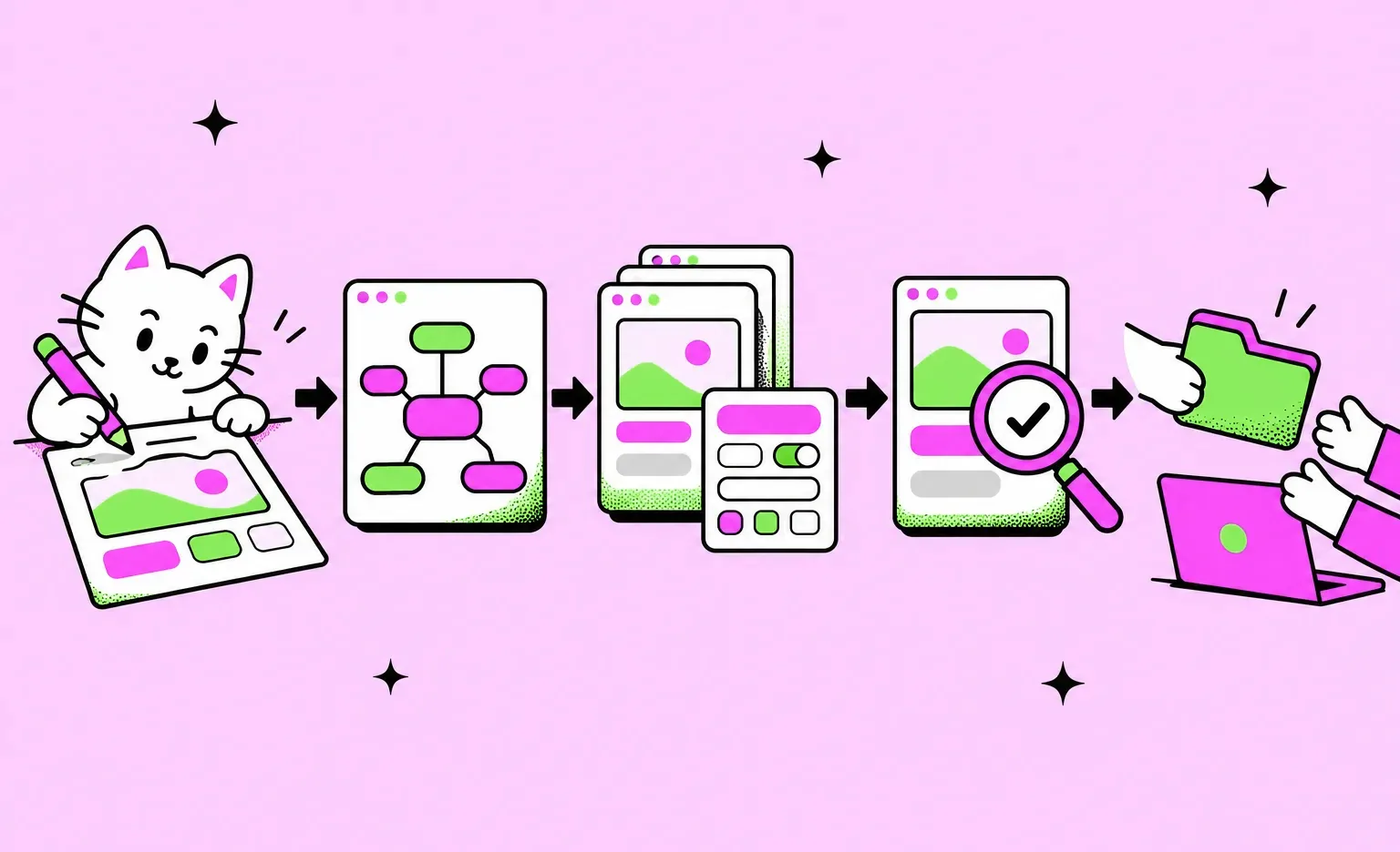
- Scope: you and the designer write down the roles, their tasks, the features of the first release, and what already exists, such as a brand or an old version of the app. The designer makes sure they understand how the app works, what content the screens need, and which controls each user flow requires, and asks about anything missing at once.
- Visual concept: the designer styles a few screens so that you can agree on the visual style, the colors, and the fonts. The concept does not have to match the future screens or features exactly, and it does not yet have to be built from the design system; its job is to settle the look and feel before the full design starts.
- Product map: a high-level diagram of the app's features, the details each one needs to work, such as fields, data, and controls, and the links between features. Its purpose is to agree on the exact feature set with you before the interface is designed; the navigation itself is worked out later, together with the screens. It can be a mind map, a flow map, or a screen flow, and the project manager can skip this step when the project documentation already covers it.
- Screens and UI kit: the designer extends the approved concept to the screens of each user flow, with their empty, loading, and error states, and builds the UI kit and the styles at the same time. Each group of screens opens with a short note on the feature: the task it solves for the user or the business, the data and states it shows, any special requirements, and its status (in progress, in review, or ready for development).
- Design review: each part of the design is reviewed by another designer before you see it, in the same way code goes through review before it is merged. The designer first checks the part against the checklist, and the reviewer sends it back with comments if something needs fixing. After the fixes, the part goes to you for approval.
- Prototype: our guidelines define three levels. Every design file has at least the minimal one, with the device set, the fixed elements in place, and scrolling inside elements working. A basic prototype adds navigation within each flow, transitions between component states, and simple animations, and a detailed one adds complex animations and conditional transitions. The two higher levels are built when the task calls for them or when some behavior is not obvious from static screens. A clickable prototype can also be exported as a web page that opens in a browser. If you want to test the prototype with people from your audience, you run those tests on your side; they are not part of the design price.
- Handoff and build: once every change asked for in the comments is made in the design, developers get a file that includes the concept, the product map, the screens of the main user flows, and the UI kit with its components and their states, plus a DESIGN.md file with the style rules for their AI coding tools. While the app is being built, the designer reviews the screens as they are implemented.
Our design guidelines also describe an alternative path with AI assistants. The assistant drafts the project documentation: the user roles, the data model, the entities each role works with, and the structure of the app, and the designer checks, corrects, and completes it. The assistant then builds a working front-end prototype from it, and the screens are copied into the design file for your comments. The visual concept is still designed by hand, because our guidelines hold that AI assistants cannot design a good-looking UI on their own. Visual changes are made by the designer in the design file and then carried over to the prototype. On this path, the prototype rather than the design file goes to the developers as the source of truth.
On either path, our designers work in Figma together with an AI agent that is connected to the file and can both read it and change it. The agent takes a full part in that work: it creates the components each screen needs, works on the type system, helps build the UI kit, and helps reason through the UI and the UX of each flow. The designer directs it and makes the decisions. Every design delivery includes the DESIGN.md file described in the handoff step.
Scope and the product map are part of the design work. Our analysis phase is optional and has its own price: start with it when the feature list is still open. It turns the features into user stories (short notes on what each user needs to do), maps out the main flows, and closes with a written estimate of the budget and timeline.
What web app UI design costs
Designing a new web app at Ronas IT starts from $2,000. That starting price fits a small app with a few roles; a SaaS product is priced by how many screens it has and how complex they are. The design covers the flows and the screens each role needs, with the states of each screen, adapted to desktop, tablet, and phone, plus a UI kit the screens are built from. The designer also works with the developers while they build the app. Project management is part of the design price; only the optional analysis phase is a separate line. By default, the price includes three rounds of concept revisions, and we set the number with each client, so each figure here is a lower bound. A design system your company already has lowers the cost only sometimes: we check it first, and it tends to change once the app's real screens are drawn.
| What you need | Starting price | Timeline |
|---|---|---|
| Optional analysis phase for a feature list that is still open: user stories, flow maps, and an estimate of budget and timeline | $1,000-$2,000 | At least 1 week |
| UX audit of a live web app: key flows reviewed, problems ranked, recommendations | From $500 | From 3 days |
| Design of a new web app: flows, a UI kit, and all screens | From $2,000 | At least 1 week |
| Redesign of a live web app: a review, the key screens redesigned, and a UI kit for the rest | From $2,500 | At least 1 week |
If our web app development team also builds the app, you pay the development price instead, and the design is included in it. A web app with its core features starts from $5,000 and 2 weeks as a basic MVP. A web product with complex business logic or high real-time load starts from $20,000 and 8 weeks, while a simple real-time feature such as chat can fit an MVP. Both prices also cover the backend, the admin panel, testing, and project management. Our guide to UI/UX design cost explains what moves design prices up or down.
What to do next
- List the roles that will use the app and the main tasks of each role.
- Mark which of those tasks people need to do on a phone.
- Export a sample of your real data, with personal details removed, for the tables and forms.
- Ask to see the visual concept and the product map before the full set of screens is drawn, and approve them one step at a time.
- Before the handoff, check the screens for contrast, keyboard use, and how each one looks when it is empty, still loading, or showing an error.


Frequently Asked Questions (FAQs)
What is the difference between web app UI design and website design?
A website is mostly read: visitors come to a few pages, learn something, and leave or get in touch. A web application is mostly used: people sign in, often every working day, to finish tasks in lists, tables, and forms. So designing a web app means more work on roles and permissions, on dense data, and on the states of each screen, such as empty, loading, and error.
What are the key principles of web app UI design?
Start from the roles and their main tasks, keep the navigation in the same place on every screen, and give each screen one main action. Build tables and forms around real data, show what the app is doing after every click, meet the contrast and keyboard rules of WCAG 2.2, plan for wide and narrow screens, and check each screen against a checklist before review. A UI kit keeps all of it consistent as the app grows.
How long does it take to design a web application UI?
At Ronas IT, the design of a new web app takes at least 1 week, and the exact timeline comes with its estimate. More roles, more screens, and slow approval of each step add time. A tool with one role and a few screens is at the short end. A SaaS product with a customer side, a staff side, and an admin panel takes longer, since every role needs its own set of flows and screens.
How much does web app UI design cost?
Ronas IT prices the design of a new web app without development from $2,000, with the flows, responsive screens, and a UI kit. A SaaS product or an internal tool is estimated by the number of its screens and their complexity. A redesign of a live app starts from $2,500. If we also build the app, the design is included in the development price: a basic MVP starts from $5,000, and a complex web product from $20,000. Project management is included in each of these prices.
Should a web app work on mobile phones?
Yes, the layout should adapt to any screen, but only the tasks people do away from a desk need screens designed for a phone.
Which accessibility standard should a web app meet?
A good target is level AA of WCAG 2.2, the W3C Recommendation first published in October 2023. It sets contrast ratios for text and interface parts, a minimum size for click and tap targets, a visible keyboard focus, and rules for error messages. Which law applies depends on your market. Our guide to ADA compliant website design covers the US rules.
Can you improve the UI of a web app that is already live?
Yes. If you first want to know what to fix, a review of the current UI and usability without a redesign is a UX audit, from $500 and 3 days. A redesign is separate work: it starts from $2,500 and 1 week, includes a review of how the current UI looks and how easy it is to use, and keeps your key features and your brand identity in place.