

Users often leave web pages within 10–20 seconds. This means that we have only these few seconds to make users interested and catch their eye. Apart from that, 94% of the first impressions about the digital product are design-related, which is why investing in clean and fresh UI design can become a priority for many brands.
In this article, we are sharing a list of UI design trends and principles that would make your product aesthetically attractive and simple to use. We have also gathered some eye-catching UI design examples from different industries for your inspiration.
Why is good UI design crucial for your business?
UI design is an inseparable component of any successful website or application. It focuses on the visual style and layout of the product's interface and includes anything a user might interact with like buttons, texts, images, sliders, and other interactive elements. When designers are working with UI design, their aim is to create a visually appealing yet intuitive and functional interface that would be enjoyable to use.
There are several reasons for businesses to invest in UI/UX design services. First of all, a well-designed user interface allows users to quickly and effortlessly find the information they require. This fosters trust and increases the loyalty of the users. More than that, an aesthetically pleasing and functional UI captures users' attention, encouraging them to spend more time exploring the product and building a habit around the app or website.
Good UI design also strengthens the brand image of the business. Many users recognize your business by the color and high-quality images you present your brand with. Also, consistent and professional design elements reflect positively on a brand, enhancing its credibility and differentiating it from competitors. When users associate a brand with high-quality design, it reinforces brand identity and fosters loyalty.
What is the shape of modern UI design?
There are several worldwide events and movements that have recently shaped key trends and principles in UI design. They include post-pandemic digital transformation that forced most users to shift to digital platforms for work, education, and communication and made designers create more user-friendly designs that can help different groups of people accomplish their everyday and business tasks.
The advance of AI and machine learning, the trends for inclusion, environmental awareness, and extensive usage of mobile devices were other factors that shaped the principles and trends in UI design. Below, we list key trends that you may stick to when you think through your website or app design and enumerate several principles that any brand can benefit from.
Minimalism
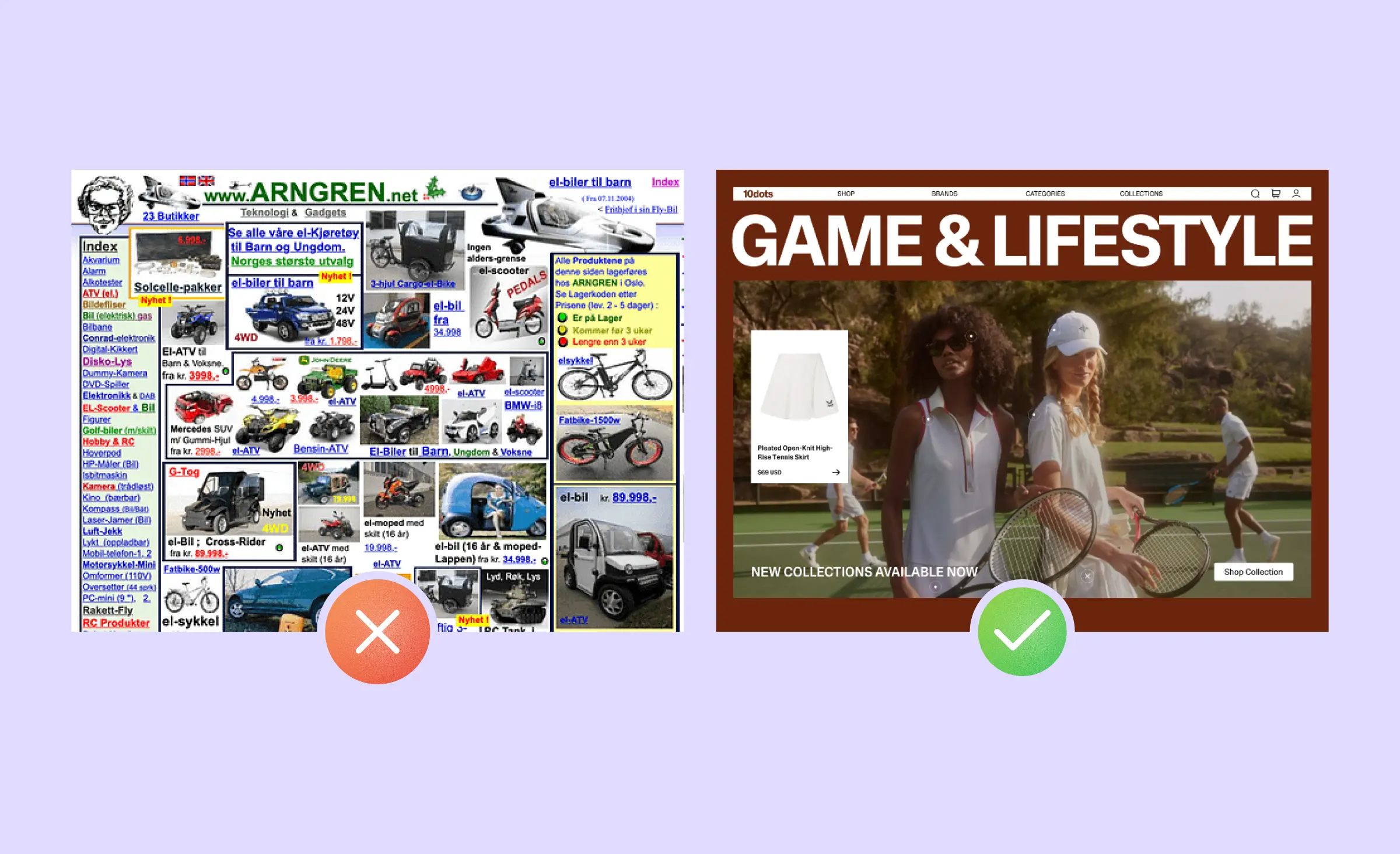
When smartphones appeared, the first user interfaces were designed with realism in mind, or skeuomorphism as designers always call it. This was done to make the transition from the real world to the virtual one less bewildering for users. The key characteristic of this visual style is UI elements that mimic the images of real objects.
As the functionality of apps became more complex, designers started using flat design more often, and this visual style later evolved into minimalism. Digital products with minimal interface design load faster and can be made responsive for mobile screens easier. Web apps and websites benefit from this because loading time and the ability to adapt to mobile screens are among the most important SEO metrics.
Minimal app design makes the products look clear and professional to users. When working with such a visual style, UI designers should focus on eliminating unnecessary details and distractions and placing an emphasis on important content or products. Such a UI design makes users navigate and find the necessary information in the interface without distractions and confusion.
Clear hierarchy
Another thing that enhances user experience is a clear hierarchy that allows users to navigate through the interface quickly, quickly scan the page content, and focus on the most important elements or actions, such as call-to-action buttons or critical information. One UI design trend that can help you establish a clear hierarchy is bold typography.
While bold typography brings some bits of aesthetical appeal, it also has a functional purpose and enhances the UX design of the product. Bold fonts capture the user's attention, improve scanability of the interface, and aid navigation. Bold typefaces can be used for titles and CTAs, to emphasize brand names and logos, to highlight important information as well as for many other purposes.
Many popular brands use bold typefaces for various purposes. UI design examples of bold typography include Apple's iOS which uses this trend to enhance readability and navigation and make the interface design more intuitive. Airbnb employs bold typography to highlight important information, while Spotify creates a clear hierarchy and makes navigating through music categories a breeze.
Our team also extensively uses this trend when creating UI designs for our interfaces. Here's the UI design example of an e-commerce website created by Ronas IT team. For this concept, we have used a curly font that both establishes the hierarchy and serves as a vivid accent that makes the website look more sophisticated.
Interactivity
Interactivity has become an essential trend in UI design as users seek to go beyond passive data consumption and desire immersive and engaging interactions with the product. Interactivity enhances the overall user experience by making it more dynamic and responsive, leading to increased engagement and user retention.
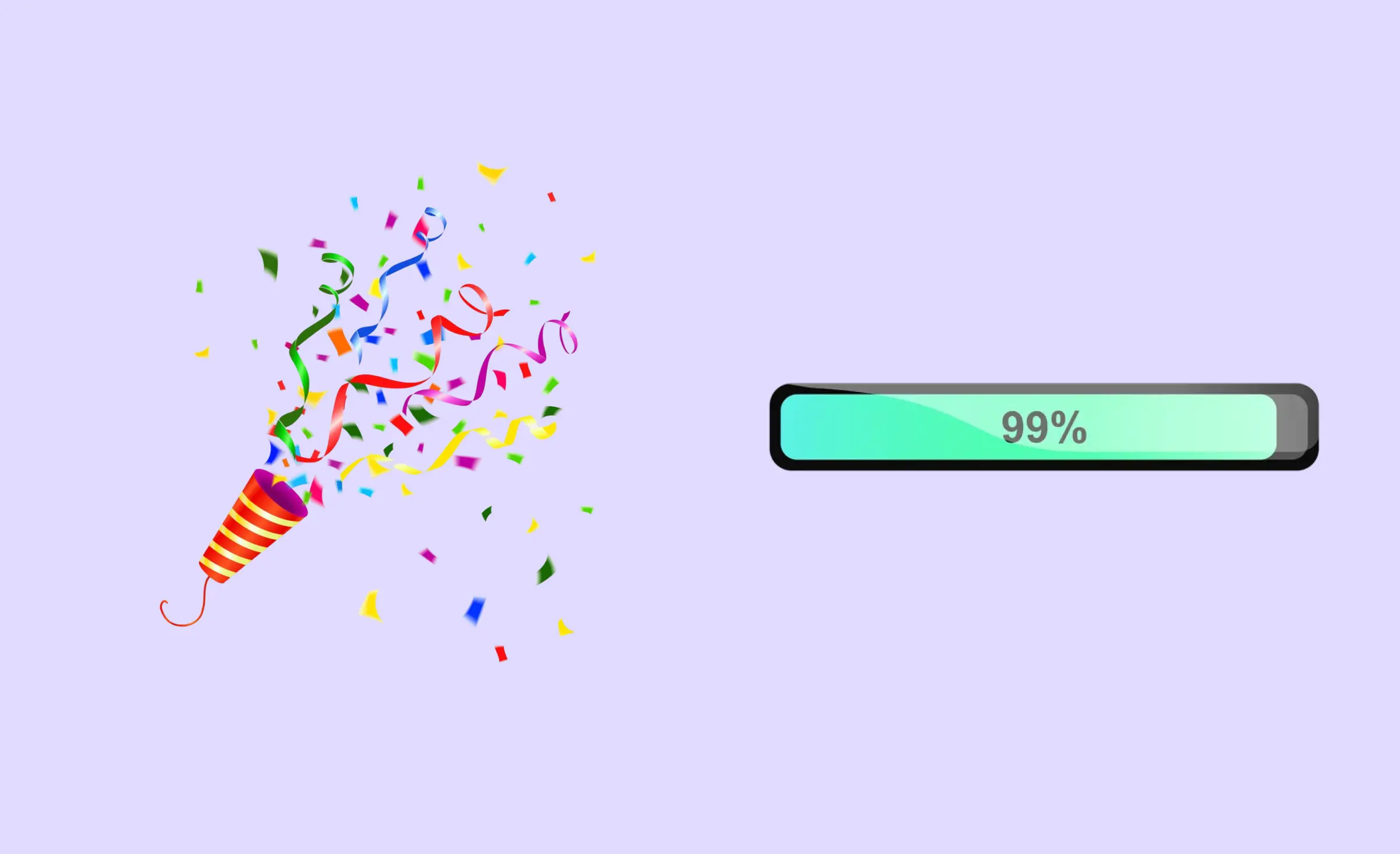
A key component of interactive app design is micro-interactions, which are subtle elements that provide immediate feedback and facilitate seamless navigation through the interface. Micro-interactions can be called an important part of UX design. Examples of micro-interactions include swipe gestures, button press animations, and hover effects that make interfaces feel responsive and alive.
Micro-interactions in the Duolingo language-learning app can be called an excellent UI design example of interactivity. Colorful confetti explosions reward users when they complete a lesson, providing positive reinforcement and celebrating their progress. Moreover, progress indicators guide users through their learning journey. They keep users motivated and committed to their language learning goals.
Sustainability
Our eco-friendly approach can begin with smarter consumption of goods and energy. With the growing usage of portable devices, the problem of energy used by these devices becomes a greater concern. Eco-conscious UI designers can focus on optimizing UIs to decrease energy consumption. By creating dark modes, lowering CPU usage, and implementing adaptive brightness, these designs contribute to extending the battery life of devices.
One of the key approaches that can be used to make the app design more eco-friendly is offering users to switch to dark modes of the applications. Most smartphones now feature AMOLED displays, where dark areas consist of pixels that emit no light, helping to extend battery life. Also, some researches show that 83% of users are willing to turn on the dark mode after 10 pm. Therefore creating a dark mode during the UI design process is a win-win variant.
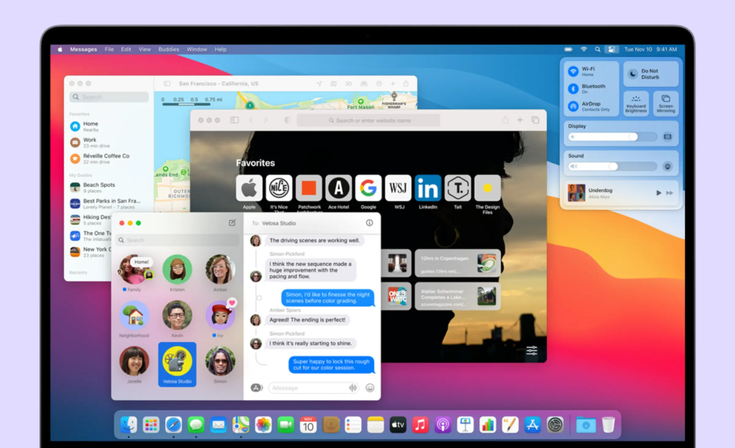
Glassmorphism
Glassmorphism is a design trend characterized by translucent, frosted-glass-like elements with blurred backgrounds, creating a layered and depth-filled effect. This trend makes the UI design visually appealing and serves some practical functions. Glassmorphism enhances focus on foreground content and maintains a sense of hierarchy and separation between layers, which enhances navigation.
The popularity of glassmorphism can be largely attributed to Apple's influence on design. Apple's use of this style has popularized it across various digital products and platforms. Notably, glassmorphism has been a prominent feature in the macOS Big Sur user interface, where elements like app cards and notifications exhibit frosted glass effects.
No matter what visual style you choose, to create a good UI design you or your UI designer will need to follow a few important principles.
Responsiveness
According to data from current studies, people from different generations spend 3–6 hours daily with their smartphones. Therefore, they tend to view many websites and web applications using their phones which makes responsive design a must-have.
Responsive design is an app design approach that ensures that websites and applications adapt seamlessly to different screen sizes, orientations, and resolutions across a variety of devices, from smartphones and tablets to desktop computers. Also, web resources that load equally well on mobile devices and on PCs are better indexed by search engines, which results in better visibility.
Consistency
When creating a responsive UI design we should ensure it is consistent. In UI/UX design, consistency is the uniformity of interface elements and flows in several versions of the digital product. This principle should concern both visual style encompassing typefaces, color palettes, icons, and animations, and functional consistency that includes interaction patterns, like navigation and button functionalities.
Consistency in an interface provides users with a predictable and intuitive user experience. When users know how each of the interface elements behaves, their cognitive load decreases, and they are more likely to get back to the application more often. Consistency not only improves user satisfaction but also makes the interface approachable and efficient for users of all levels.
Accessibility
When designing a user interface, ensuring accessibility is crucial. An interface can be called accessible if it can be used by everyone, including individuals with disabilities. This principle encompasses various aspects such as visual accessibility through adjustable font sizes, color contrasts, and alternative texts, auditory accessibility with subtitles and transcripts for audio content, and navigational accessibility by allowing keyboard-only navigation and screen reader compatibility. Accessible UI design provides users with an inclusive and equitable user experience.
Eye-catching UI design examples from different business domains
Our design team daily produces app designs for products from different business fields. To find design inspiration, we have decided to gather some examples of beautiful UI and share it with you.
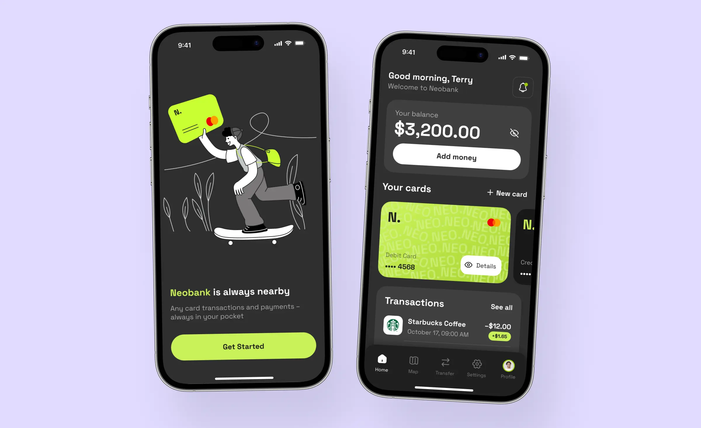
Fintech
Monzo banking app⭐️ Minimalist style, strong brand identity, custom illustrations
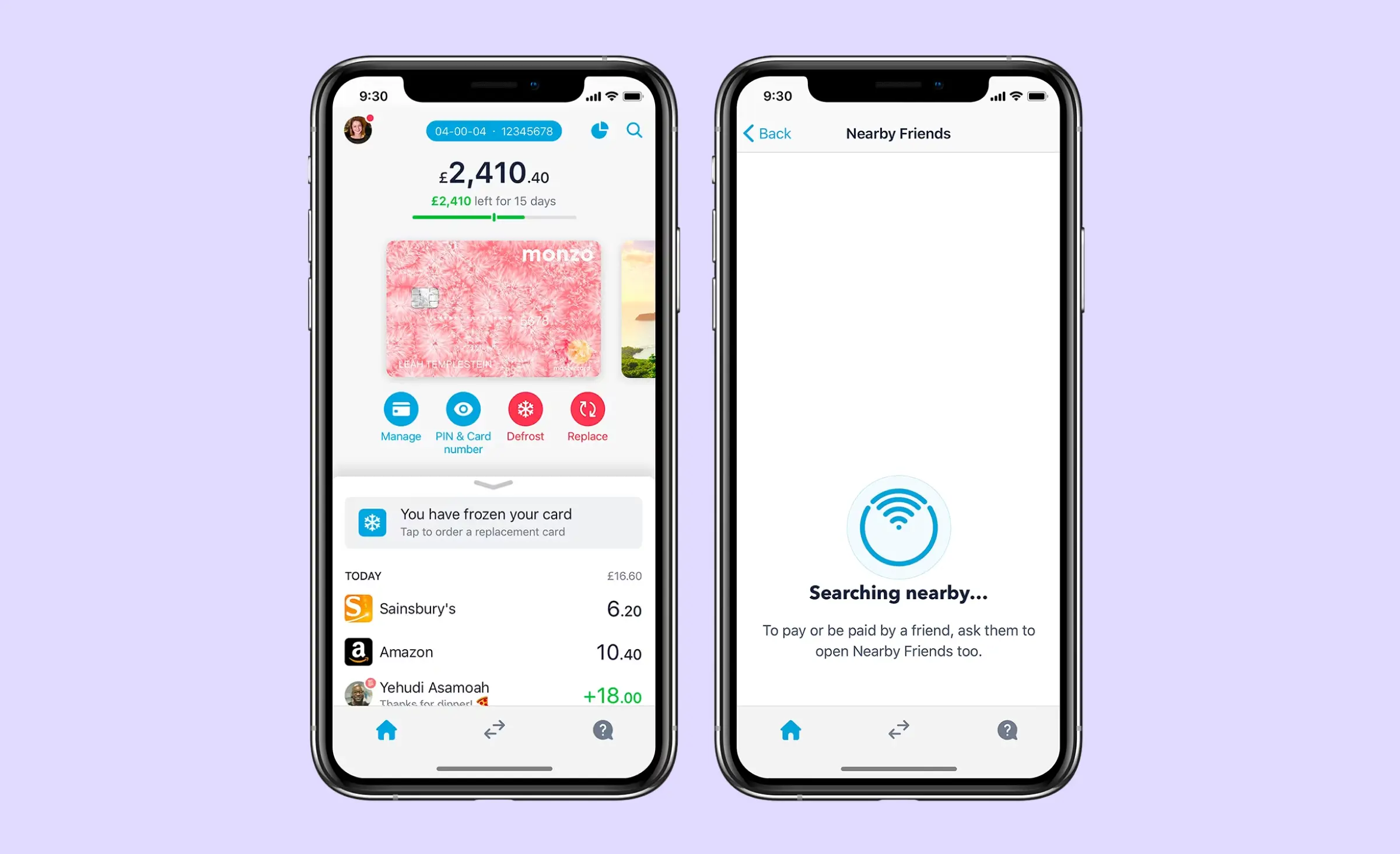
Monzo is a UI design example that employs minimalist style, with a striking use of hot coral shade as an accent color, it draws attention to key features and actions. This app design can be characterized by much white space that makes the layout uncluttered and the usage of bold typography that establishes a clear hierarchy and makes the data easy to read.
One of the most striking design features is the custom illustrations that Monzo uses to explain what the user is supposed to do on one screen or another. These images create a welcoming in-app aesthetics and make the digital banking experience less stressful. Monzo's illustrations smoothly align with the bank's brand identity and reinforce its image as an up-to-date and trustful app.
Personal finance tracking app⭐️Uncluttered layout, simplified data visualization, colorful illustrations
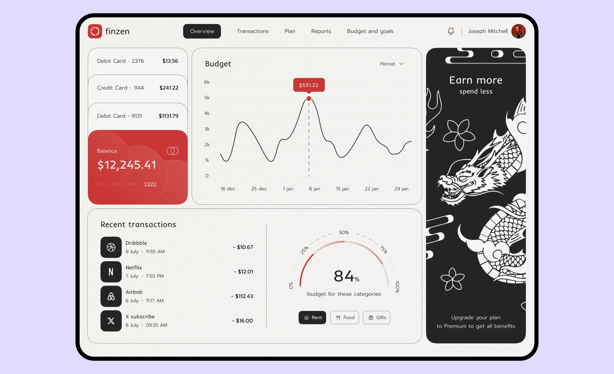
Our team has recently created a budget-tracking app design too. Before creating it, we analyzed several other apps for personal finance and understood they can be cluttered with unnecessary info and their UI design may look too strict for younger generations. In this UI design example, we have created an interface employing Eastern aesthetics.
To make the app remind users of Japanese culture, we have added illustrations of dragons, koi fish, and a Maneki-Neko lucky cat. More than that, we used a neutral black-and-white color palette with a red accent to keep users focused on managing finances. One of our coolest inventions in this UI design is a clear dashboard that allows users to see a complete picture of their savings.
E-commerce
Rhode⭐️ Off-white visual style, high-quality responsive design, engaging visuals
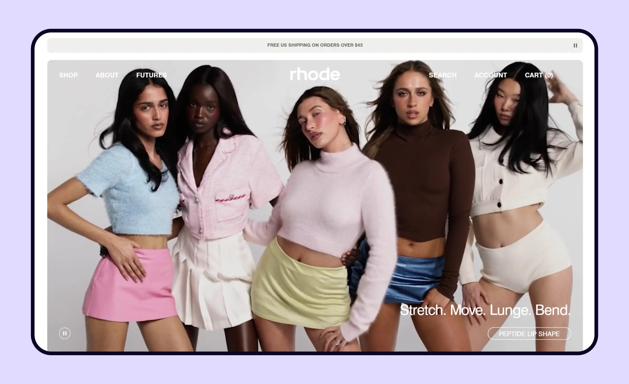
The Rhode website is a prime UI design example that combines elegance and user-friendliness, with a color palette that subtly guides user attention without overwhelming the senses. This modern UI design is characterized by generous white space, creating an airy and uncluttered layout that enhances readability and visual comfort.
One of the standout design elements of the Rhode website is its engaging visuals, including high-quality imagery and interactive elements that capture interest and make the user experience engaging. The seamless integration of these visual components aligns perfectly with Rhode's brand identity and makes its website a reliable and accessible resource for users seeking high-quality products, reviews, or other information.
Mobile marketplace for home goods⭐️ Non-standard typography, clear layout, intuitive navigation
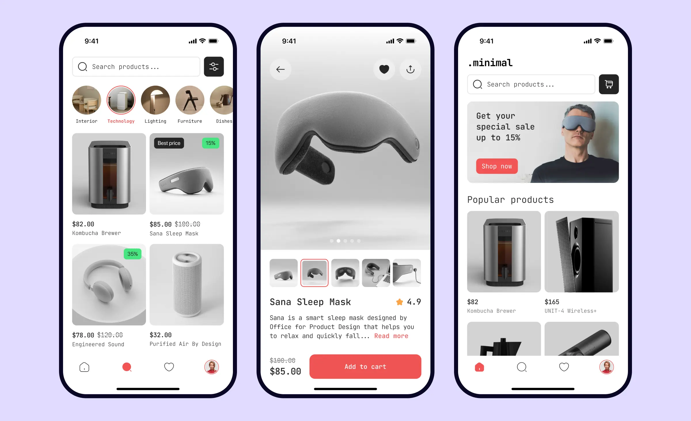
This is a design concept for a mobile marketplace selling home goods. When creating this concept we used a light color palette with coral accents. To make this app design stand out from similar ones we used a geometric font that IT engineers often use when coding to make code readable and clear. Within this UI design example, we tried to make the stylish goods pop out and leave minimum details and distractions to help users get a smooth shopping experience.
Healthcare and mindfulness
Calm meditation app⭐️ Aesthetic simplicity, website with responsive design, engaging visuals, accessibility
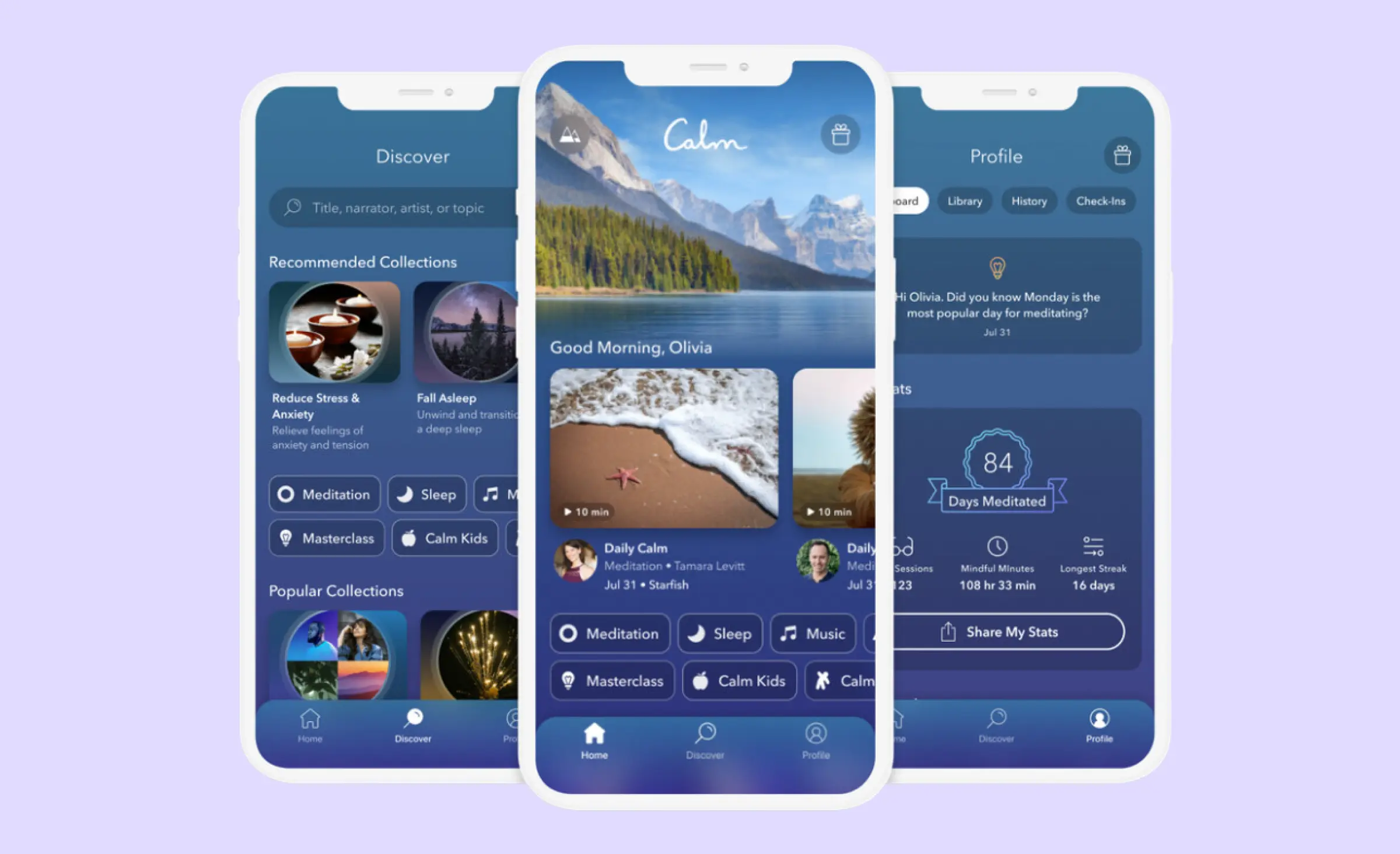
The entire UI design of Calm is focused on creating a soothing and tranquil atmosphere within their application. Calm as a cool UI design example has a clean interface that doesn't overwhelm users, uses high-quality imagery and soft animations that make their product immersive, and keeps all the products including apps and websites consistent in visual style, reinforcing the strong brand identity.
The Calm mobile app can also be praised for good UX design as well. The app's navigation is straightforward and user-friendly, allowing users to easily access the meditation sessions, sleep stories, breathing exercises, and other features without confusion. This user interface design can also be called accessible since it uses readable typography, appropriate contrast, and easy-to-click buttons that allow different groups of users to use this product.
Therapy Pal podcast app⭐️Colorful UI design, custom illustrations, unusual typography
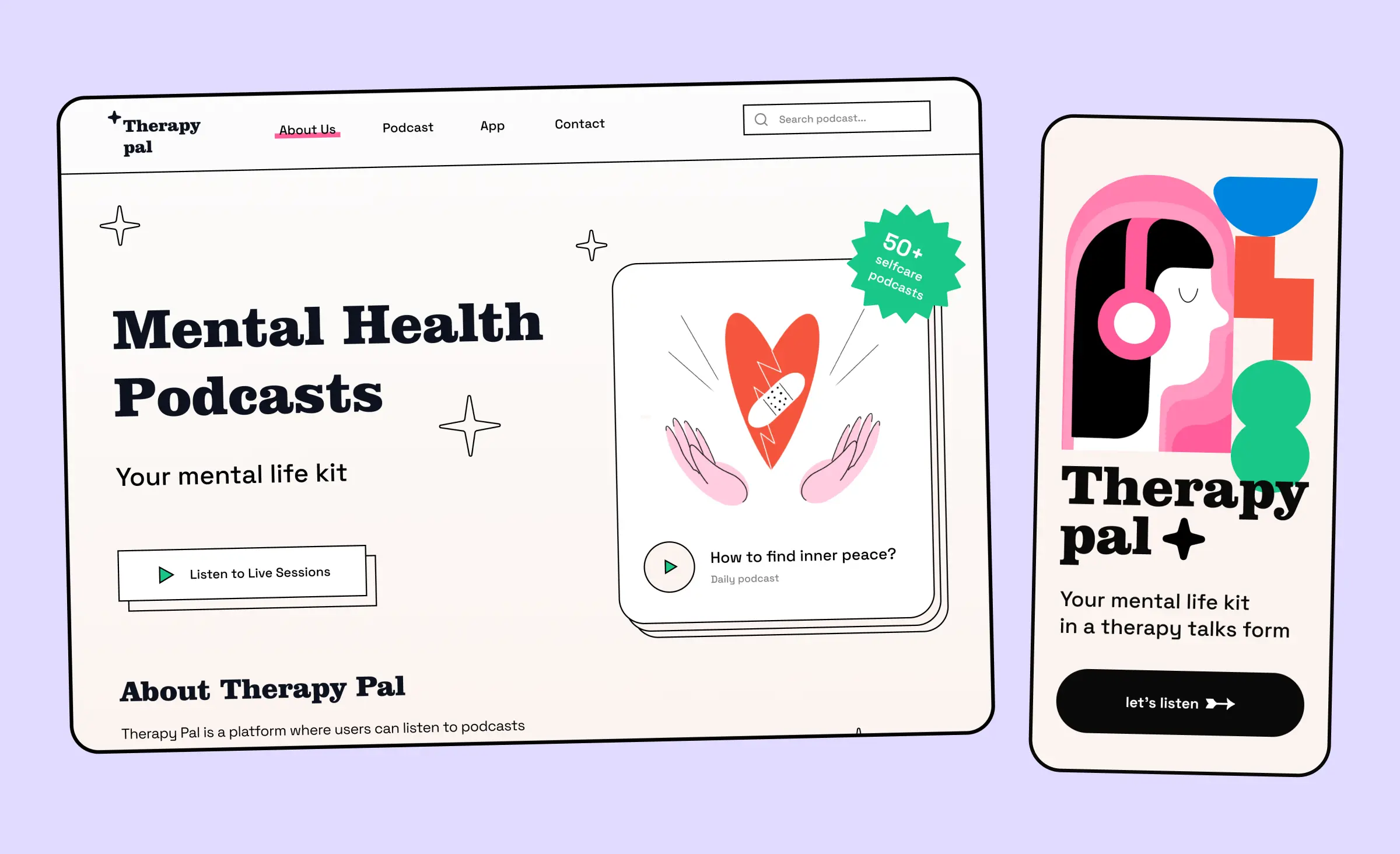
Therapy Pal is a platform where users can listen to podcasts about mental health. This platform is created for those who are searching for guidance from professionals who specialize in dealing with mental health issues. This is a vivid UI design example enhanced with colorful hand-drawn illustrations that create a positive and friendly in-app atmosphere.
To make the podcast app design more balanced, we have used a neutral black-and-white color palette and bold typography to establish visual hierarchy and make the app contents easy to scan. Another powerful side of this app is its UX design. From the home screen, users can access any section of the podcast app or find a needed podcast topic. The podcast player looks intuitive, so users of all levels can easily understand how it works.
Community apps
Letterboxd, a social network for film lovers⭐️ Dark aesthetics, vivid imagery, consistency across all the apps
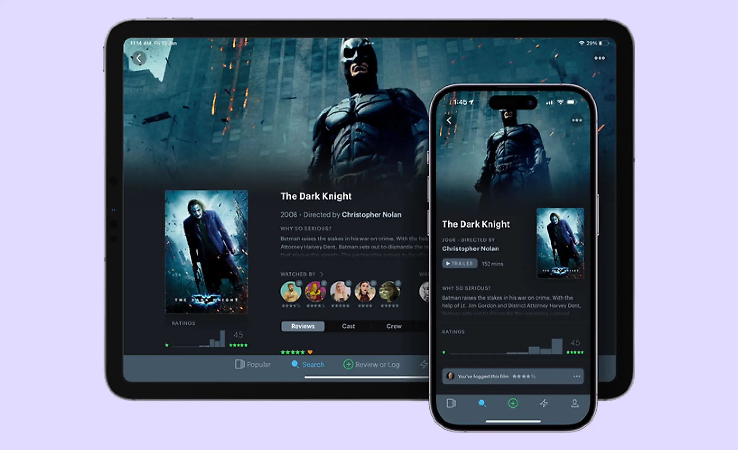
Letterboxd's UI design crafts an engaging environment for film enthusiasts, employing dark aesthetics that amplify its cinematic feel. This UI design example uses vivid imagery from films and user-generated content that create an immersive experience. Although the interface design is primarily dark, it's also minimalist and is not cluttered with little details that provide visual noise.
The app also shines in its UX design. The designers of this app took into account the needs of users and provided them with multiple ways to find movies they wanted to watch. They can use collections created by service owners, view their friends' collections, use numerous filters, or find movies by favorite actors, directors, or high ratings. More than that, consistency is key in Letterboxd's design, as this aesthetic and functional similarity extends across its apps for Android, iPad, iPhone, and Apple TV devices, providing a uniform user experience on all devices.
Waku Waku app for anime enthusiasts
⭐️ Vivid UI design, strong brand identity, consistency across several apps, clear icons
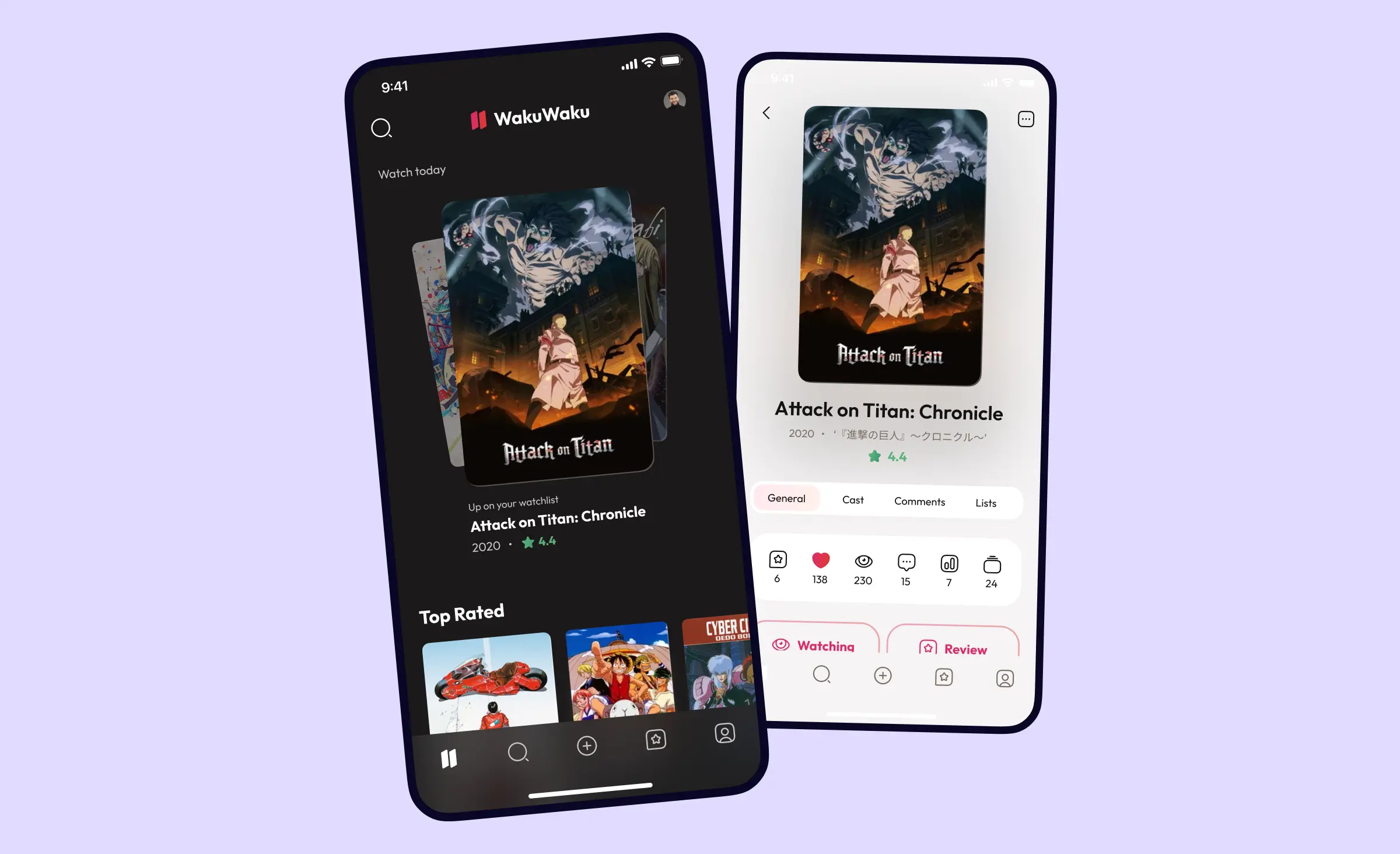
When our team worked on the Waku Waku project, our task was to create an app that would engage anime enthusiasts with its design and features for communication. This is one of our UI design examples employing such vivid pinkish-red accents that users can associate with Japanese culture. The entire design is complemented with a custom logo that looks like banners that can typically be seen on the streets of Japan.
Another cool feature of this UI design is the effective use of icons. Icons highlight key statistics on each anime series, helping users understand how popular each episode is. We also implemented some UX design solutions taking into account the characteristics of the anime genre and key user needs. These include numerous filters and episode selectors that help users quickly find needed episodes even if there are dozens of them within one season.
I want an app design that stands out. Where can I find UI designers for it?
At Ronas IT, we can design and develop web and mobile applications from scratch. As a part of our design process, we can build up the entire layout of the application sticking to trends. We usually make our app designs aesthetically pleasing, create branding elements to enhance them, and also ensure smooth hand-off of the mockups to the development process.
Our team daily creates beautiful UI design examples that we usually share in our Dribbble and Behance accounts. This helps us to sharpen our design skills even further, explore new visual trends, and provide you with UI design inspiration. That's why if you are searching for a team of designers, you may contact us to discuss your app or website idea.


Related posts


Related Services
React Native App Development Services
Save time and costs with Ronas IT's React Native app development, allowing cross-platform capabilities for iOS and Android. Our team has built over 30 apps across various sectors, ensuring rapid development, flexible maintenance, and cost-effective solutions.
MVP Development Services
Need to launch your startup quickly? Ronas IT offers urgent MVP development services, allowing you to get a fully-functional app in just 1-3 months. Ideal for testing business ideas, presenting to investors, or entering the market swiftly. Benefit from our extensive experience and accelerated development process.
Custom Mobile App Development
Transform your business with Ronas IT's custom mobile app development. We create tailored UI/UX designs, write clear and efficient code, and ensure seamless releases to Google Play and the App Store. Our experienced team delivers high-performance, secure apps within 3-4 months.