logo
Mind Easy — inclusive mental health app design
Mind Easy helps people of different ethnicities and abilities to improve their mental health. The app provides culturally sensitive resources in forms of audios, videos, and articles.
UI/UX design
Graphic design
Healthcare
Mental health
Client’s request
The Mind Easy team already had an application but realized their initial mental health app design had issues. It was outdated, not adaptive, and didn’t follow AppStore and Google Play guidelines. They requested us to bring a new vision to their project, redesign it to make it more inclusive, modern and simple to use.

Work Steps

First of all, we needed to plan the mental health app design process carefully. Our designer decided to follow these steps:

Competitor
analysis

We compared key industry players with Mind Easy in terms of content and main focus of the apps.

This analysis helped us to distinguish Mind Easy from competitors and find ways to emphasize their strengths.

User Flow

We thought out the user flow and created wireframes based on the existing functionality to figure out a better way to arrange elements and make the interface easier for users.

Log in process

Log in process

The app requires users to log in with an email address and a password, so we didn’t add options to log in via social media accounts.
Home and Profile

Home and Profile

On the Home screen, users can talk to the chatbot and see their streak of exercises and featured exercises. From there, users can go to the Profile screen to manage the subscription, change the password, report problems, and call emergency services if they’re in crisis.

During the mental health app design, we highlighted the most important actions with accent colors and designed the chart for the streak of exercises.

Exercises

Exercises

On the Explore screen, users can search for mental health exercises and materials, watch, listen, and read them. It’s also possible to add exercises to favorites.
In the Library, users can see their favorite exercises and sessions. We used pleasant and simple illustrations for the cards with exercises to bring a calming and welcoming vibe.
Subscription

Subscription

Users can subscribe to get access to all the available content in the Mind Easy app. We made two different modes for activated and non-activated subscriptions — it helps users clearly see whether their subscription is still active.
Rewards

Rewards

In the app, users get points for performing exercises. Further, they can exchange these points for money — once a user claims the reward, the app congratulates them with confetti.

Concept

Initially, our clients didn’t have a clear vision of the future design, so we asked them to show us some references and anti references. They liked monochrome themes with slight color shading and fonts and disliked crowded interfaces with too many colors and common illustrations. To figure out the mental health app design direction, we made several versions of the concept.

Animations

Mind Easy wanted us to make something unique and unusual, with a style that would differ from the previous design. They saw our animated concepts on Dribbble and wished us to try it in their project. Together we decided to experiment with creating a couple of screens with 3D animations.

It helped us to find out that the Mind Easy team wanted something as lightweight and simple as possible. So we rejected the idea of 3D animations and moved forward with minimalism.

If you wish to spice up your app design with 3D animations, we’re experienced in motion design and ready to help
👇

🌝
Dark theme

Another test version included a dark theme — it also didn’t fit the client’s vision of mental health app design but helped us to narrow down the search for the perfect match.

Final version

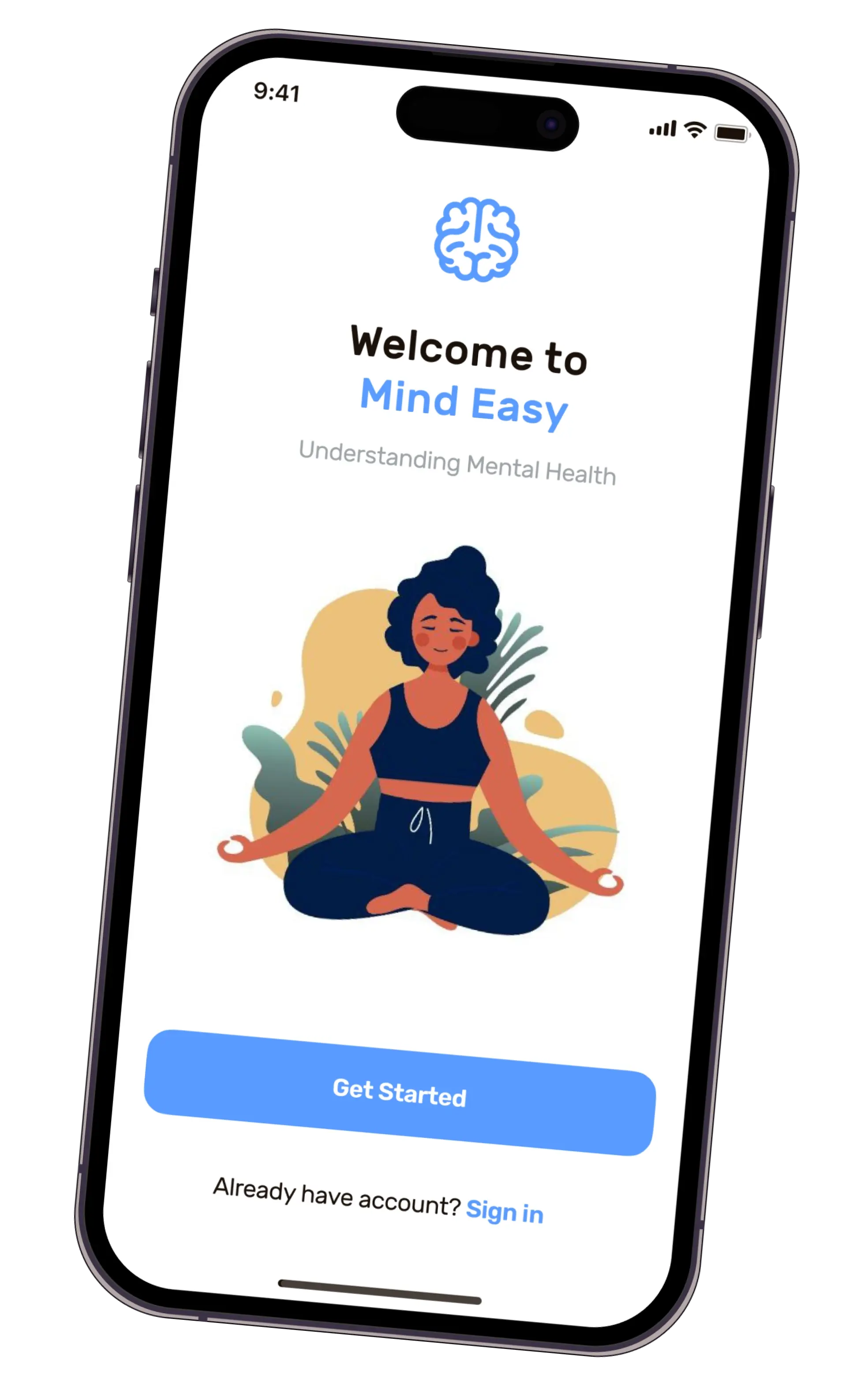
Considering our previous attempts, we aimed for a light and minimalistic interface that would reflect Mind Easy’s values. The company’s main focus was on inclusion and cultural sensitivity — they already had such elements in the mental health app design but wished to amplify them.

We used contrasting colors to make the interface well visible for people with color deficiency. Also, we added chatbot Olivia so that users can navigate the app with their voice.
We didn't have a task to make a new logo since Mind Easy already had a nice logo with a brain. However, we decided to simplify this icon so that it would match the style of other icons in the app.

Colors & typography

We chose dark colors for the text and light colors for the background. As for the accent color, we used blue, as it adds enough contrast and, at the same time, looks calm and soft against the light background. It symbolizes lightness, purity, and reasonableness, and reflects concern for the mental health of users.

UI-kit

Results

We redesigned the app following App Store and Google Play guidelines and made it more inclusive and simple. By making several versions of the mental health app design concept, we managed to find the Mind Easy’s vision and meet their expectations. Since the app already existed and our client was satisfied with the technical implementation, we didn’t go further with development. However, we prepared a proper UI-kit to help the dev team implement the new design.
The Mind Easy team knows a lot about inclusive content, and they appreciated the way we included their ideas about making the app for everyone. Now, the team looks forward to seeing their updated app help even more people with their mental health needs.
1 designer
95 hours
3 concepts
Want to create a custom mental health app? We design and develop digital solutions for business
THANKS
FOR WATCHING
Ronas.IT
Design & Dev Team
2023
We use cookies to enable necessary site functionality, to provide the best possible user experience, and to tailor future communications. By using this website, you agree to the use of cookies as outlined in Ronas IT’s online Privacy Policy