
UI or user interface is an essential part of any interface. It makes apps and websites look beautiful, helps users to find key information, and catches their attention. With proper design, you can increase conversions and get a loyal customer base. In this article, we will share some tips on UI design that can help you improve the interface of your product.
Tip 1. Limit your choice of colors and typography
It might seem that combining four different colors will make your app bright and beautiful. However, when it comes to user interfaces, we place usability above creativity — that’s why we don’t recommend using more than two colors. As the interface is a structure of an app, it should be simple and minimalistic. Moreover, the colors we use in interfaces help to build a brand identity. The image of a brand can become unclear if we use too many colors. If you’d like your brand to be associated with something juicy and colorful, you can use illustrations, images, and videos. As long as the variety of colors is contained in a simple and clear structure, it’s fine.

Another reason to keep UI minimalistic is the fact that our brains like consistency. When users see that all headlines have the same typeface, they can quickly find out which information is important and which is not. The more typefaces your interface has, the more time it takes for users to perceive information. It’s okay to use just one typeface and apply different weights and sizes for different text elements.

Tip 2. Enhance visual hierarchy
Visual hierarchy is one of the basics of UI/UX design. It helps users to understand how interface elements relate to each other and find what they need quickly. By showing users what is primary and secondary, you can draw their attention to action buttons, special offers, etc. The lack of visual hierarchy leaves users frustrated and spoils their experience. Imagine scrolling through a taxi app and having problems with finding the “Get a car” button — most probably, you’ll just download another app to save time.
Establishing a proper hierarchy is part of UX design — you can find more info about stages and aspects of design in our Stories and articles. There are several ways to enhance visual hierarchy at the stage of UI design:
- Make your CTA buttons stand out
- Distinguish elements visually
- Make tags look different from primary buttons
- Apply different weights, sizes, and line heights to the text

Tip 3. Make icons simple and recognizable
There’s no need to reinvent the wheel and make icons look completely different from what people got used to. You can modify the icons to make them match your brand but the shape should be familiar — this way users can clearly understand the meaning of the icons.

We don’t recommend overcomplicating the design of icons. It can distract users and make it harder for them to identify the icons. Make them simple, minimalistic, and consistent with each other and the overall interface.

Tip 4. Take care of the contrast
Good design should be inclusive because it makes apps accessible to people of all abilities. Colors are one of those things that all people perceive differently. Moreover, about 8% of men and 0.5% of women are affected by some form of color blindness. Contrast helps to make interfaces convenient for people with color blindness and low vision.
However, just using contrasting colors won’t work, that’s why it’s important to use contrasting tones instead. For example, light blue for a background and dark blue for an accent. Converting an image to black and white can help you find out if it has enough contrast.

A simple and very popular method to increase the contrast between text and image is adding a text stroke or an overlay. Text stroke makes the text stand out, while overlay darkens the image to make the text more visible. If you use Figma and set a picture as a background, it automatically creates an overlay — designers used this simple trick so often that it became a must-have.

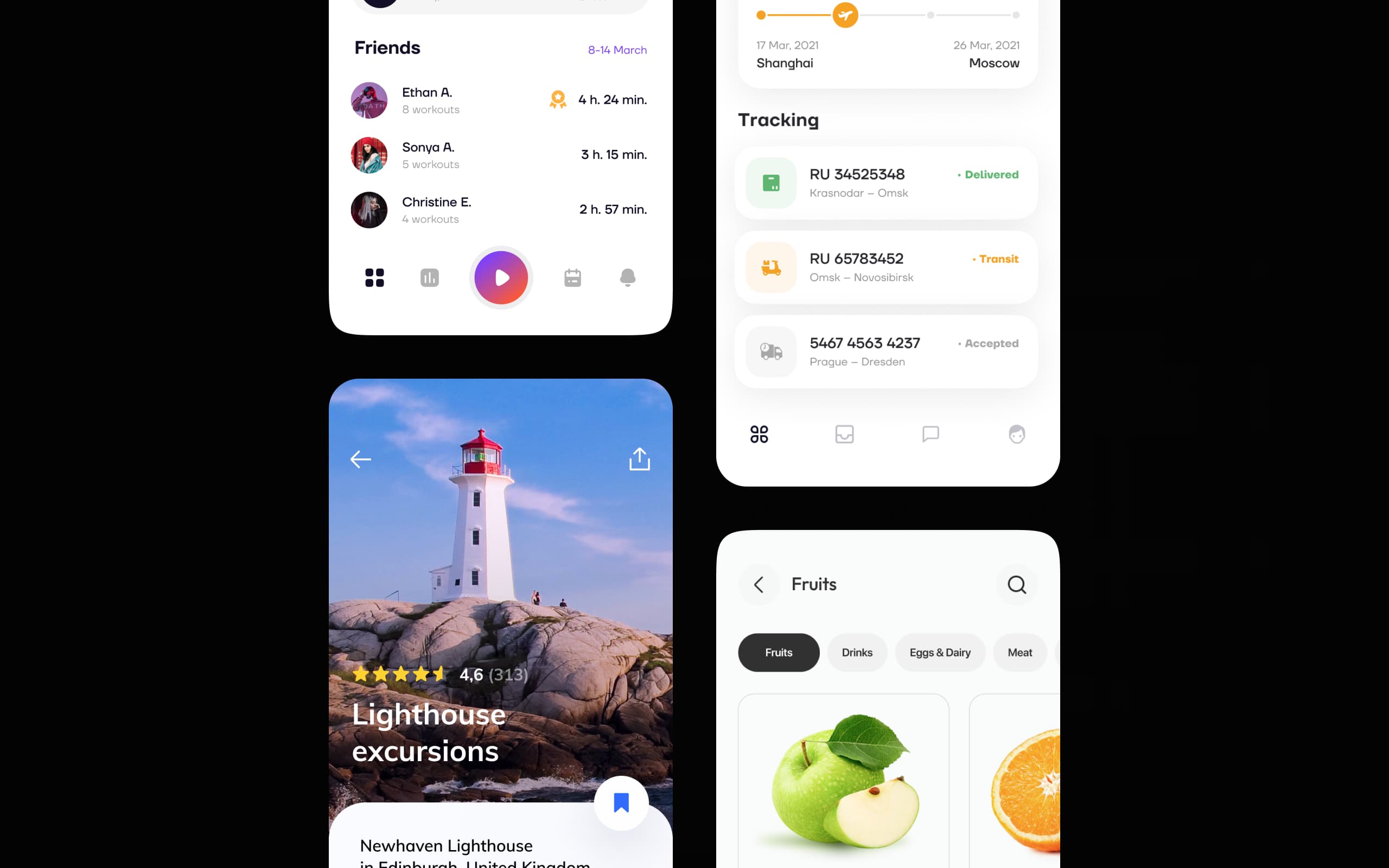
Tip 5. Use relevant and high-quality pictures
Low-resolution images can appear blurry on some screens, so you need to make sure that all images in your app are of high quality. You can check the guidelines of iOS and Android to find out if an image has an acceptable resolution. We don’t recommend using irrelevant stock images — custom illustrations or real photos can tell users a lot more about your product.

Tip 6. Use white space effectively
White space, or negative space, is a blank area around design elements in a layout. It’s a simple way to make an interface look cleaner and more polished. Designers use it intentionally to draw users’ attention to the element surrounded by white space. Take a look at these screens:

The first screen is overloaded with visual elements which make users frustrated and focused on too many areas on the page. The second screen doesn’t contain many elements, but all the users’ attention is drawn to the key information. In this case, nothing distracts the user, and blank space lets the design breathe.
Tip 7. Show which elements are clickable
It’s a common UI design mistake when clickable elements fail to indicate that they’re clickable. It leads to decreased conversions and spoils user experience. You can show clickability by adding shadows or changing the color of the element when a user navigates the interface. Another way to indicate clickability is to add action buttons, toggles, or text links.

Wrapping up
When designing an interface, it’s important to take care of users in the first place and create as few obstacles as possible. Try to make it simple, consistent, and inclusive. Don’t forget the basics, like visual hierarchy and distinguishing elements using whitespace.
If you need help with designing and developing applications, you can visit the Ronas IT Services page and send us a request. Our team is always ready to discuss your idea and find a solution fitting your needs.
Related posts


Related Services
React Native App Development Services
Save time and costs with Ronas IT's React Native app development, allowing cross-platform capabilities for iOS and Android. Our team has built over 30 apps across various sectors, ensuring rapid development, flexible maintenance, and cost-effective solutions.
MVP Development Services
Need to launch your startup quickly? Ronas IT offers urgent MVP development services, allowing you to get a fully-functional app in just 1-3 months. Ideal for testing business ideas, presenting to investors, or entering the market swiftly. Benefit from our extensive experience and accelerated development process.
Custom Mobile App Development
Transform your business with Ronas IT's custom mobile app development. We create tailored UI/UX designs, write clear and efficient code, and ensure seamless releases to Google Play and the App Store. Our experienced team delivers high-performance, secure apps within 3-4 months.